The holiday season has been blown away by the winter winds, and we’re back from our dog(e)sled ride across the yet uncharted snowdrifts of marketland! Find out what’s new on our charting map!
Corporate Events on Chart
We know that chartists are proponents of mathematically-proven facts and hard technical analysis. However, real-life market prices cannot work in a vacuum, and it’s good to know how ongoing events affect the prices. Feel free to track important financial events such as earnings, dividends, and splits on the chart and make more informed decisions.
To enable the Events on Chart feature, go to Settings and activate the Events checkbox. You will be able to see events under the chart by hovering over the red icon.
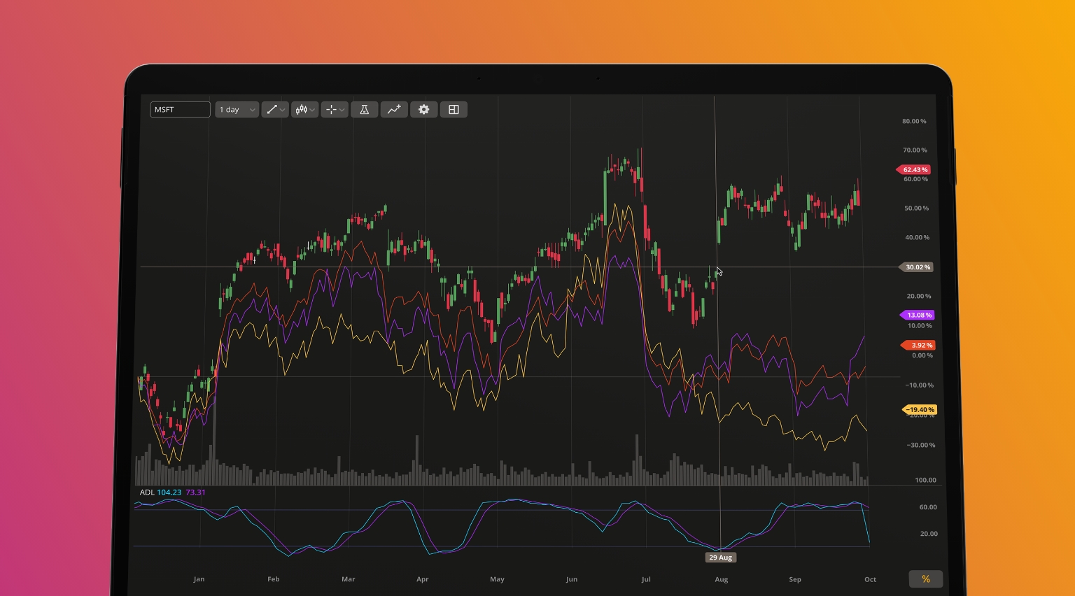
Price Scale Improvements
We’ve revamped our price scale and stuffed it full of information available right on chart. You can display labels and lines on your chart or switch to a logarithmic scale. To enter the price scale menu, right-click on the price line.
Custom Aggregation Period
Before, you were able to select from a variety of candle aggregation periods on the chart. Now, you can enter a custom aggregation period of your own. To do so, click on the arrow next to the aggregation period, select Custom, and type any aggregation period of your choosing (e.g. 6m). The chart will display the candles (bars) aggregated for this period. You can also remove any aggregation period from the list, even the default ones.
Spring brings growth and green grass, and DXcharts will bring you more green candles! Don’t forget to check our updates in May and stay tuned,
The DXcharts team