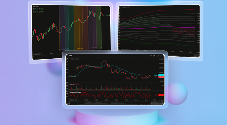
All masterpieces come as trilogies, they say. Well, at least our DXcharts update does. The highlights of Part 3 of our supermassive update are: a new chart type, new drawings & indicators, remastered candles, indicator templates, and many more minor improvements.
Candle Trend Chart
Chartists, welcome a new chart type out there! DXcharts will soon have enough chart types to field a soccer team of its own – with Candle Trend chart added, it now has 10 chart types on its active roster.
The Trend chart is similar to the Candle chart but with different coloring patterns. The candles are colored bullish or bearish depending on the open and the close price values of the current aggregation period and two adjacent aggregation periods.
New Studies & dxScript Improvement
For galactic charting brains out there, we’ve added 14 new technical indicators. Now, you can apply even more advanced mathematics to your technical analysis and identify trends right as they appear.
The new studies in our toolbox are:
- Advance/Decline. A cumulative indicator that plots the difference between the daily number of advancing and declining units. It can be used to confirm a price trend and alert a trader if there is a possibility for trend reversal.
- Average Directional Index. This indicator is used to measure the strength or weakness of a trend over time. This directional index study is obtained from smoothed averages of the difference between +DI (Plus Directional Indicator) and -DI (Minus Directional Indicator).
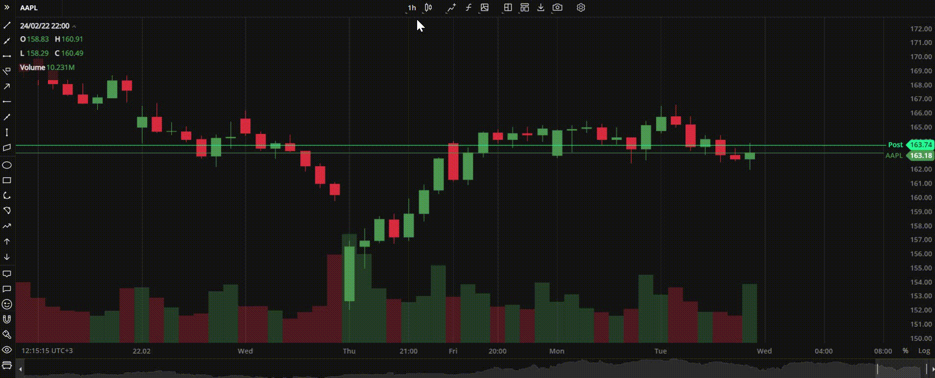
- Balance of Power. This study uses price to measure the buying and selling pressure by showing how strongly the price has changed.
- Bollinger Bands %B. This indicator is used together with the main Bollinger Bands study and shows where the price lies in relation to the bands.
- Bollinger Bandwidth. This is another companion indicator to Bollinger Bands that shows the distance between the upper and the lower band.
- Chaikin Money Flow. This indicator created by Marc Chaikin shows the distribution and accumulation of an instrument. It works as follows: the nearer the close to the high, the more the accumulation.
- Commodity Channel Index. This is the oscillation study that displays the difference between the current price and the historical average price.
- EMA Cross. This is a variation of the EMA (Exponential Moving Average) indicator that points out the crossovers between Day 9 and Day 26 EMA.
- Fibonacci Bollinger Bands. This is a variation of the standard Bollinger Bands where the baseline is a simple moving average, and each band is a Fibonacci ratio of the ATR (average true range) from the baseline.
- Kaufman Moving Average Adaptive. This EMA-based indicator responds to trends and volatility. When the line moves down, it shows a downtrend; when the line moves up, it shows an uptrend.
- Triple Exponential Average (TRIX). This is an indicator that helps visualize both trend and momentum. When used as an oscillator, it shows potential peaks and troughs; when used as a momentum indicator, it helps filter out irrelevant spikes in the price.
We also have a treat for those trailblazing traders who prefer to write their own indicators using our dxScript language. Now they can specify the plot type and its color right in code when editing an indicator.
New Fibonacci Drawings
What can be better than Fibonacci drawings? Even more Fibonacci drawings, of course! Our list of drawings is getting longer and longer like a true Fibonacci sequence and now it includes:
- Fibonacci Projection. A variant of the Fib Retracement drawing tool that allows to identify swing high and swing low points on the chart.
- Fibonacci Time Zone. A series of vertical lines at Fib sequence intervals along the time axis. It helps identify potential areas of importance related to time with no regard to price.
- Fibonacci Time Ratio. Another time-based Fib drawing that helps forecast potential trend reversals based on elapsed time.
- Fibonacci Time Extension. A time-based drawing similar to Fibonacci Extension. It highlights the time areas of importance where the trends are expected to reverse.
- Fibonacci Spiral. A trend-based tool that draws a spiral on the chart using Fibonacci ratios. It is useful in predicting areas of support and resistance.
Candle Improvements
We’ve also sprinkled some magic dust on our candle charts to make you feel more at home with those candles:
Volume Coloring
With this update, volume bars at the bottom of a candle-type chart (Candlestick, Hollow Candles, Trend, Heikin Ashi) can have the same color as candles. The default coloring pattern (green and red) is used for all other chart types.
Hide/Show Wicks
Now you can hide or show candle wicks on the chart for better visibility. It can be used with all candle-based chart types. To show or hide candle wicks, select or clear the Candle Wick checkbox in Settings – General Settings.
Another minor but very important improvement in our charts is indicator templates. Now, you are free to save a list of frequently used studies as a template and add them to a selected layout in one click. You are welcome to try all these new things out in our demo platform at https://devexperts.com/dxcharts-demo/. Meanwhile, keep your eyes peeled for more great stuff to come and
Stay tuned,
The DXcharts team