How We Work on Design Use Сases. Symbol Library
Designing mobile apps, we aspire to maintain the entire functionality of the base platforms (web and desktop). As one could expect, a transition of massive web components to a mobile platform would require a very thorough adaptation. Needless to say, it is crucial for us to keep the platform up to system guidelines and modern trends. We have been designing this app for a couple of years already so we have faced and solved numerous different cases during this time.
This article is an attempt to describe one of these cases on our Android application.
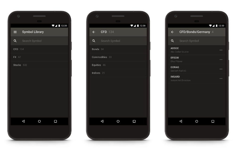
Symbol Library is a big catalog of trading instruments with a complex tree structure. We’ve found this case to be the most interesting in our work during the past couple of months. First, we’ve received a request from the analysts to introduce a specific search/filter ability. Use case: a user-trader is looking for a certain trading instrument. In the forex version, the list is limited to a couple dozen instruments so the user is able to monitor the simple watchlist, but in the case of Brokerage, they interact with hundreds of instruments. They may know the instrument title in full, partially, or only by the folder title. The catalog may be extensive and the hierarchy transition chains may be long, therefore our filter should be available on each screen of the catalog hierarchy (parent — subsidiary — sub-subsidiary, etc.) and should not have the user navigate from the current folder.
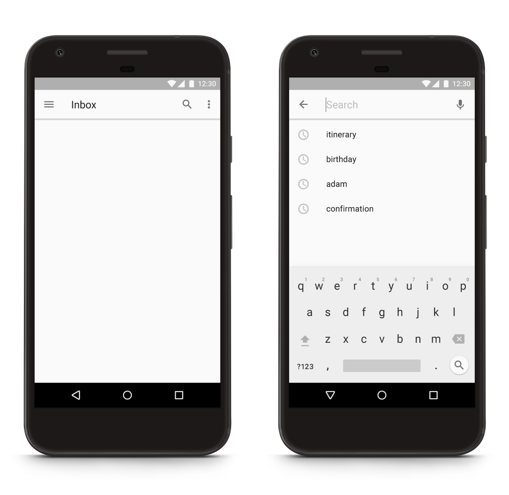
This is where the problem occurs. Referring to Google Material guidelines there are two standard ways to introduce search — Persistent Search or Expandable Search. Unfortunately, these methods do not allow the user to search/filter and move through the catalog simultaneously.

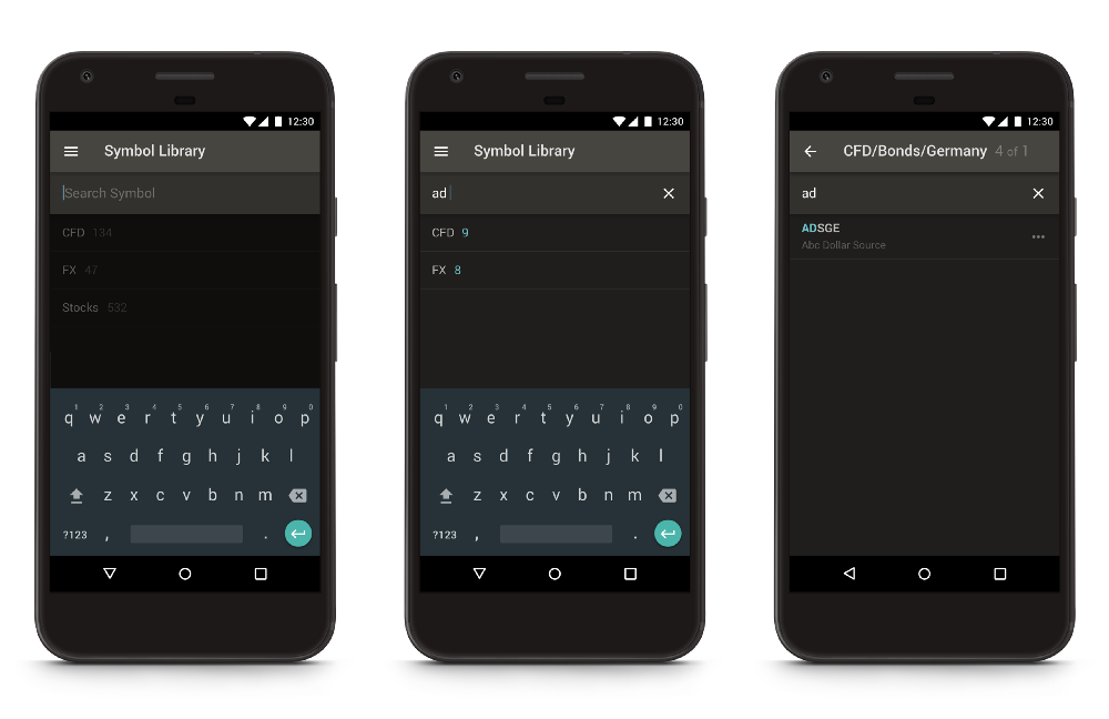
Having researched miscellaneous applications that provide operations with catalogs and analyzed their pros and cons, we came to the conclusion that search should be performed with a separate component under the action bar. The action bar should contain a hierarchy chain and a number of instruments in the current folder. Very long chains will inevitably appear so we’ve added the ability to horizontally scroll it. By tapping on the folder title in a chain, the user can quickly move through the catalog (without losing the search query).
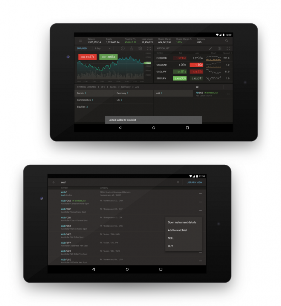
After performing a search query, user can see how many matches there are in their current folder. If there are none, they will be transferred to one of the previous folders that do have matches (in case when there are no matches at all, they will see a placeholder text which explains the situation). Numbers highlight search matches. This pattern is not common for most of the catalogs but is convenient for the current case.
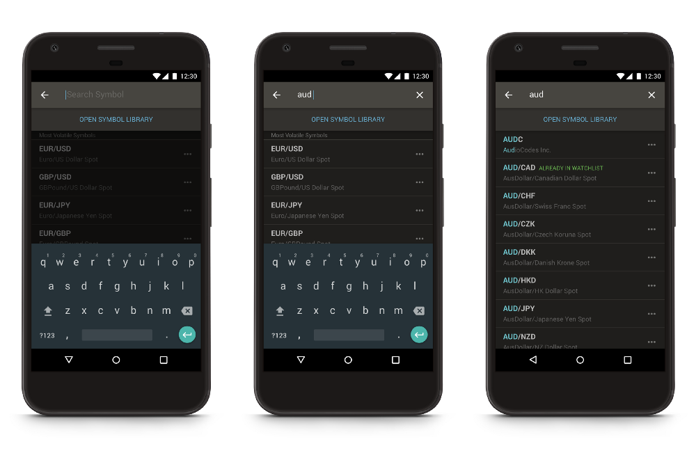
In addition, standard search (global quick search without the catalog structure) is always available from the side menu and its implementation is standard, so the only innovation here is the ability to switch to the symbol library mode.
Not Only Smartphones
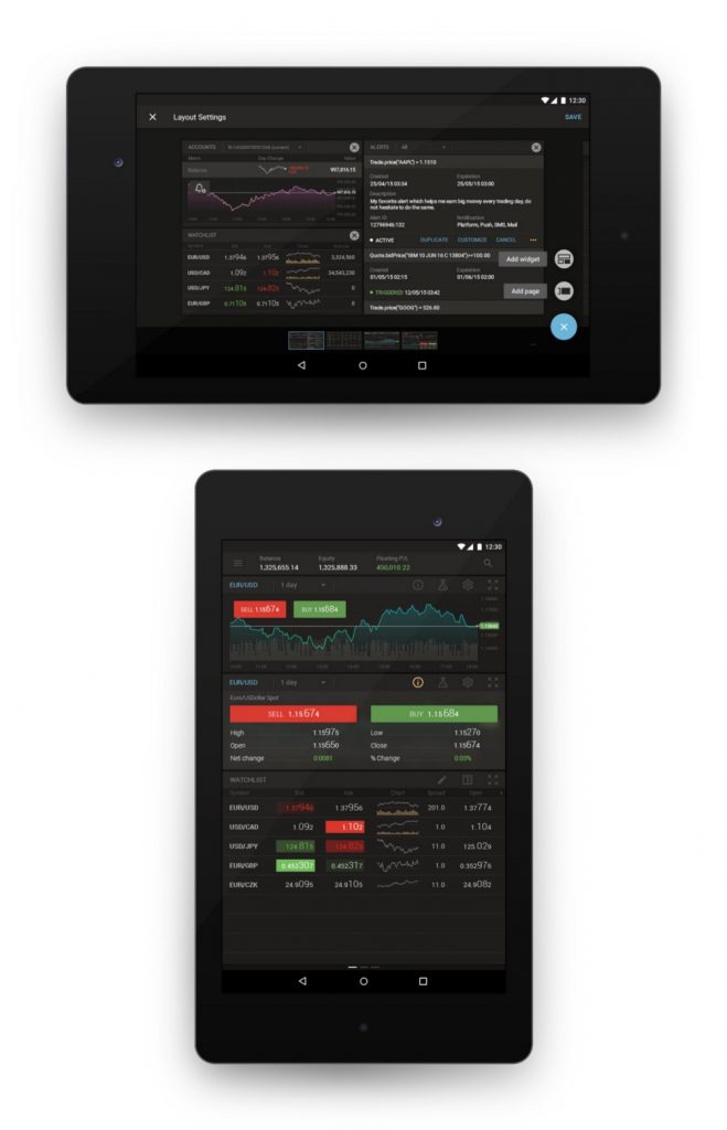
Besides the smartphone application, we also support the tablet version. We strive to make it as consistent with both the smartphone version
Using this approach we’ve faced such problems as
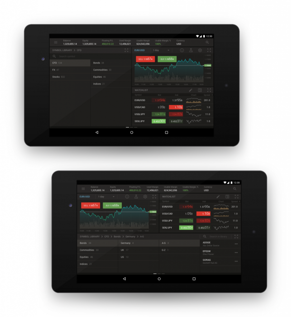
The most frequent use case of Symbol Library on tablets has been noticeably affected by the widget structure too. In this use case, the user has the Watchlist widget (a list of instruments which contains bid and ask prices and a bit of additional information) and the Chart widget (this component provides detailed information about the trading instrument, user having an ability to compare prices, explore and customize the chart, look through additional market data and trade) on the same screen. This layout provides an ability to look quickly through the instrument list, set the selected instrument on the Chart widget, analyze it, and make fast trade decisions. It’s not that simple though to search quickly for new instruments through a standard watchlist. This is where our Symbol Library comes into play.
In the majority of apps, the search function is provided by alteration of the current content display or applied globally (above the current structure level). This is a basic approach resulting in global search being always available from the app header. However, we needed to consider two additional cases. First, global search should have two modes: simple and catalog view. Second, an introduction of search/filter ability inside the widget. We started with the widget’s inner structure. In order to avoid the smartphone way of implementing catalog inside the widget (with a back button), we decided to show content in a cascade (it also saves a lot of usable space). This option is perfect for wide widgets (2×1, 2×2 or full-screen). In this case, 4 content columns (folders) can be showed. For narrow formats (1×1 or 1×2) there are 2 columns. In the widget header, we’ve placed a scrollable hierarchy chain (which is consistent with the smartphone), so the issue with transferring through the history is addressed (in order to open another folder, the user can also tap into the column content, of course). What about the global search though? Its catalog view should almost replicate the symbol library structure so all we have to do is to add a proper mode switch control.
In conclusion, it will not be redundant to remind that all of the decisions have been made through difficult discussions with analysts and product owners and tested both in-house and in focus groups. It wasn’t that easy of a task so we’ve spent quite a while working hard at our workplaces, sketching on whiteboards with markers in our hands, and deliberating in the meeting rooms. That said, we hope this information will help you resolve your own cases. Stay in touch!
