What Is the Customer Not Aware of When Developing Trade Application Design?
Nik Slezkinsky, Head of UX Design Department at Devexperts, shared his vision on building award-winning trade application UI’s
Interviewer: Can you describe the Devexperts Design Team working process?
Nik: There are two ways to develop a UI. The first one is when we are free to create a product from scratch. Starting from scratch is easy, as we have full control over the implementation process and the result. In the second case, clients provide us with logos, colors, and maybe some more guidelines, so front-end terminals design is built under certain constraints. Here the story is unpredictable every time as we may have some challenges to overcome. For example, a client might want to insert a specific picture of a specific format in the bottom-left corner, because it means a lot for his business. But this insertion doesn’t go there technically; it unbalances the accurately adjusted grid. And in this scenario we solve this task by finding an option that suits all parties. We can move the element to a login page, or suggest another better location. And for every suggested offer we need to forecast how it will reflect on further development.
I: What team’s line up should be to create a unique interface?
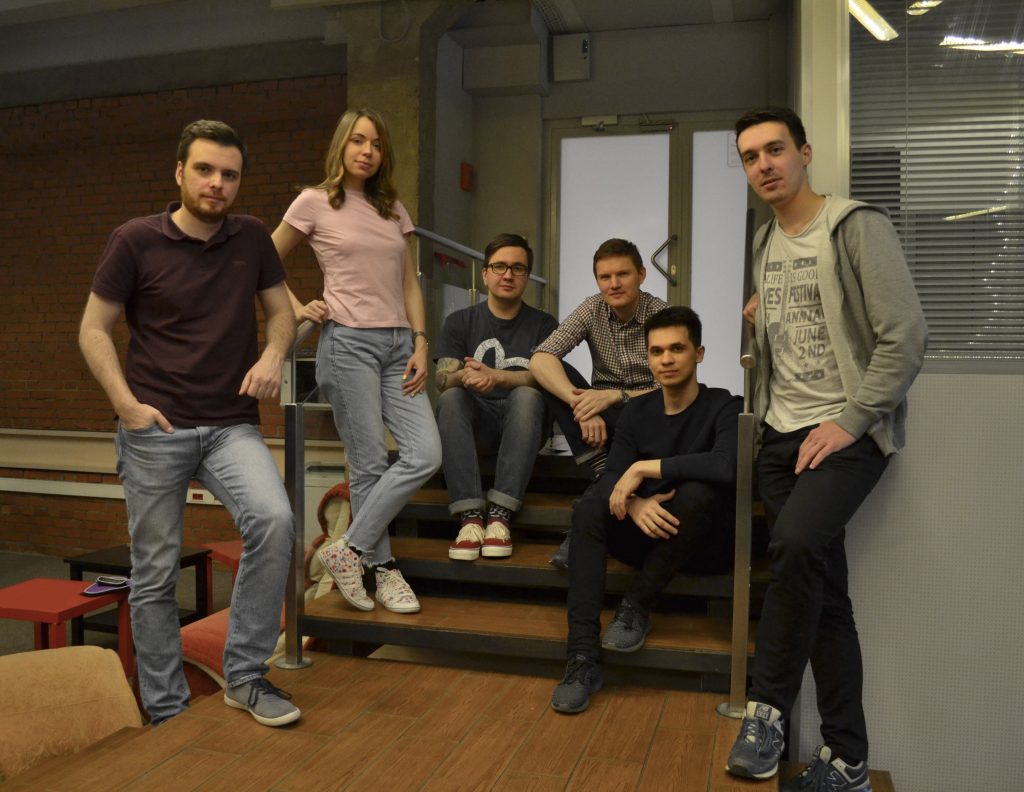
N: My team mostly consists of graphics engineers and graphic designers. But besides them, there are single-discipline specialists, because the UI of a trading application has a lot to do with organizing quantitative information. We’ve got a good platforms division in the team. Some are professionals in desktop, others in web, and in mobile platforms. Some of us are mainly devoted to prototyping and information architecture. There are also people who make animation. The team may look fragile and fragmented due to their focus on specialization, but actually it is not so. People can replace each other at any time as we pay attention to maintaining a rich skillset in every design engineer. Besides, one third of the Devexperts UI is dedicated to particular clients, who have long-term relationships with the company.
I: What are the main criteria to hire a candidate? Before, it was about their aesthetic vision but now psychological knowledge and a scientific approach are a must. Do you look for those skills in a potential candidate?
N: We mostly look for technical education.
I: So, art education plus technical? What is worth money today?
N: Art was never a demand. The technical education is needed to be able to solve tasks in terms of time restrictions and costs. And we do it by analyzing information and looking for the right solution from the array of choices. If an employee knows how to paint and make layouts, it is good, but it won’t help in solving tasks. Solving a task is to propose a solution, which can efficiently address a problem or request. Our goal is to provide a customer with several options, putting them in order by priority, issues, cost, and other applicable criteria, so that a stakeholder can make an educated decision.
There is a common misperception, that a designer is a person who can draw and match fancy colors. You do not need a degree in art just to master color matching. There are lots of resources available on the Internet where several colors are matched by mathematical calculation. It is so noughties to spend time on color choice. Just look up the suitable palettes, compare and pick the right one.
People with a technical degree are the most sought-after in my UX/UI team. These people analyze information and can work with it, set out their thoughts clearly and understand why something was preferred. The rest, like drawing buttons or matching colors, one can learn in a week by using a couple of Internet resources; this is not what we are really paid for.
I: Try to form an ideal candidate profile. I know that it takes months to find the right candidate in your department. What is the reason for that? Is it a particular Devexperts’ attitude?
N: It really takes us long because in addition to basic design skills, we evaluate how the candidates work with information. There are tables, charts, lists, information which should be correctly represented. Our designers work with different languages and must know numerals and currencies, spelling, punctuation, etc. If a designer is not competent in literacy, and doesn’t know how to deliver information, they would throw a monkey wrench in the team’s works. I pick those who understand the nature of language, semiotics, syntax, a set of rules or word order. This knowledge influences how they visually represent digital data.
I: Nowadays more and more companies are enlarging their design teams with linguists, psychologists, sociologists – those people who translate behaviors, intonation and gestures into digital interactions. And you have already said that you have some narrowly-specialized experts. What do you need them for?
N: Such experts are mostly needed to consult about pitfalls or peculiarities, to demonstrate how a user will behave. But in this case the clients themselves can be even more helpful. The end-user’s interaction with an application, his expectations depend on the social group he belongs to. Besides social groups, we make projects for different nationalities and mentalities! And no one can predict that only one solution will work with everyone and everywhere. We have experience of 20 platform localizations for 20 different markets. You cannot enlarge your staff with a specialist for every single country and nationality; it would be an enormous number. Any other local implementation demands different length and width, because the number of symbols will differ. It never happens that the picture you created is always going to stay within the 4×6 inches dimension as a standard photo print size. It will always get transformed. That is why we value people with a technical way of thinking.


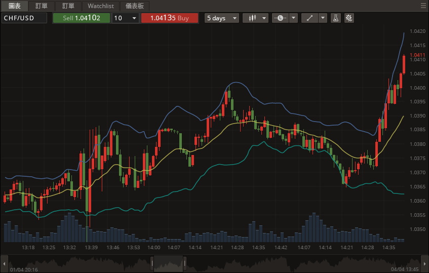
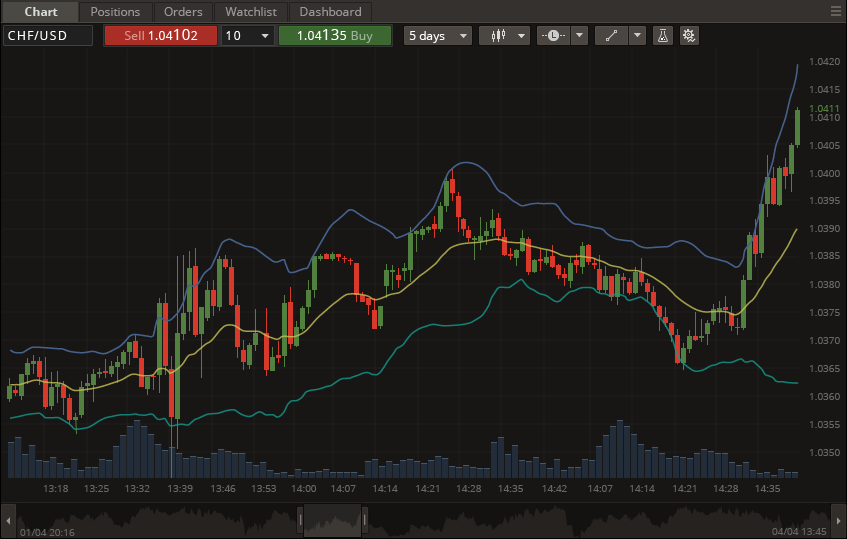
We have created one platform as a basis or a demonstration for everyone and after that it could be adapted for a specific market. For example, in one of our projects for the Chinese market my colleagues had to swap colors of candles, so that those which go up became red and those going down are green. It is different from the European or American culture. Because red for the Chinese is a positive color, it symbolizes wealth and luck.
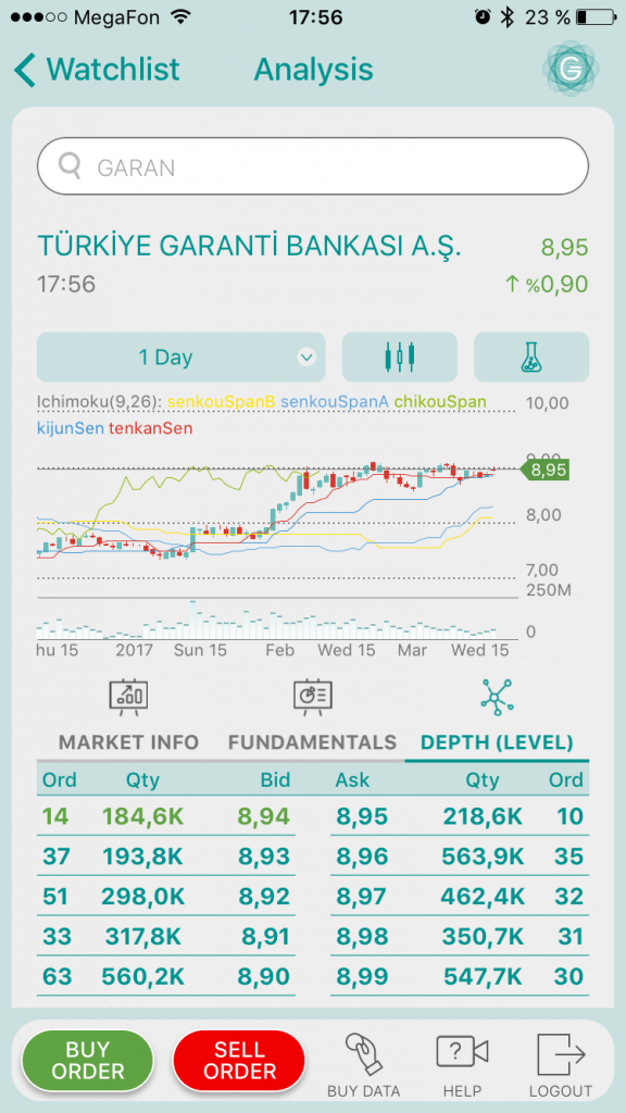
Another case study: for a Turkish project we received a mock-up proposal from our Devexperts Turkey colleagues. By the way, this is precisely the case when we have people in our staff knowing everything about local culture because it is their own native culture. We took that mockup as a starting point and started to adapt the DXtrade Enterprise platform. One of the changes was tabulation structure – market depth representation is not very common compared to the American look, it is specific for the Turkish market, so we had to think about a different way to display the data. This is where analytical ability is needed.
I: What else do you need to keep in mind about mentality? I mean, you think not only about colors, but also some habits…
N: Yes, and in order to keep it in mind you need to ask the right questions at the right time. When we create new templates we always consider doing mockups for different form factors, for example for the iPhone alone it would be for 4, 5 and 6/6 plus formats. And in this project for the Turkish market mentioned above we found out from our clients that the most popular screen size in Turkey is iPhone 6, and since then we took it into account and concentrated on achieving the best for 6 and above. We didn’t spend extra time on the smaller sizes and our client didn’t spend extra money on something less valuable for them, and yet the display remained customized and user-friendly, regardless of the device they prefer using.

