
Ultimate Oscillator (UO) is a momentum oscillator that shows the price momentum based on the weighted average of three different time frames: 7-period, 14-period, and 28-period. UO oscillates on the scale from 0 to +100 and generates buy and sell signals related to divergences between the oscillator line and price.
UO = 100 x [(4 x Avg7 + 2 x Avg14 + Avg28)] / (4 + 2 + 1)
Avgi = sum of BP / sum of TRi
BP = Current Close - Minimum (Current Low or Previous Close)
TR = Maxiumum (Current High or Previous Close) - Minimum (Current Low or Previous Close)
where:
Avgi – weithed average
TR – True Range
BP – Buying Pressure
i – the number of periods used in calculation
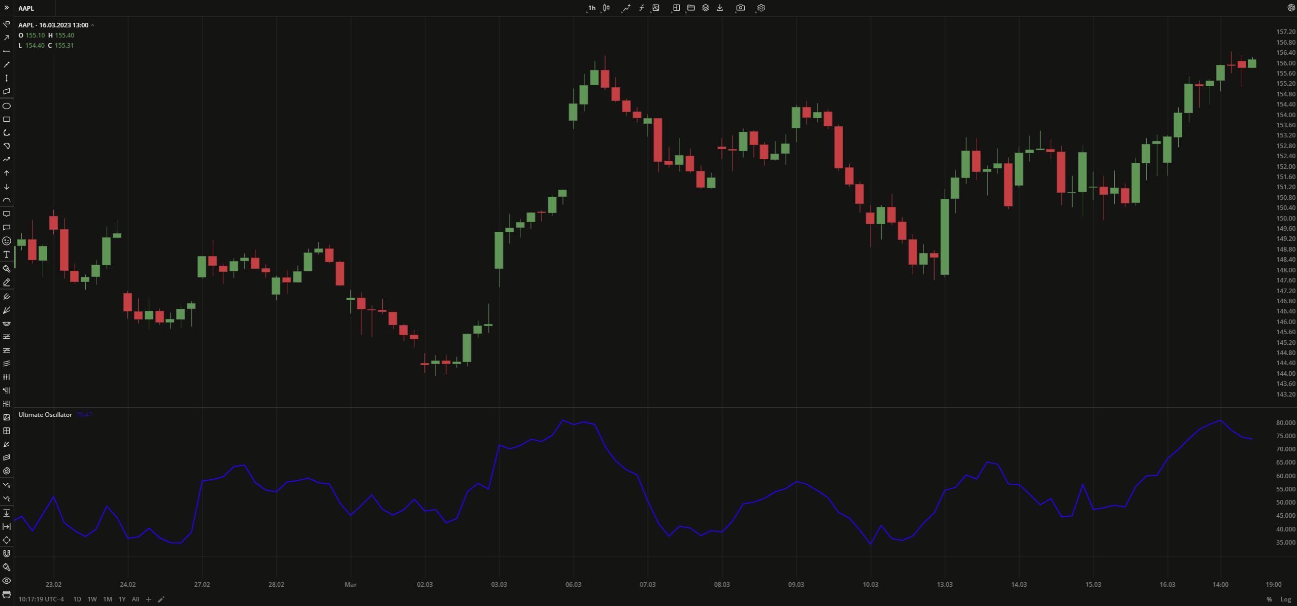 Ultimate Oscillator
INPUTS
| Input | Description |
|---|---|
| FastLength | The number of bars used in calculation of the fast weighted average |
| MediumLength | The number of bars used in calculation of the medium weighted average |
| SlowLength | The number of bars used in calculation of the slow weighted average |
PLOTS
The plot renders the data you are working with on the chart. You can show/hide a plot by clicking the corresponding item in the settings. Every plot has a set of basic settings that you can change: color, weight, and type.
| Plot | Description |
|---|---|
| UO | The Ultimate Oscillator plot |
| Color |
|---|
Click the color rectangle under the plot's name to open the palette. Use the slider at the bottom to set the opacity of the color. 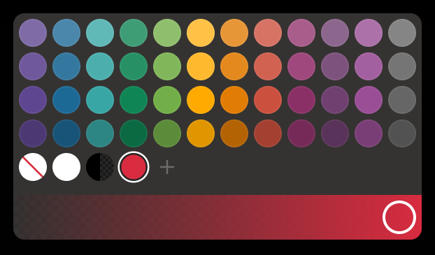 Palette To create a custom color:
The custom-created colors are added to your palette. To remove a custom color, drag it out of the palette. |
| Weight |
| Change the value (in px) to adjust the thickness of the plot. |
| Type |
The following plot types are available:
|
 to open the color picker
OVERLAYING
Check Overlaying to display the indicator on the chart. Otherwise, the indicator is shown in a study pane down below.