
WaveTrend (WT) is an oscillator that follows the price swings and indicates when the market conditions are overbought/oversold. The WT plots two waves with highs (appear as a line) and lows (appear as dots) oscillating below/above the zero level. The oscillator also provides overbought/oversold levels (-60 and +60) and additional signal levels (-50 and +50) that appear as dots. When one of the oscillator's wave is above the overbought level and crosses down the signal level, it is considered a sell signal. Similarly, when one of the oscillator's wave is below the oversold level and crosses above the signal level, it is considered a buy signal. Additionally, WT plots the Wave Difference plot that shows the relationship between the high and low prices over specified period.
WT = (10 * EMA((High + Low + 2Close)/4) - 21 * EMA((High + Low + 2Close)/4)) / sqrt(2 * 30 * Var((High + Low + 2*Close)/4))
where:
EMA – Exponential Moving Average
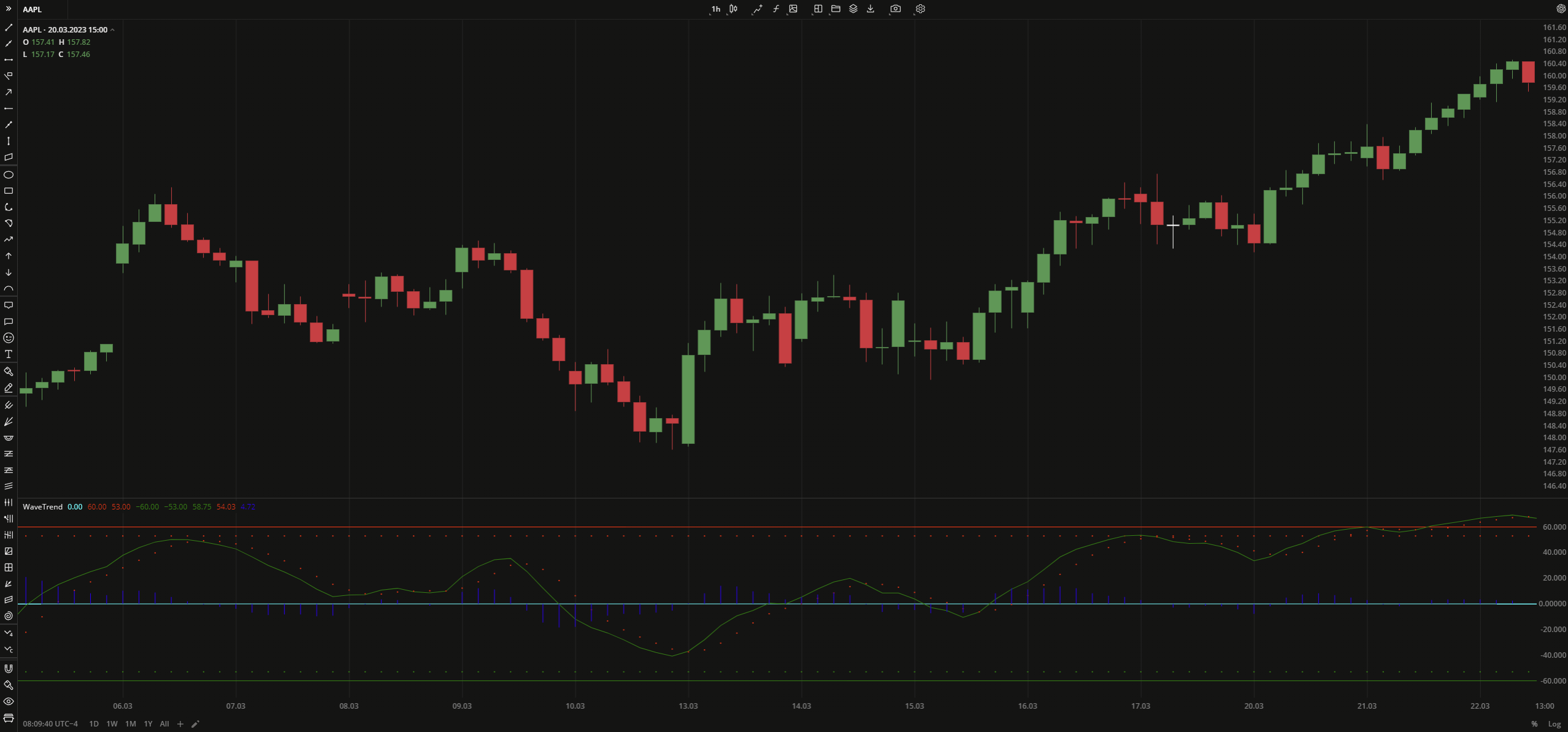 WaveTrend
INPUTS
| Input | Description |
|---|---|
| ChannelLength | The number of bars used to calculate both WaveTrend1 and WaveTrend2 plots |
| AverageLength | The number of bars used to calculate EMA that is applied to the WaveTrend1 and WaveTrend2 plots |
| OverBoughtLevel1 | The price to fix the overbought level at |
| OverBoughtLevel2 | The price to fix the signal line for the overbought level |
| OverSoldLevel1 | The price to fix the oversold level at |
| OverSoldLevel2 | The price to fix the signal line for the oversold level |
PLOTS
The plot renders the data you are working with on the chart. You can show/hide a plot by clicking the corresponding item in the settings. Every plot has a set of basic settings that you can change: color, weight, and type.
| Plot | Description |
|---|---|
| Zero | The zero level |
| OverBought Level1 | The overbought level |
| OverBoughtLevel2 | The signal level for the overbought level |
| OverSoldLevel1 | The oversold level |
| OverSoldLevel2 | The signal level for the oversold level |
| WaveTrend1 | The plot going through the high prices |
| WaveTrend2 | The plot indicating the low prices |
| WaveDifference | The plot that visualizes the difference between WaveTrend1 and WaveTrend2 |
| Color |
|---|
Click the color rectangle under the plot's name to open the palette. Use the slider at the bottom to set the opacity of the color. 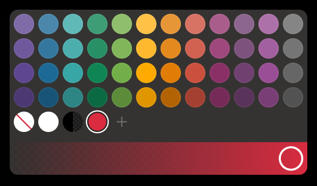 Palette To create a custom color:
The custom-created colors are added to your palette. To remove a custom color, drag it out of the palette. |
| Weight |
| Change the value (in px) to adjust the thickness of the plot. |
| Type |
The following plot types are available:
|
 to open the color picker
OVERLAYING
Check Overlaying to display the indicator on the chart. Otherwise, the indicator is shown in a study pane down below.