Aroon Oscillator
- DarkLight
Aroon Oscillator
- DarkLight
Article summary
Did you find this summary helpful?
Thank you for your feedback!

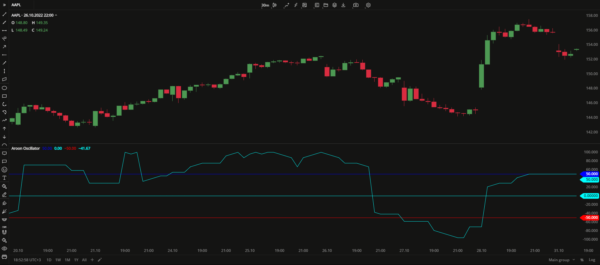
Aroon Oscillator is a study that uses Aroon Indicator to quantify the strength of the current trend and the possibility of its further strengthening. The Aroon Oscillator is calculated as the difference between Aroon Up and Aroon Down. Fluctuating in a range from -100 to +100, high oscillator values indicate an uptrend while the low ones indicate a downtrend.
Aroon Oscillator = Aroon Up - Aroon Down
Aroon Up = 100 * (n-periods since n-day High) / n
Aroon Down = 100 * (n-periods since n-day Low) / n
where:
n – the amount of periods
n-day High – the n-days highest price
n-day Low – the n-days lowest price
 Aroon Oscillator
INPUTS
| Input | Description |
|---|---|
| Length | The number of periods the indicator uses to calculate the AroonOscillator plot |
| Overbought | The price value to fix the overbought level at |
| Oversold | The price value to fix the oversold level at |
PLOTS
The plot renders the data you are working with on the chart. You can show/hide a plot by clicking the corresponding item in the settings. Every plot has a set of basic settings that you can change: color, weight, and type.
| Plot | Description |
|---|---|
| AroonOscillator | The Aroon Oscillator plot |
| OverBought | The overbought level |
| MidLine | The middle line |
| OverSold | The oversold level |
| Color |
|---|
Click the color rectangle under the plot's name to open the palette. Use the slider at the bottom to set the opacity of the color.  Palette PaletteTo create a custom color:
The custom-created colors are added to your palette. To remove a custom color, drag it out of the palette. |
| Weight |
| Change the value (in px) to adjust the thickness of the plot. |
| Type |
The following plot types are available:
|
OVERLAYING
Check Overlaying to display the indicator on the chart. Otherwise, the indicator is shown in a study pane down below.
Note: To reset the settings, click Restore to Default next to the SETTINGS: INDICATOR'S TITLE