Average Directional Movement Index (ADX)
- DarkLight
Average Directional Movement Index (ADX)
- DarkLight
Article summary
Did you find this summary helpful?
Thank you for your feedback!

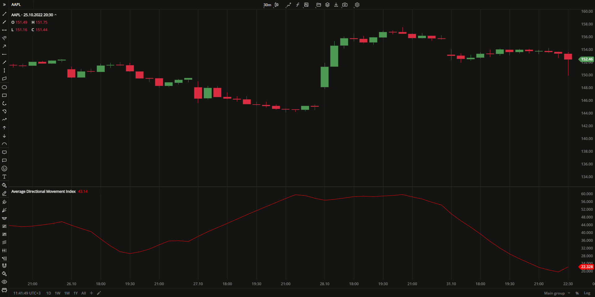
Average Directional Movement Index (ADX) is an indicator that measures the overall strength of a trend. Being a component of the Directional Movement System, ADX combines and smooths (by Moving Average) the result of two other indicators: the positive directional indicator (DMI+) and negative directional indicator (DMI-). The indicator line fluctuates in the range from 0 to +100, whereby the readings below 20 indicate trend's weakness, and readings above 40 indicate trend's strength.
ADX = MAi x [ |DMI(+) - DMI(-)| / (DMI(+) + DMI(-)] x 100
where:
MAi – the Moving Average value calculated for the period
DMI(+) – the positive Direction Movement Index value calculated for the period
DMI(+) – the negative Direction Movement Index value calculated for the period
 Average Directional Movement Index
INPUTS
| Input | Description |
|---|---|
| Length | The number of periods the indicator uses to calculate the ADX plot |
| Average |
|---|
The following Moving Average types are available for calculations:
|
PLOTS
The plot renders the data you are working with on the chart. You can show/hide a plot by clicking the corresponding item in the settings. Every plot has a set of basic settings that you can change: color, weight, and type.
| Plot | Description |
|---|---|
| ADX | The Average Directional Movement Index plot |
| Color |
|---|
Click the color rectangle under the plot's name to open the palette. Use the slider at the bottom to set the opacity of the color.  Palette PaletteTo create a custom color:
The custom-created colors are added to your palette. To remove a custom color, drag it out of the palette. |
| Weight |
| Change the value (in px) to adjust the thickness of the plot. |
| Type |
The following plot types are available:
|
OVERLAYING
Check Overlaying to display the indicator on the chart. Otherwise, the indicator is shown in a study pane down below.
Note: To reset the settings, click Restore to Default next to the SETTINGS: INDICATOR'S TITLE
Was this article helpful?