Baseline
- DarkLight
Baseline
- DarkLight
Article summary
Did you find this summary helpful?
Thank you for your feedback!
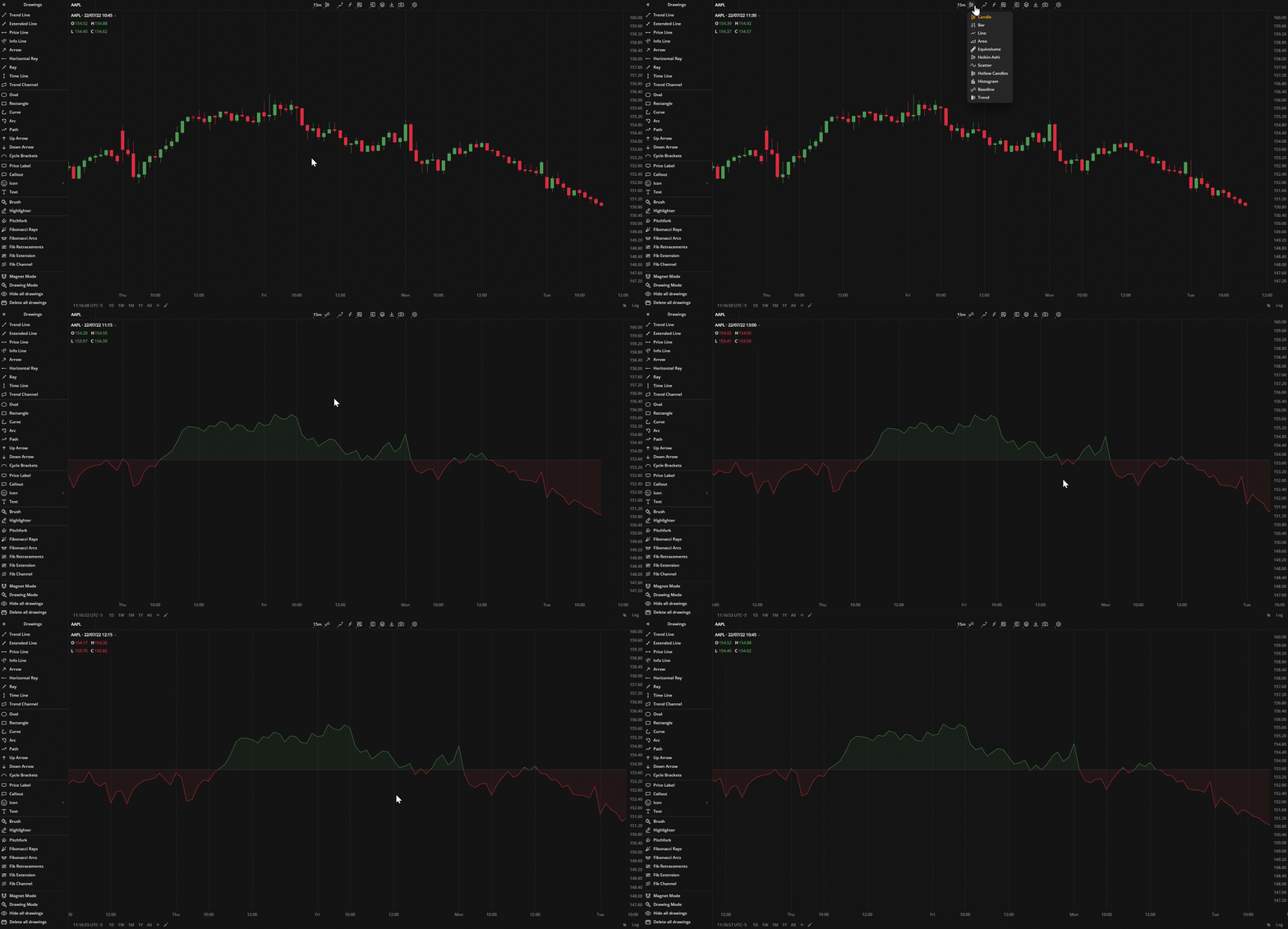
The Baseline chart shows price movements relative to a trader-selected baseline. The baseline is drawn horizontally on the chart and can be adjusted up or down. The Baseline chart can be used for analyzing price fluctuations.
 Baseline chart
Coloring
The area between the data points and the baseline is colored depending on whether the Close prices are greater or lower that the baseline price.
- Close price > Baseline price - The area is "up-colored" (green by default)
- Close price < Baseline price - The area is "down-colored" (red by default)
You can select alternative colors for the chart in Settings![]() > Colors
> Colors![]() .
.
Was this article helpful?


(23).webp)