Chart settings
- DarkLight
Chart settings
- DarkLight
Article summary
Did you find this summary helpful?
Thank you for your feedback!

Overview
Through the Chart settings menu, you can choose whether to show or hide additional objects on the chart, set and customize colors, switch between themes, change a price type, set paddings, and other.
Open the Chart settings menu by clicking the![]() icon on the Toolbar at the top-center of the charts window. The chart settings are also available via shortcut menu by right-clicking the chart area >
icon on the Toolbar at the top-center of the charts window. The chart settings are also available via shortcut menu by right-clicking the chart area >![]() Settings.
Settings.
As any of the default settings change, Reset to Default appears at the bottom of the menu.
Note: To reset the chart to default settings, right-click the chart area and choose Reset chart from the shortcut menu.
General
№ | Name | Description |
|---|---|---|
1 | High and low | Displays the highest and the lowest prices for the chosen instrument on the chart. |
2 | Horizontal grid | Displays a horizontal grid on the chart. The horizontal grid can also be toggled on/off by right-clicking on the chart area. |
3 | Vertical grid | Displays a vertical grid on the chart. The horizontal grid can also be toggled on/off by right-clicking on the chart area. |
4 | Candle wick | Displays candle wicks (for the candle chart types only). |
5 | Watermark | Displays a watermark with the name of the instrument in the middle of the chart. The watermark can also be toggled on/off by right-clicking on the chart area. |
6 | Crosshair | Displays a crosshair on the chart. Here, you can choose what price the crosshair should be snapped to. The different chart types have diverse elements on them, the following example is for the candle-type charts:
The crosshair can also be toggled on and off by right-clicking on the chart area. When the crosshair is enabled, the cursor automatically switches to a cross |
Trading
Activate Trading from chart to show a marker on the price axis. The marker allows adjusting price value and placing orders from the order menu.
See the Trading from chart section to learn how to place orders.
№ | Name | Description |
|---|---|---|
1 | Trading from chart | Allows placing orders right from the chart. |
2 | Show active orders | Shows all the created orders on the chart. |
3 | Show open positions | Shows all the active positons on the chart after the order price is reached. |
4 | Executions | Shows the markers with information about an order execution on the chart. There are two possible ways to display the markers:
.png) Bubbles
(2).png) Labels |
.png)
(1).png) on the chart.
on the chart.Legend
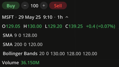
The legend for particular instrument is shown in the top-left corner of the charts area. It is also shown on hover on a candle. The data on the chosen instrument (Open, High, Low, Close price values, and Volume) correlate with the crosshair position on the chart. Price change shows the difference between Open and Close or current price in pips and in percents. Additionally, there is a possibility to place market orders from the Legend if Trading from chart is activated in the Chart settings > Trading.
See the Trading from chart section to learn how to place orders.
Legend
You can turn on/off displaying of Instrument name, OHLC values, Volume, Aggregation period, Aggregation period or Price change by clicking the corresponding option in the Chart settings > Legend.
Note: Click the instrument name on the Legend to hide/show additional info (OHLC values, Volume, Aggregation period)
Scales
The Scales settings are described in the Price-axis section.
Data
№ | Name | Description |
|---|---|---|
1 | Session breaks | Highlights the time breaks on the chart if the aggregation period is less than 1 day. The session breaks can also be toggled on/off by right-clicking on the chart area. |
2 | Extended hours | Displays extended hours volume on the chart if the chosen instrument supports extended hours trading and aggregation period is less than 1 day. The extended hours can also be toggled on/off by right-clicking on the chart area. |
3 | Align data with session start | Synchronizes chart data with the market session start. The chart data will be synchronized with the time the market opens, not with the start of the day. |
4 | Price type | Price type for the chart to be based on:
Note: for quick access to the price types, right-click any element on the chart |
5 | Volume | Displays volume bars. There are two options available:
Calculation of a bar volume: |
Colors
In this section, you can switch the color theme or change the color of the chart elements. There are five themes available to switch between:
Classic Dark
Classic Light
Oud (a more muted Dark theme)
Solar (a warmer version of the Dark theme)
Still (a softer Light theme)
Note: You can also switch between themes from the shortcut menu by right-clicking on the chart area.
Depending on the chart type you have set, you can change the color of the chart elements: body and borders of candles, as well as the color of watermark, grid, values on scales, crosshair, chart background, and news.
Click the color circle next to an option to open the palette. Use the slider at the bottom to set the opacity of the color.

Palette
To create a custom color:
Click
 to open the color picker.
By using the slider at the bottom, adjust the main color.
Then, set a shade for the main color.
The custom-created colors are added to your palette. To remove a custom color, drag it out of the palette.
Events
Events on chart. Displays info markers about upcoming events on the time axis. The following events are available:
Dividends
Splits and consolidations
Earnings and estimates
Conference calls
News
Paddings
In this section, you can set top, right, and bottom margin for the chart:
Top margin (0 - 30%)
Right margin (up to 999 bars)
Bottom margin (0 - 30%)
To set a margin, you can whether type in a new value or click on the option and move the pointer left/right for adjusting the value.
Note: Click Reset to Default to return to the default settings for the current section
Was this article helpful?