Chart types
- DarkLight
Chart types
- DarkLight
Article summary
Did you find this summary helpful?
Thank you for your feedback!

Overview
At the moment, DXcharts mobile supports 11 chart types. These include must-have basic chart types such as Candle, Bar, or Line as well as specialized chart types to give users more versatility and additional technical analysis capabilities.
To change a chart type, go to Settings by tapping.png) icon on the main screen. Then select another chart type by tapping the current chart type in General > Chart type.
icon on the main screen. Then select another chart type by tapping the current chart type in General > Chart type.
Note: Swipe left or right to apply the new chart type
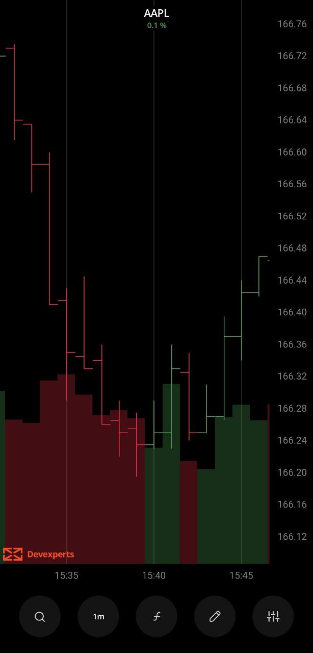
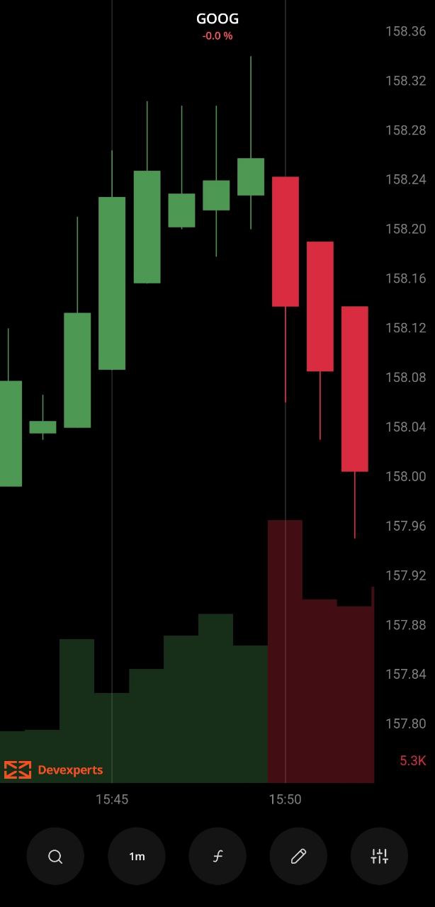
Candles
The Candles chart shows colored rectangles, or candles, that have a body and wicks, or line sections going up and down from the body. The tip of the upper candle wick indicates the high price during the aggregation period, and the bottom tip of the lower candle wick indicates the low price during the aggregation period. The top and bottom of the candle body show to the open and the close prices, respectively.
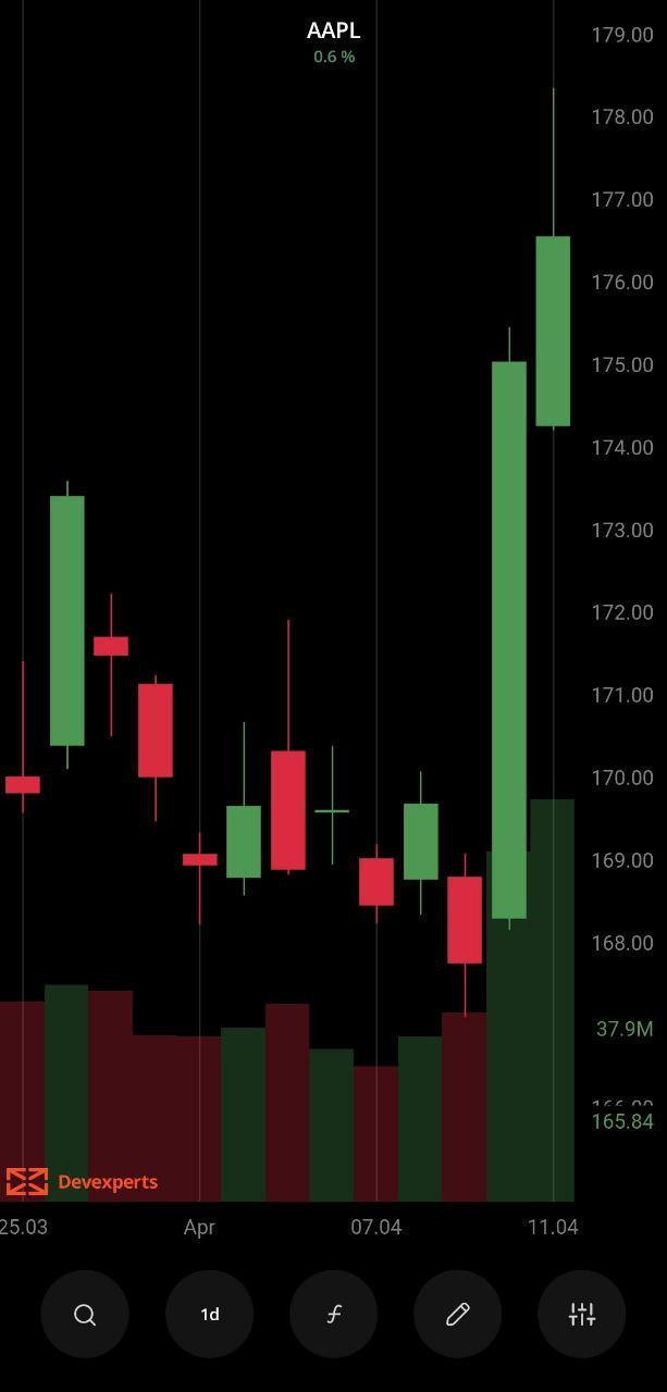 Candles chart
Coloring
The candle borders are colored depending on whether the close price is greater or lower than the open price of the current aggregation period. The candle body is then color-filled depending on whether the close price is greater or lower than the open price of the current aggregation period.
The coloring patterns are the following:
Border
- If the close price is higher than the open price, it's a bull market (green by default).
- If the close price is lower than the open price, it's a bear market (red by default).
- If the close price is the same as the open price, it's a doji (white by default).
Body
- If the close price is higher than the open price, it's a bull market (green by default).
- If the close price is lower than the open price, it's a bear market (red by default).
Bar
The Bar chart shows the average open, high, low, and close price values. Each bar on the chart is made up of a vertical line, an opening stroke (a foot facing left), and a closing stroke (a foot facing right). The bottom tip of the vertical line indicates the Low price, and the upper tip of the line indicates the High price. The opening foot shows the open price and the closing foot shows the close price.
 Bar chart
Coloring
A bar is colored depending on whether the current close price is greater or lower than the previous close.
- If the current close price is higher than the previous close price, the bar is colored green.
- If the current close price is lower than the previous close price, the bar is colored red.
- If the current close price is the same as the previous close price, the bar is colored white.
Line
The Line chart shows the connection between consecutive close prices on the chart. It doesn't show open, high, or low values.
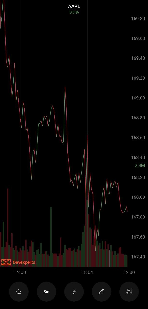 Line chart
Coloring
The line sections are colored depending on whether the current close price is lower or greater than the previous one:
- If the current close price is lower than the previous close price, the line between the two prices is "down-colored" (red by default).
- If the current close price is higher than the previous close price, the line between the two prices is "up-colored" (green by default).
- If the current close price is the same as the previous close price, the line between the two prices is "neutral-colored" (white by default).
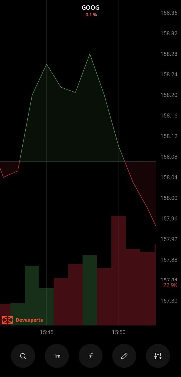
Area
The Area chart is plotted using the close price values and shows the area between the current close price and the zero price level. The area is color-filled to make it easier for users to see the trend.
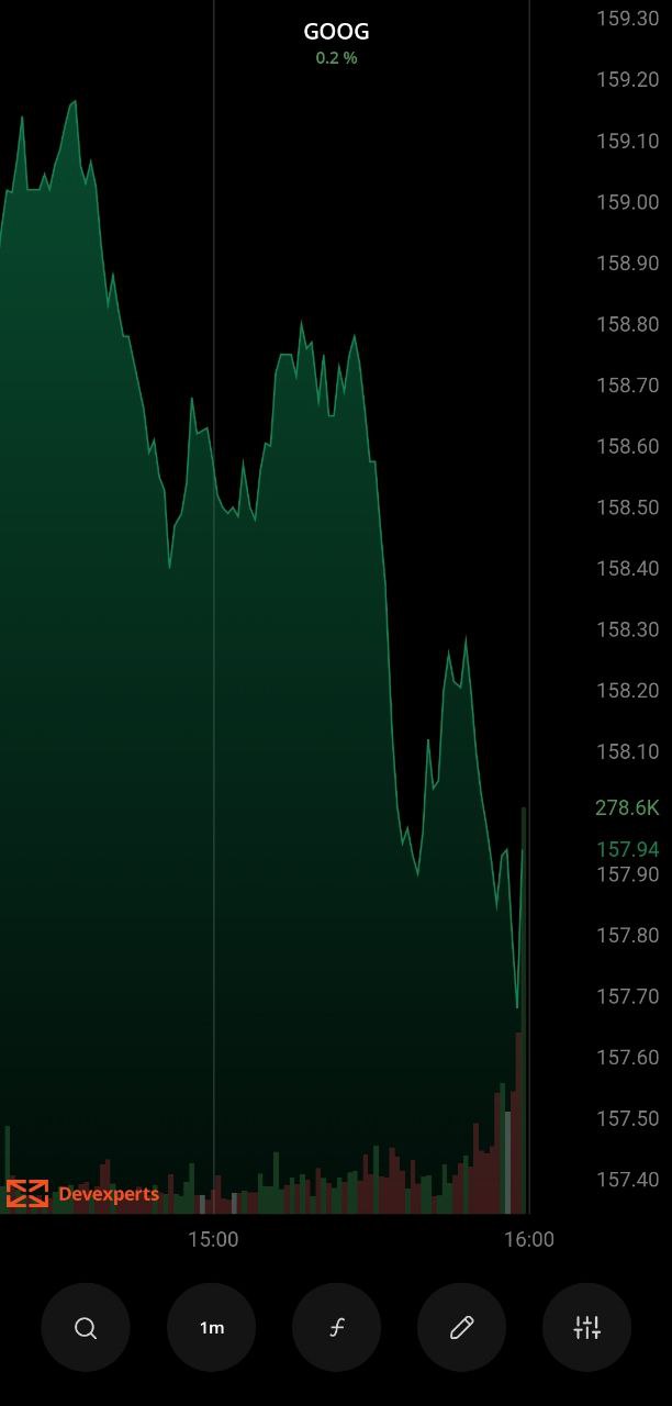 Area Chart
Scatter
The Scatter or Scatterplot chart shows close price values as individual dots on the chart. It's similar to the Line chart but without connecting lines.
The Scatter chart lets you see if two or more prices are related. You can also use them to spot outliers or data gaps.
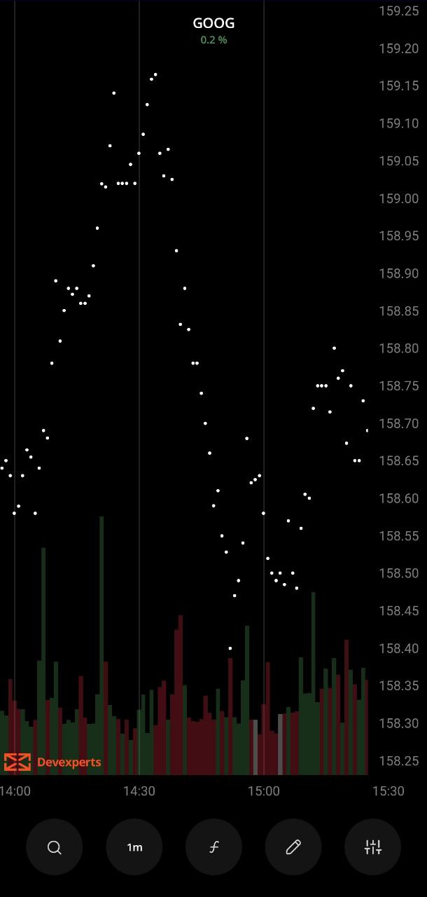 Scatter chart
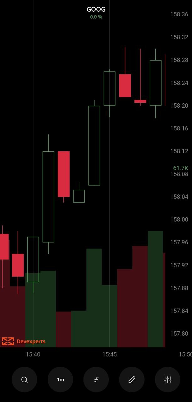
 Hollow Candle
The Hollow Candle chart shows the difference not only between the close price and the open price of the current candle but also takes into account the high and low prices of the nearby candles.
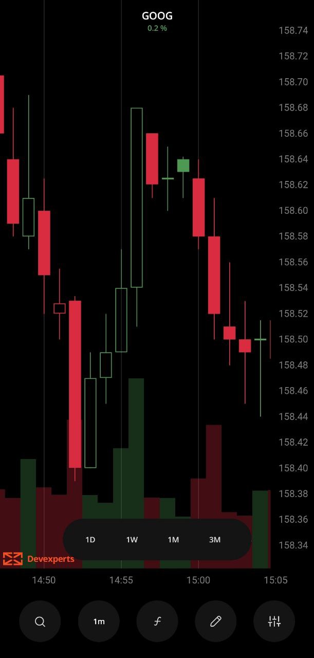 Hollow Candle chart
Coloring and filling
In the Hollow Candle chart, candles are filled based on whether the current close price is higher or lower than the open price, and colored based on whether the current close price is higher or lower than the previous close price. Here's how the coloring and filling patterns work:
- Current Close > Current Open - bull border (green by default).
- Current Close < Current Open - bull filling (green by default).
- Current Close > Previous Close - bull filling or bull border (green by default).
- Current Close < Previous Close - bear filling or bear border (red by default).
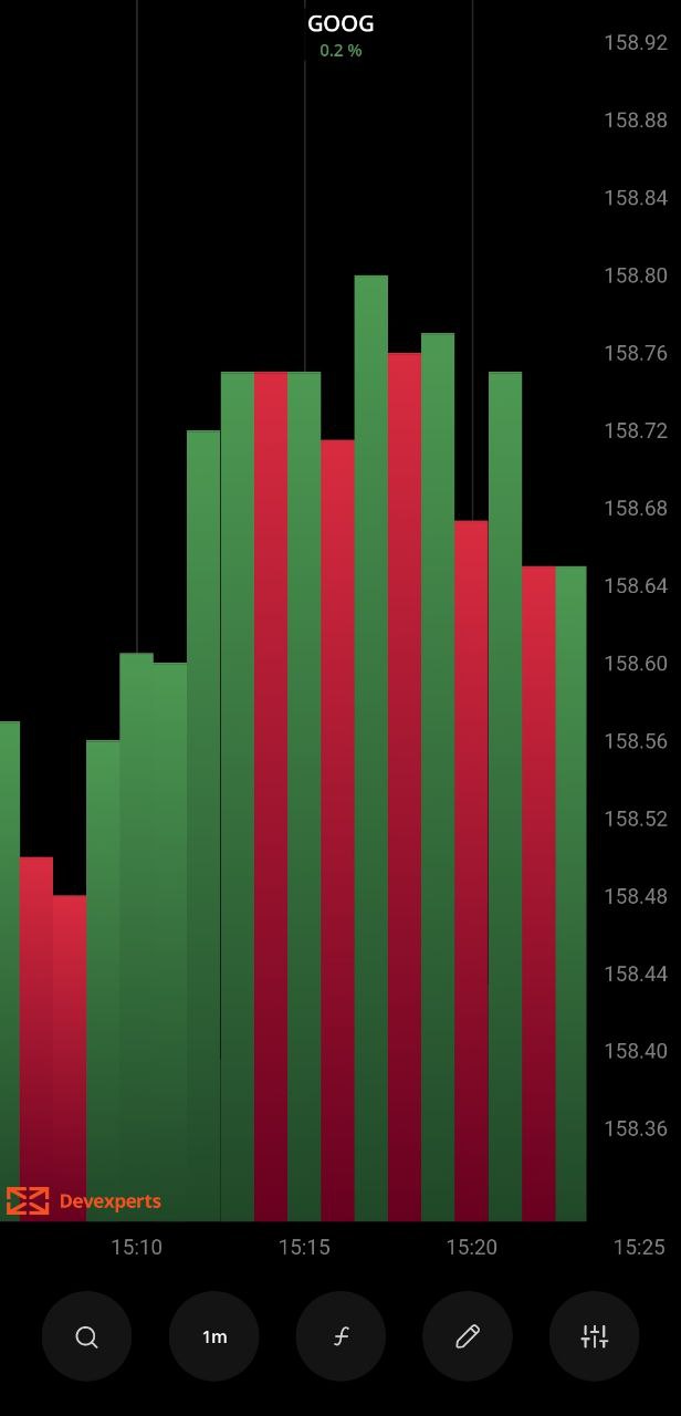
Histogram
The Histogram chart is similar to the Area chart, but the distance between close price values and the zero price level is displayed as a series of columns. You can use the Histogram chart to identify the distribution of peaks and visualize distribution patterns.
 Histogram chart
Coloring
The Histogram columns are colored depending on whether the current close price is greater or lower than the current open price.
- If the close price is less than the open price, the column is colored green.
- If the close price is less than the open price, the column is colored red.
- If the close price is the same as the open price, the column is colored white.
Equivolume
Equivolume is similar to the Candle chart, but instead of the candles, it shows equivolume boxes - rectangles of different width and height. The width of the volume bar is proportional to the volume traded during the aggregation period.
The upper boundary of the hollow rectangle indicates the high price reached during the aggregation period, and the lower boundary indicates the low price during the aggregation period. The Equivolume chart doesn't show the open and close prices.
 Equivolume chart
Coloring
The equivolume box borders are colored depending on whether the close price is greater or lower than the open price of the current aggregation period. The volume bar body is color-filled depending on whether the close price is greater or lower than the open price of the current aggregation period.
The coloring patterns are:
Border
- Close price > Open price - bull border (green by default).
- Close price < Open price - bear border (red by default).
- Close price = Open price - doji (white by default).
Body
- Close price > Open price - bull (green by default).
- Close price < Open price - bear (red by default).
Heikin-Ashi
The Heikin-Ashi chart is plotted with candles like the Candle chart, but the prices are converted into the Heikin Ashi values using formulas (see the Calculation section below).
 Heikin-Ashi chart
Calculation
A new candle opens at the midpoint of the previous candle.
The Heikin-Ashi values are calculated according to the formula:
- Open = (Previous Open + Previous Close) / 2.
- Close = (Close + Open + High + Low) / 4.
- High = The highest of the recent High, or Close values.
- Low = The lowest of the recent Low, Open, or Close values.
Coloring
The Heikin-Ashi candle borders are colored depending on whether the close price is greater or lower than the open price of the current aggregation period. The candle body is then color-filled depending on whether the close price is greater or lower than the open price of the current aggregation period. Here are the coloring patterns:
Border
- Close price > Open price - bull border (green by default).
- Close price < Open price - bear border (red by default).
- Close price = Open price - doji (white by default).
Body
- Close price > Open price - bull (green by default).
- Close price < Open price - bear (red by default).
Baseline
The Baseline chart shows how prices have changed over time compared to a baseline that you adjusted. The Baseline chart can be used to analyze price fluctuations.
 Baseline chart
Coloring
The area between the data points and the baseline is colored depending on whether the close prices are greater or lower than the baseline price.
- If the close price is greater than the baseline price, the area is colored green.
- If the close price is less than the baseline price, the area is colored red.
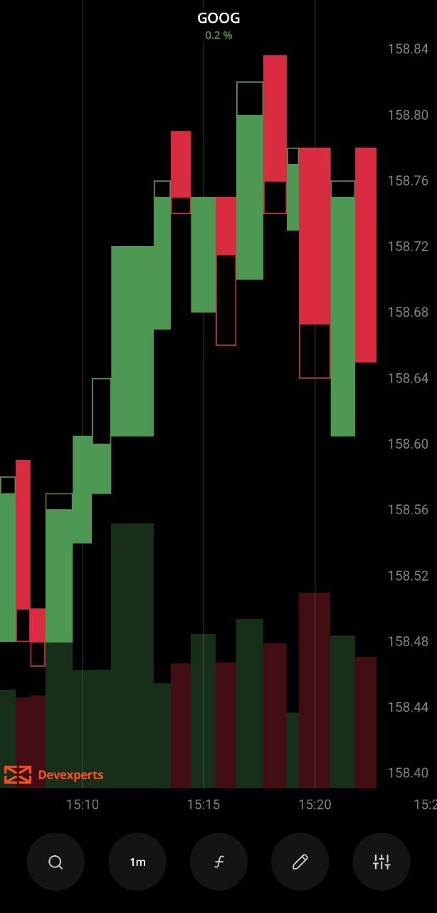
Trend
The Trend chart is similar to the Candle chart but with different coloring patterns. The candles are colored depending on the open and the close price values of the current aggregation period and two adjacent aggregation periods.
 Trend chart
Coloring
The borders of the Trend chart candle are colored depending on whether the current close price is greater or lower than the previous close price. Then, the candle body is color-filled depending on whether the close price is greater or lower than the open price of the current aggregation period. Here are the coloring patterns:
Border
- If the current close is higher than the previous close, the border is green.
- If the current close is lower than the previous close, the border is red.
- If the current close is the same as the previous close, or if it's the first candle on the chart, the border is white.
Body filling
Bull border candle:
- Close price > Open price - Bull (green by default).
- Close price < Open price - Bear (red by default).
Bear border candle:
- Close price < Open price - Bear (red by default).
Doji border candle:
- Close price < Open price - Doji (white by default).
In all other cases, the candle body is left hollow.
Was this article helpful?