Commodity Channel Index (CCI)
- DarkLight
Commodity Channel Index (CCI)
- DarkLight
Article summary
Did you find this summary helpful?
Thank you for your feedback!

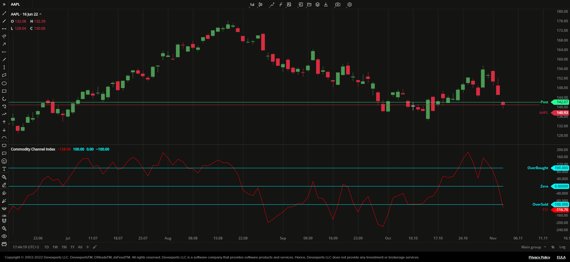
Commodity Channel Index (CCI) is a momentum oscillator that represents security price's variation calculated from its statistical mean (average absolute deviation). To plot the variation, CCI first calculates the difference between a Typical Price (arithmetic average of the high, low, and close prices) and its Simple Moving Average (SMA). Then, the indicator divides the result by the statistical mean of the typical price.
CCI has two adjustable overbought and oversold levels and the zero line. When the oscillator's line moves above the zero line, it indicates strengthening of the market momentum. Moving below the zero line indicates the market momentum weakening.
CCI = [TPn - SMAn (TP)] / [0.15 x MDn (TP)]
where:
TPn – Typical Price for n-period
SMAn – Simple Moving Average for n-period
MDn – Mean Deviation for n-period
0.15 – Lambert's constant
n – the number of periods
 Commodity Channel Index
INPUTS
| Input | Description |
|---|---|
| Length | The number of periods the indicator uses to calculate the CCI |
| Overbought | The price value to fix the overbought level at |
| Oversold | The price value to fix the oversold level at |
PLOTS
The plot renders the data you are working with on the chart. You can show/hide a plot by clicking the corresponding item in the settings. Every plot has a set of basic settings that you can change: color, weight, and type.
| Plot | Description |
|---|---|
| CCI | The Commodity Channel Index plot |
| Overbought | The overbought level |
| Oversold | The oversold level |
| Zero | The zero level |
| Color |
|---|
Click the color rectangle under the plot's name to open the palette. Use the slider at the bottom to set the opacity of the color.  Palette PaletteTo create a custom color:
The custom-created colors are added to your palette. To remove a custom color, drag it out of the palette. |
| Weight |
| Change the value (in px) to adjust the thickness of the plot. |
| Type |
The following plot types are available:
|
OVERLAYING
Check Overlaying to display the indicator on the chart. Otherwise, the indicator is shown in a study pane down below.
Note: To reset the settings, click Restore to Default next to the SETTINGS: INDICATOR'S TITLE
Was this article helpful?