- DarkLight
Commodity Selection Index (CSI)
- DarkLight
Commodity Selection Index (CSI) is a technical momentum indicator that helps select commodities suitable for short-term trading based on their CSI values. The larger the value, the more suitable the commodity is. To calculate the values, the indicator multiplies Average Directional Movement Rating (ADR) and Average True Range (ATR) by a constant that incorporates the Big Point Value (1 full point of price movement represented in dollars), initial margin requirements, and the commission.
CSI = K x ADXR x ATR
K = [movevalue/sqrt(margin)] / (150 + commission)
where:
ADXR – Average Directional Movement Rating
ATR – Average True Range
K – Welles Wilder's coefficient including price movement value (Big Point Value), initital margin requirements, and commission
.png) Commodity Selection Index
Commodity Selection Index
INPUTS
| Input | Description |
|---|---|
| Length | The number of periods the indicator uses to calculate the CSI |
| BigPointValue | The big point value of a security |
| MyMargin | Initial margin requirements |
| MyCommission | The commission to be paid |
| Average |
|---|
The following Moving Average types are available for calculations:
|
PLOTS
The plot renders the data you are working with on the chart. You can show/hide a plot by clicking the corresponding item in the settings. Every plot has a set of basic settings that you can change: color, weight, and type.
| Plot | Description |
|---|---|
| CCI | The Commodity Selection Index plot |
| Color |
|---|
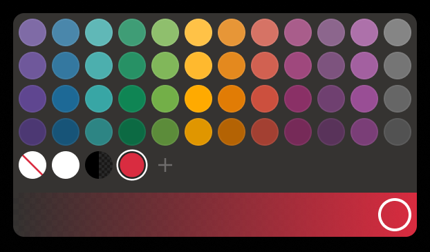
Click the color rectangle under the plot's name to open the palette. Use the slider at the bottom to set the opacity of the color.  Palette PaletteTo create a custom color:
The custom-created colors are added to your palette. To remove a custom color, drag it out of the palette. |
| Weight |
| Change the value (in px) to adjust the thickness of the plot. |
| Type |
The following plot types are available:
|
OVERLAYING
Check Overlaying to display the indicator on the chart. Otherwise, the indicator is shown in a study pane down below.


