Compare charts
- DarkLight
Compare charts
- DarkLight
Article summary
Did you find this summary helpful?
Thank you for your feedback!
(29).webp)
Overview
Compare charts is an analysis tool that helps reveal the percentage correlation between instruments on the chart. You can add up to 4 symbols to compare at the same time.
There are two types of plots available to choose from for each compared instrument: Line and Area. You can change the settings of the plots through the Compare box or from the shortcut menu by right-clicking any plot on the chart:
- Chart type. Specifies a type for the plot.
- Color. Specifies the color of the plot.
- Bring to front. The visual display of the plot relative to the other plots. The plot is moved to the front.
- Send to back. The visual display of the plot relative to the other plots. The plot is moved to the back.
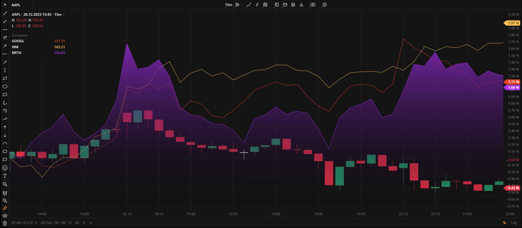 Compare chartsIn the Compare box, you can see the exact price value for each symbol. The value corresponds to the point where the crosshair is positioned.
.png) Compare box
Compare box
How to compare charts
- At the top-center of the charts, on the Toolbar, click the Compare charts
 icon.
icon. - Start typing an instrument name to display the list of available symbols.
- Click on the required symbol to display its plot on the chart.
How to change a plot type
- Move the pointer to the Compare box on the charts.
- Click the Settings
 icon against the required symbol.
 - Choose one of the availble plot types: Line or Area.
- Click outside the menu to close the pop-up window.
How to change a plot color
- Right-click a chart plotMove the pointer to the Compare box on the charts.
- Click the Settingsicon against the required symbol.
- Set the required Line color or adjust the new one:
Color Click the color circle to open the palette. Select one of the default colors, use the slider at the bottom to set the opacity of the color.
 Palette
 To create a custom color:
- Click
 to open the color picker
 - By using the slider at the bottom, adjust the main color
- Then, set a shade for the main color on the palette
The custom-created colors are added to your palette. To remove a custom color, drag it out of the palette.
- Click
- Click outside the menu to close the pop-up window.
How to delete a plot
- Move the pointer to the Compare box on the charts.
- Click
 to remove the plot.
Was this article helpful?