Exponential Moving Average Clouds
- DarkLight
Exponential Moving Average Clouds
- DarkLight
Article summary
Did you find this summary helpful?
Thank you for your feedback!

Exponential Moving Average Clouds or EMA Clouds is a trend-following indicator that visualizes the area between two Exponential Moving Averages (EMAs) as a shaded cloud. The cloud serves as dynamic support or resistance, shifting color based on trend direction: bullish when the short EMA is above the long EMA, and bearish when below. Up to five customizable EMA pairs can be displayed at once, helping track both short- and long-term trends. Each EMA line is split by trend direction for clarity. EMA Clouds are suited for multiple timeframes and widely used in intraday and swing trading.
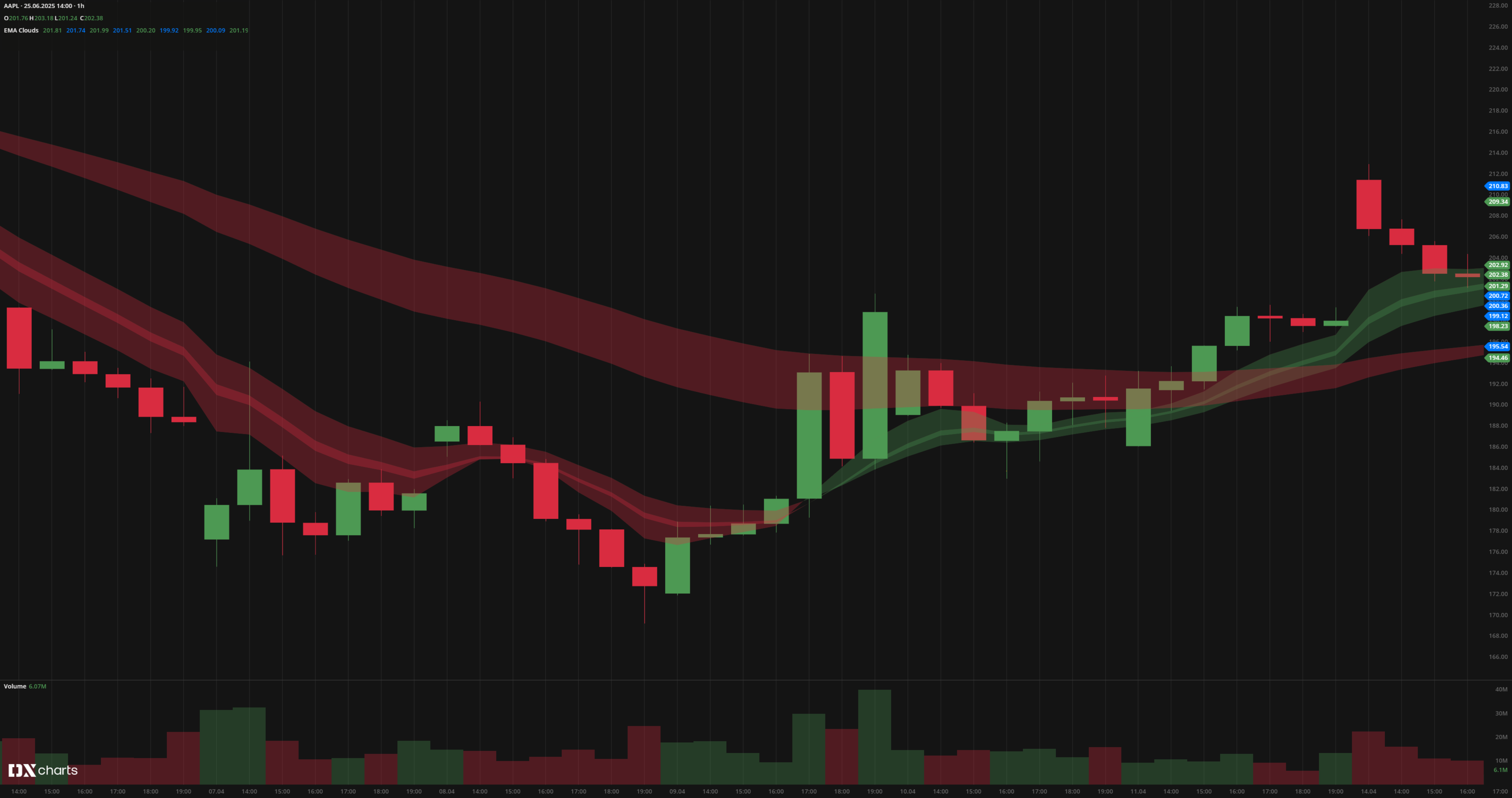 EMA Clouds
INPUTS
| Input | Description |
|---|---|
| Price | The price source used for EMA calculation |
| EMA lengths | Short and long EMA periods for each cloud |
| Leading period | Offset applied to shift the EMAs forward and backward |
| Visibility | Options to show or hide EMA lines and clouds |
PLOTS
The plot renders the data you are working with on the chart. You can show/hide a plot by clicking the corresponding item in the settings. Every plot has a set of basic settings that you can change: color, weight, and type.
| Plot | Description |
|---|---|
| EMA lines | Short and long EMAs, colored by trend direction |
| EMA Clouds | Shaded areas between EMAs, with bullish and bearish colors |
| Color |
|---|
Click the color rectangle under the plot's name to open the palette. Use the slider at the bottom to set the opacity of the color.  Palette
The custom-created colors are added to your palette. To remove a custom color, drag it out of the palette. |
| Weight |
| Change the value (in px) to adjust the thickness of the plot. |
| Type |
The following plot types are available:
|
OVERLAYING
Check Overlaying to display the indicator on the chart. Otherwise, the indicator is shown in a study pane down below.
Note: To reset the settings, click Restore to Default next to the SETTINGS: INDICATOR'S TITLE
Was this article helpful?