- DarkLight
Equivolume
- DarkLight
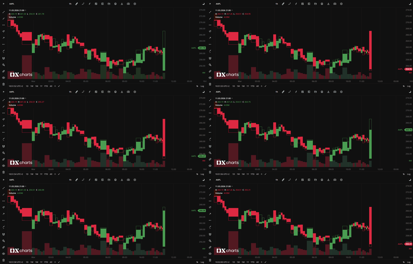
Equivolume is similar to the Candle chart, but instead of the candles it shows equivolume boxes, rectangles of different width and height. The width of the volume bar is proportional to the volume traded during the aggregation period. The upper boundary of the hollow rectangle indicates the High price reached during the aggregation period, and the lower boundary indicates the Low price during the aggregation period. The Equivolume chart does not show the open price, but it can show the close price. The setting can be enabled/disabled through Settings![]() > General > Show close price.
> General > Show close price.

Equivolume chart type
Coloring
The equivolume box borders and body are colored depending on whether the current Close price is greater or lower than the Close price of the previous aggregation period. The coloring patterns are:
Current Close > Previous Close - Bull (green by default)
Current Close < Previous Close - Bear (red by default)
Current Close = Previous Close - Doji (white by default)
You can select alternative colors for equivolume bars in Settings![]() > Colors
> Colors![]() .
.


(18).webp)