Fast Stochastic
- DarkLight
Fast Stochastic
- DarkLight
Article summary
Did you find this summary helpful?
Thank you for your feedback!

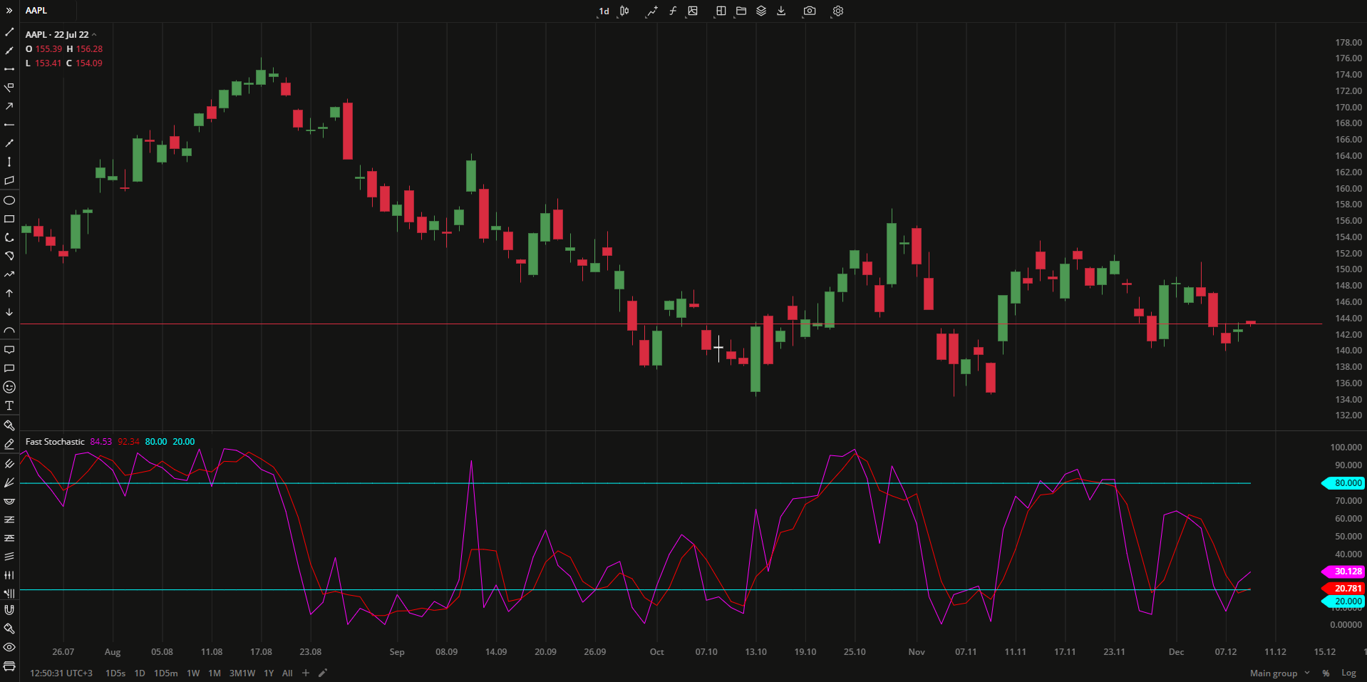
The Fast Stochastic is a momentum oscillator that identifies the market strength by comparing the closing price of a security with its price range over period of time. Fast Stochastic is bounded to the range from 0 to +100 and is consisted of two lines: FastK and its smoothed version FastD. Crossover of either lines with overbought/oversold levels generates sell (above 80) and buy (below 20) signals respectively.
%K = [ (C - L) / (H - L) ] * 100
%D = MA(%K)
where:
%K – FastK
%D – FastD
C – the most recent closing price
L – the Lowest price during period
H – the Highest price during period
MA – Moving Average
 Fast Stochastic
INPUTS
| Input | Description |
|---|---|
| KPeriod | The period the indicator uses to calculate FastK |
| DPeriod | The length of the moving average to calculate FastD (%D) |
| Overbought | The price value to fix the overbought level at |
| Oversold | The price value to fix the oversold level at |
| Average |
|---|
The following Moving Average types are available for calculations:
|
PLOTS
The plot renders the data you are working with on the chart. You can show/hide a plot by clicking the corresponding item in the settings. Every plot has a set of basic settings that you can change: color, weight, and type.
| Plot | Description |
|---|---|
| FastK | The FastK plot |
| FastD | The FastD plot |
| OverBought | The oversold level |
| OverSold | The overbought level |
| Color |
|---|
Click the color rectangle under the plot's name to open the palette. Use the slider at the bottom to set the opacity of the color.  Palette PaletteTo create a custom color:
The custom-created colors are added to your palette. To remove a custom color, drag it out of the palette. |
| Weight |
| Change the value (in px) to adjust the thickness of the plot. |
| Type |
The following plot types are available:
|
OVERLAYING
Check Overlaying to display the indicator on the chart. Otherwise, the indicator is shown in a study pane down below.
Note: To reset the settings, click Restore to Default next to the SETTINGS: INDICATOR'S TITLE
Was this article helpful?