High-Low Volatility
- DarkLight
High-Low Volatility
- DarkLight
Article summary
Did you find this summary helpful?
Thank you for your feedback!

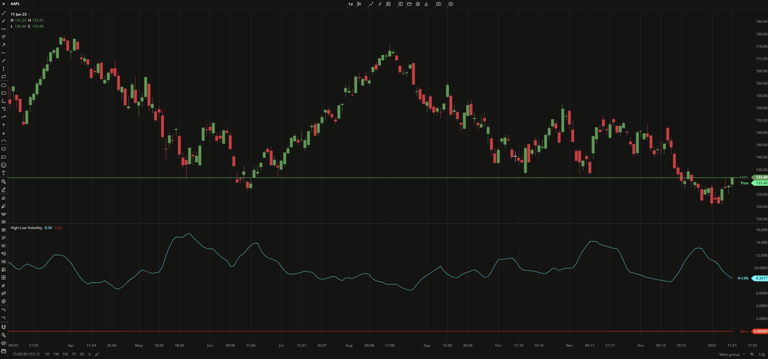
The High-Low Volatility indicator measures price volatility in a specific way: it considers min and max price values for a given period and relates them to the current price. The values are calculated as a percentage ratio of two EMAs, EMA1 for the difference between highest high and lowest low prices, and EMA2 for the current close.
High-Low Volatility = EMA1 (Highest High - Lowest Low) / EMA2 (Current close) * 100
where:
EMA – Exponential Moving Average
 High-Low Volatility
INPUTS
| Input | Description |
|---|---|
| Length | The number of periods the indicator uses to calculate EMAs |
PLOTS
The plot renders the data you are working with on the chart. You can show/hide a plot by clicking the corresponding item in the settings. Every plot has a set of basic settings that you can change: color, weight, and type.
| Plot | Description |
|---|---|
| H-Lvlt | The High-Low Volatility plot |
| Zero | The zero level |
| Color |
|---|
Click the color rectangle under the plot's name to open the palette. Use the slider at the bottom to set the opacity of the color.  Palette PaletteTo create a custom color:
The custom-created colors are added to your palette. To remove a custom color, drag it out of the palette. |
| Weight |
| Change the value (in px) to adjust the thickness of the plot. |
| Type |
The following plot types are available:
|
OVERLAYING
Check Overlaying to display the indicator on the chart. Otherwise, the indicator is shown in a study pane down below.
Note: To reset the settings, click Restore to Default next to the SETTINGS: INDICATOR'S TITLE
Was this article helpful?