Inertia
- DarkLight
Inertia
- DarkLight
Article summary
Did you find this summary helpful?
Thank you for your feedback!

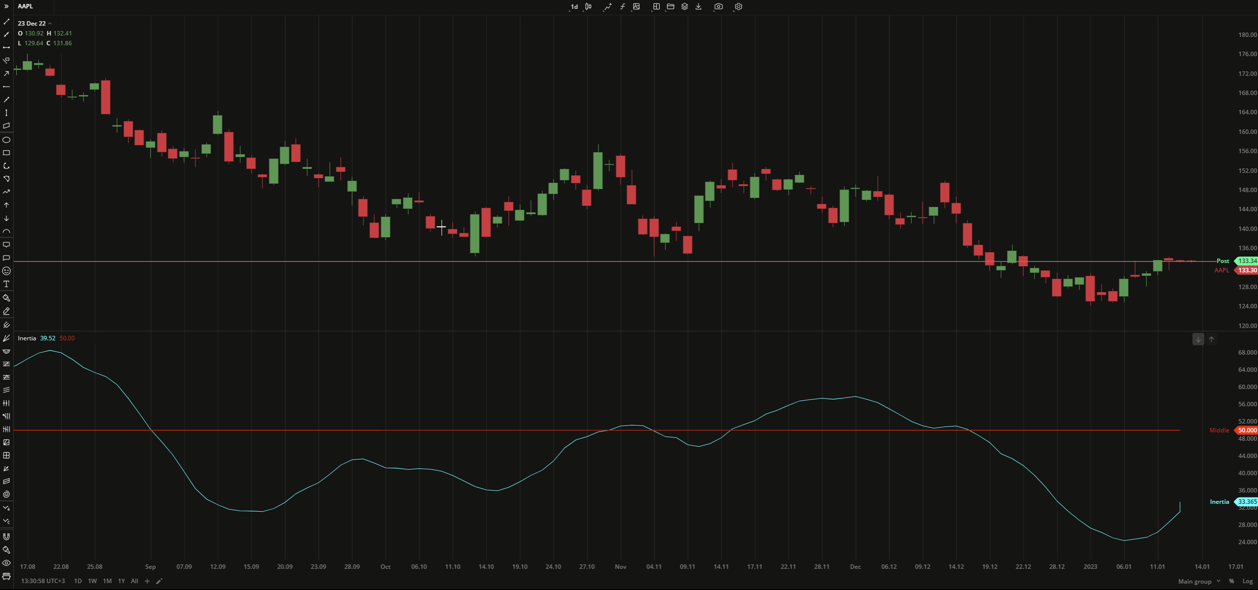
Inertia is an indicator that helps determine the prevailing price trend. The indicator uses the linear regression algorithm to plot a curve based on Relative Volatility Index (RVI). The curve's values are utilized on the scale from 0 to +100, where 50 is a neutral level. When the readings are greater than 50, the market is considered uptrend, and when the readings are lower than 50, it is considered downtrend.
Inertia = LinearRegressionn (RVIn )
where:
RVI – Relative Volatility Index
N – number of bars
 Inertia
INPUTS
| Input | Description |
|---|---|
| RviLength | The number of bars used to calculate the Relative Volatility Index |
| RegressionLength | The number of bars used to calculate the linear regression curve |
PLOTS
The plot renders the data you are working with on the chart. You can show/hide a plot by clicking the corresponding item in the settings. Every plot has a set of basic settings that you can change: color, weight, and type.
| Plot | Description |
|---|---|
| Inertia | The Inertia plot |
| Middle | The neutral volatility level |
| Color |
|---|
Click the color rectangle under the plot's name to open the palette. Use the slider at the bottom to set the opacity of the color.  Palette PaletteTo create a custom color:
The custom-created colors are added to your palette. To remove a custom color, drag it out of the palette. |
| Weight |
| Change the value (in px) to adjust the thickness of the plot. |
| Type |
The following plot types are available:
|
OVERLAYING
Check Overlaying to display the indicator on the chart. Otherwise, the indicator is shown in a study pane down below.
Note: To reset the settings, click Restore to Default next to the SETTINGS: INDICATOR'S TITLE
Was this article helpful?