Kaufman Adaptive Moving Average (KAMA)
- DarkLight
Kaufman Adaptive Moving Average (KAMA)
- DarkLight
Article summary
Did you find this summary helpful?
Thank you for your feedback!

The Kaufman Adaptive Moving Average (KAMA) indicator is a moving average indicator that becomes more sensitive and adds extra weight to its average value when the market prices are steadily moving in a certain direction.
1. KAMAi = KAMAi-1 + SCi x (Price -KAMAi-1)
2. SCi = [ERi x (fastest - slowest) + slowest]2
fastest = 2 / (fastest moving average period + 1)
slowest = 2 / (slowest moving average period + 1)
3. ERi = |Pricei - Pricei-n+1| / Sum
Sum = |Pricei - Pricei-1| + |Pricei-1 - Pricei-2| + ... + |Pricei-n+1 - Pricei-n+1 - Pricei-n|
where:
KAMAi-1 – the KAMA value preceding the value for the period being calculated
Price – the data price source
SCi – the smoothing constant calculated for every period
ERi – Efficiency Ratio calculated for every period
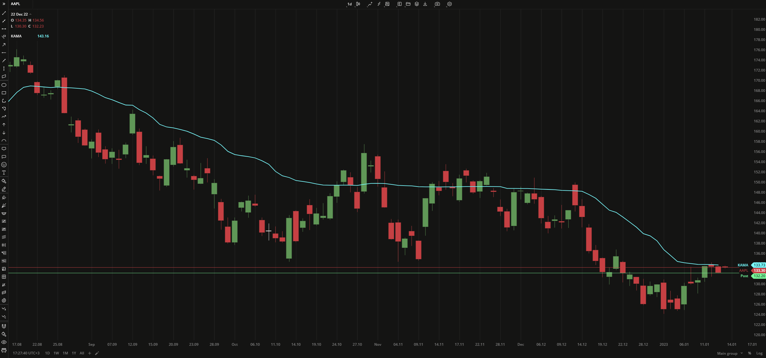 Kaufman Adaptive Moving Average
INPUTS
| Input | Description |
|---|---|
| Length | The number of bars the indicator uses for calculation |
PLOTS
The plot renders the data you are working with on the chart. You can show/hide a plot by clicking the corresponding item in the settings. Every plot has a set of basic settings that you can change: color, weight, and type.
| Plot | Description |
|---|---|
| KAMA | The Kaufman Adaptive Moving Average plot |
| Color |
|---|
Click the color rectangle under the plot's name to open the palette. Use the slider at the bottom to set the opacity of the color.  Palette To create a custom color: Palette To create a custom color:
The custom-created colors are added to your palette. To remove a custom color, drag it out of the palette. |
| Weight |
| Change the value (in px) to adjust the thickness of the plot. |
| Type |
The following plot types are available:
|
OVERLAYING
Check Overlaying to display the indicator on the chart. Otherwise, the indicator is shown in a study pane down below.
Note: To reset the settings, click Restore to Default next to the SETTINGS: INDICATOR'S TITLE
Was this article helpful?