Linear Regression Slope (LRS)
- DarkLight
Linear Regression Slope (LRS)
- DarkLight
Article summary
Did you find this summary helpful?
Thank you for your feedback!

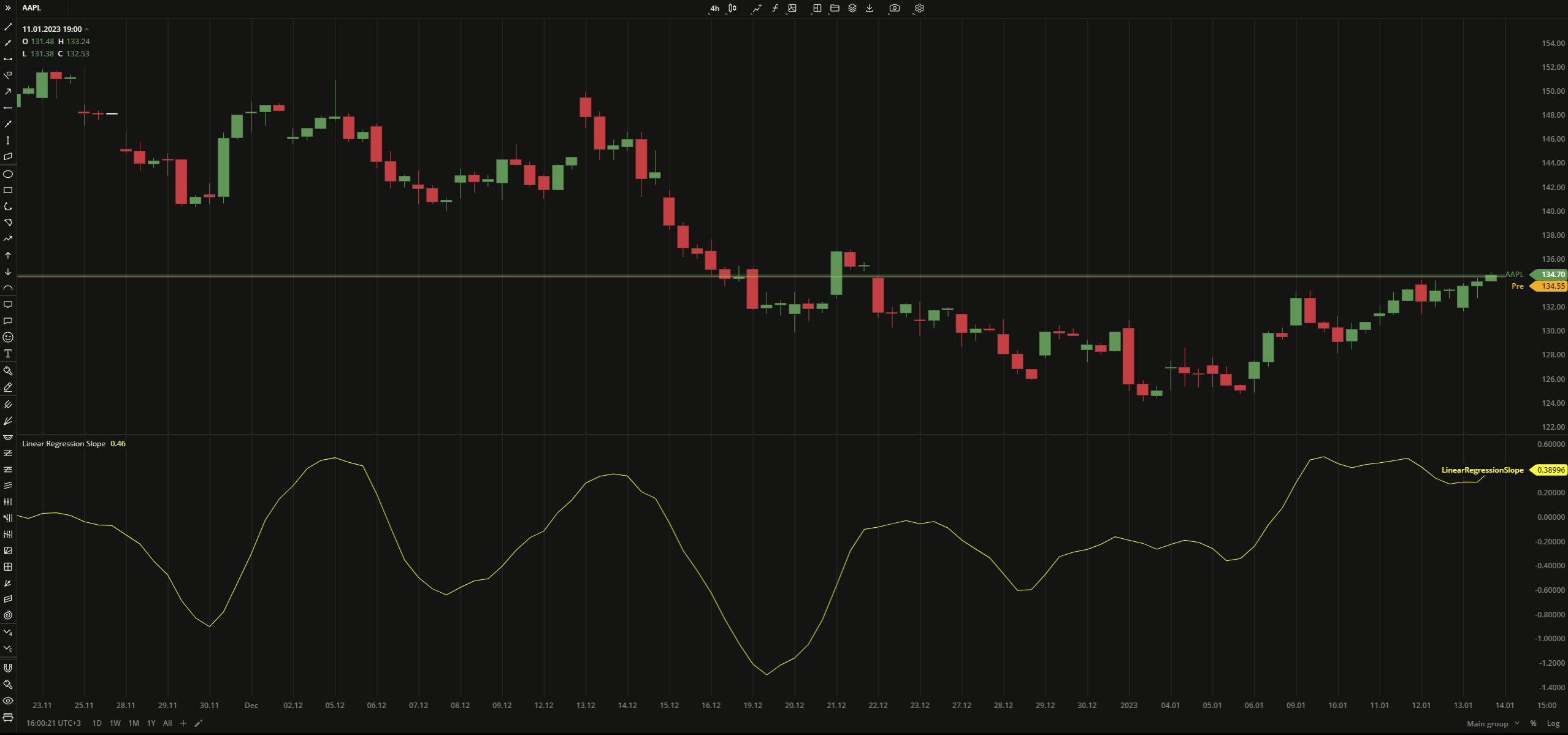
Linear Regression Slope (LRS) is an oscillator based on the linear regression algorithm which makes the line more sensitive to the price changes. The normalized slope value reflects the strength of the trend, where positive values generally make up an uptrend and negative values can be considered as a downtrend.
Regression slope uses calculation of the linear regression for each bar.
y = a + bx
b = (nΣxy - ΣxΣy) / ( nΣx2 - (Σx)2 ))
a = (Σy - bΣx) / n
where:
y – the data price source
x – the number of bars
a – the constant (the value when x equals zero)
b – the slope of the line
n – the number of data points selected
 Linear Regression Slope
INPUTS
| Price |
|---|
The following data sources are available for calculation of the LRS:
|
| Input | Description |
|---|---|
| Length | The number of bars used to calculate the LRS |
PLOTS
The plot renders the data you are working with on the chart. You can show/hide a plot by clicking the corresponding item in the settings. Every plot has a set of basic settings that you can change: color, weight, and type.
| Plot | Description |
|---|---|
| LinearRegressionSlope | The Linear Regression Slope plot |
| Color |
|---|
Click the color rectangle under the plot's name to open the palette. Use the slider at the bottom to set the opacity of the color.  Palette PaletteTo create a custom color:
The custom-created colors are added to your palette. To remove a custom color, drag it out of the palette. |
| Weight |
| Change the value (in px) to adjust the thickness of the plot. |
| Type |
The following plot types are available:
|
OVERLAYING
Check Overlaying to display the indicator on the chart. Otherwise, the indicator is shown in a study pane down below.
Note: To reset the settings, click Restore to Default next to the SETTINGS: INDICATOR'S TITLE
Was this article helpful?