Market Facilitation Index (MFI)
- DarkLight
Market Facilitation Index (MFI)
- DarkLight
Article summary
Did you find this summary helpful?
Thank you for your feedback!

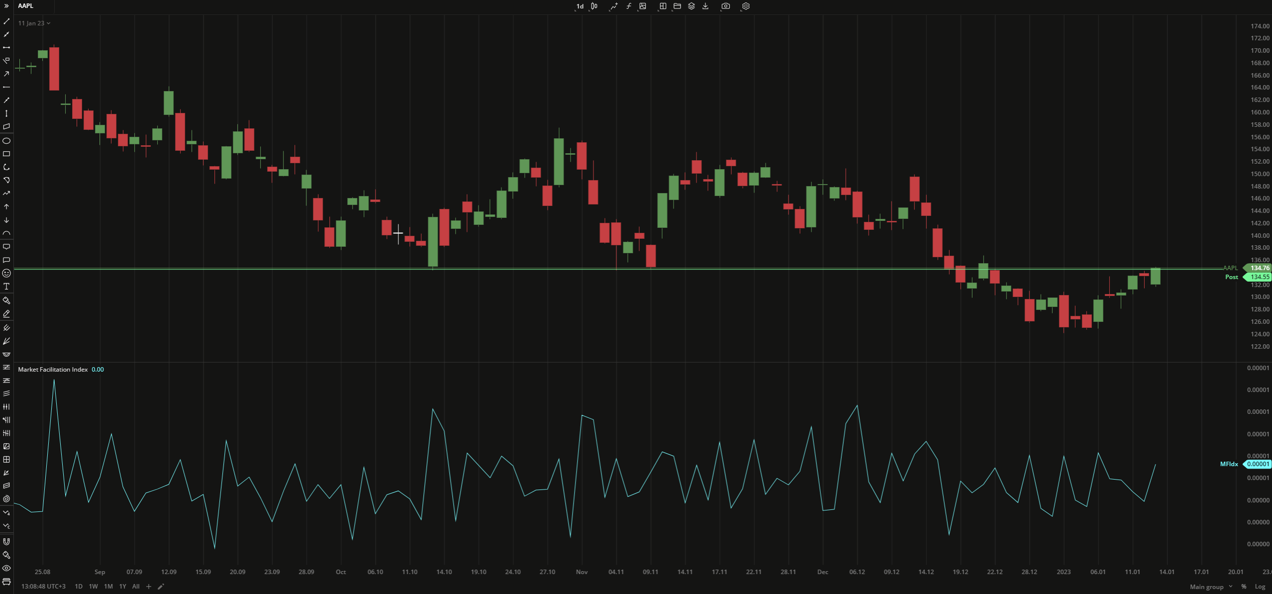
The Market Facilitation Index (MFI) indicator helps predict trend continuation or reversals by measuring an asset's price that should be interpreted in connection with the volume changes. There are 4 situations available:
- MFI increases and the volume increases - the trend continuation
- MFI decreases and the volume decreases - the market participants lost interest
- MFI increases, the volume decreases - upcoming trend reversal
- MFI decreases, the volume increases - both trend continuation and reversal are possible
The Market Facilitation Index is calculated as the difference between the day's low and high divided by the total volume.
MFI = (High - Low) / Volume
 Market Facilitation Index
PLOTS
The plot renders the data you are working with on the chart. You can show/hide a plot by clicking the corresponding item in the settings. Every plot has a set of basic settings that you can change: color, weight, and type.
| Plot | Description |
|---|---|
| MFIdx | The Market Facilitation Index plot |
| Color |
|---|
Click the color rectangle under the plot's name to open the palette. Use the slider at the bottom to set the opacity of the color.  Palette PaletteTo create a custom color:
The custom-created colors are added to your palette. To remove a custom color, drag it out of the palette. |
| Weight |
| Change the value (in px) to adjust the thickness of the plot. |
| Type |
The following plot types are available:
|
OVERLAYING
Check Overlaying to display the indicator on the chart. Otherwise, the indicator is shown in a study pane down below.
Note: To reset the settings, click Restore to Default next to the SETTINGS: INDICATOR'S TITLE
Was this article helpful?