Money Flow Index (MFI)
- DarkLight
Money Flow Index (MFI)
- DarkLight
Article summary
Did you find this summary helpful?
Thank you for your feedback!

Money Flow Index (MFI) is a momentum oscillator that measures the ratio of money flowing into and out of a security over a specified period. MFI is similar to Relative Strength Index (RSI) but unlike RSI, it incorporates not only a Typical Price but also volume data. The index is bounded to the 0 to +100 scale, where the readings above 80 indicate overbought (bearish signal) and the readings below 20 suggest oversold (bullish signal) prices.
1. Money Flow = TP x Volume
2. Money Ratio = Positive Money Flow / Negative Money Flow
3. Money Index Flow = 100 - [100 / (1 + Money Ratio)]
where:
TP – Typical Price
Positive Money Flow – today's Typical Price is greater than yesterday's Typical price; sum of the positive money over the specified period
Negative Money Flow – today's Typical Price is less than yesterday's Typical price; sum of the negative money over the specified period
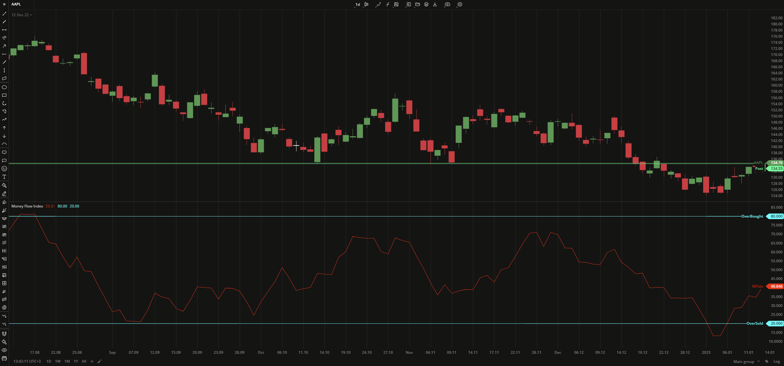 Money Flow Index
INPUTS
| Input | Description |
|---|---|
| Length | The number of bars used to calculate the Movey Flow Index |
| Overbought | The number to fix the overbought level at |
| Oversold | The number to fix the oversold level at |
PLOTS
The plot renders the data you are working with on the chart. You can show/hide a plot by clicking the corresponding item in the settings. Every plot has a set of basic settings that you can change: color, weight, and type.
| Plot | Description |
|---|---|
| MFIdx | The Money Flow Index plot |
| OverBought | The overbought level |
| OverSold | The ovelsold level |
| Color |
|---|
Click the color rectangle under the plot's name to open the palette. Use the slider at the bottom to set the opacity of the color.  Palette PaletteTo create a custom color:
The custom-created colors are added to your palette. To remove a custom color, drag it out of the palette. |
| Weight |
| Change the value (in px) to adjust the thickness of the plot. |
| Type |
The following plot types are available:
|
OVERLAYING
Check Overlaying to display the indicator on the chart. Otherwise, the indicator is shown in a study pane down below.
Note: To reset the settings, click Restore to Default next to the SETTINGS: INDICATOR'S TITLE
Was this article helpful?