Moving Average Convergence Divergence (MACD)
- DarkLight
Moving Average Convergence Divergence (MACD)
- DarkLight
Article summary
Did you find this summary helpful?
Thank you for your feedback!

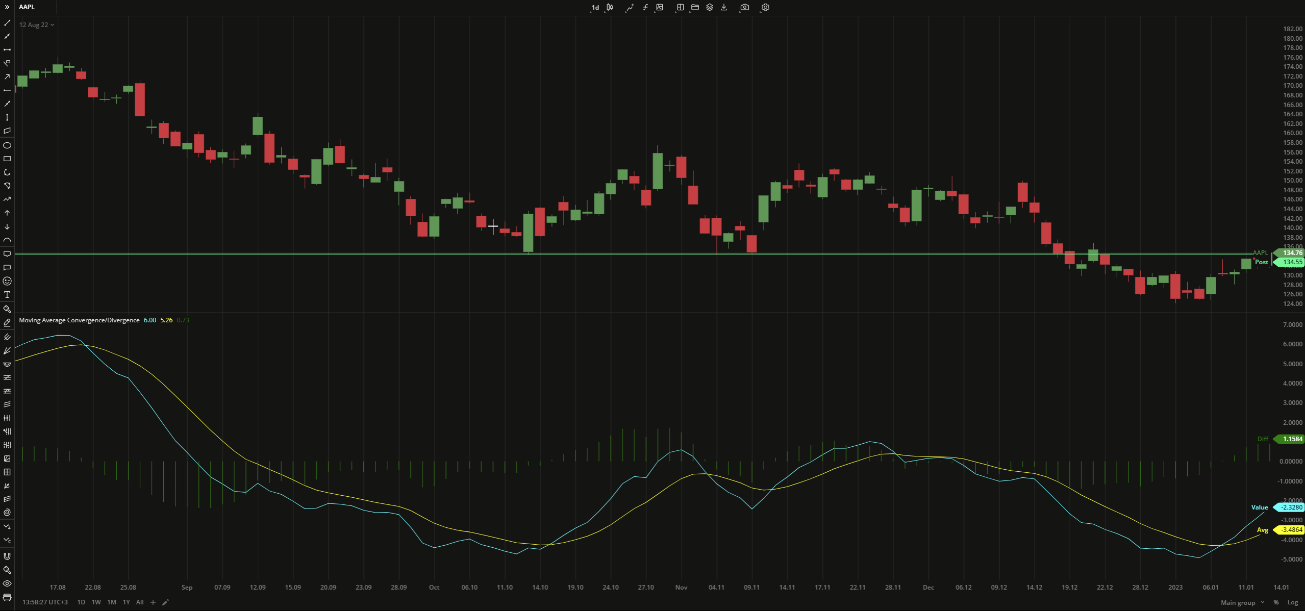
Moving Average Convergence Divergence (MACD) is a trend-following momentum indicator that is calculated as the difference between 26-period and 12-period EMAs. MACD also provides a signal line, the average of that difference. The indicator triggers when MACD plot crosses above (buy) or below (sell) the signal line.
MACD = 12-period EMA - 26-period EMA
Singal Line = SMA (MACD)
Histogram = MACD -Signal Line
where:
EMA – Exponential Moving Average
SMA – Simple Moving Average
 Moving Average Convergence Divergence
INPUTS
| Input | Description |
|---|---|
| FastLength | The number of bars used to calculate the fast moving average |
| SlowLength | The number of bars used to calculate the slow moving average |
| MacdLength | The number of bars used to calculate the MACD |
| Average |
|---|
The following Moving Average types are available for calculations:
|
PLOTS
The plot renders the data you are working with on the chart. You can show/hide a plot by clicking the corresponding item in the settings. Every plot has a set of basic settings that you can change: color, weight, and type.
| Plot | Description |
|---|---|
| Value | The Moving Average Convergence/Divergence plot |
| Avg | The moving average of the MACD |
| Diff | The difference between the MACD and its moving average (MACD Histogram) |
| Color |
|---|
Click the color rectangle under the plot's name to open the palette. Use the slider at the bottom to set the opacity of the color.  Palette PaletteTo create a custom color:
The custom-created colors are added to your palette. To remove a custom color, drag it out of the palette. |
| Weight |
| Change the value (in px) to adjust the thickness of the plot. |
| Type |
The following plot types are available:
|
OVERLAYING
Check Overlaying to display the indicator on the chart. Otherwise, the indicator is shown in a study pane down below.
Note: To reset the settings, click Restore to Default next to the SETTINGS: INDICATOR'S TITLE
Was this article helpful?