Relative Strength Index (RSI)
- DarkLight
Relative Strength Index (RSI)
- DarkLight
Article summary
Did you find this summary helpful?
Thank you for your feedback!

Relative Strength Index (RSI) is a momentum oscillator that helps identify the market strength as well as anticipate trend reversals. The index is calculated as a ratio of higher closes to lower closes where the closes are the averages of absolute values of price changes. RSI values are represented on the scale from 0 to +100 with overbought/oversold levels. An asset is considered overbought when the reading greater than 70 and oversold when the readings are lower than 30.
RSI = 100 - (100 / 1 + RS)
RS = Average Gain / Average Loss
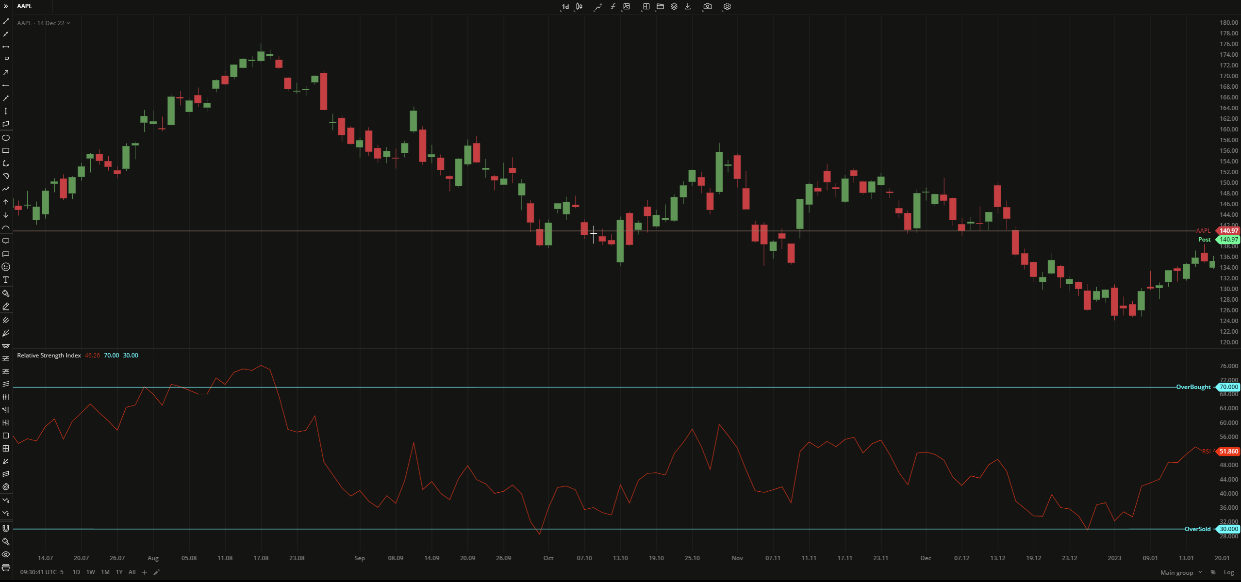 Relative Strength Index
 INPUTS
| Input | Description |
|---|---|
| Length | The number of bars used to calculate RSI |
| Overbought | The price to fix the overbought level at |
| Oversold | The price to fix the oversold level at |
| Price |
|---|
The following data sources are available for the price:
|
| Average |
|---|
The following Moving Average types are available for calculations:
|
PLOTS
The plot renders the data you are working with on the chart. You can show/hide a plot by clicking the corresponding item in the settings. Every plot has a set of basic settings that you can change: color, weight, and type.
| Plot | Description |
|---|---|
| RSI | The Relative Strength Index plot |
| OverBought | The overbought level |
| OverSold | The oversold level |
| Color |
|---|
Click the color rectangle under the plot's name to open the palette. Use the slider at the bottom to set the opacity of the color.  Palette PaletteTo create a custom color:
The custom-created colors are added to your palette. To remove a custom color, drag it out of the palette. |
| Weight |
| Change the value (in px) to adjust the thickness of the plot. |
| Type |
The following plot types are available:
|
OVERLAYING
Check Overlaying to display the indicator on the chart. Otherwise, the indicator is shown in a study pane down below.
Note: To reset the settings, click Restore to Default next to the SETTINGS: INDICATOR'S TITLE
Was this article helpful?