Relative Volatility Index (RVI)
- DarkLight
Relative Volatility Index (RVI)
- DarkLight
Article summary
Did you find this summary helpful?
Thank you for your feedback!

Relative Volatility Index (RVI) is a volatility indicator based on Relative Strength Index (RSI). RVI uses 9-period standard deviation over several last bars instead of average price change, which is used in RSI. The indicator values utilize on the scale from 0 to +100 with overbought/oversold levels. The volatility direction is interpreted as upside when the line is above 50, and downside when the line is below 50.
RVI = (RVIorig of highs + RVIorig of lows) / 2
RVIorig = 100 * (14-days EMA of U) / (14-days EMA of SD)
U = SD, if current price is above the price of previous period
U = 0, if the current price is below the price of previous period
where:
EMA – Exponential Moving Average
SD – 10-days' standard deviation
RVIorig of lows – Relative Volatility Index for minimums
RVIorig of highs – Relative Volatility Index for maximums
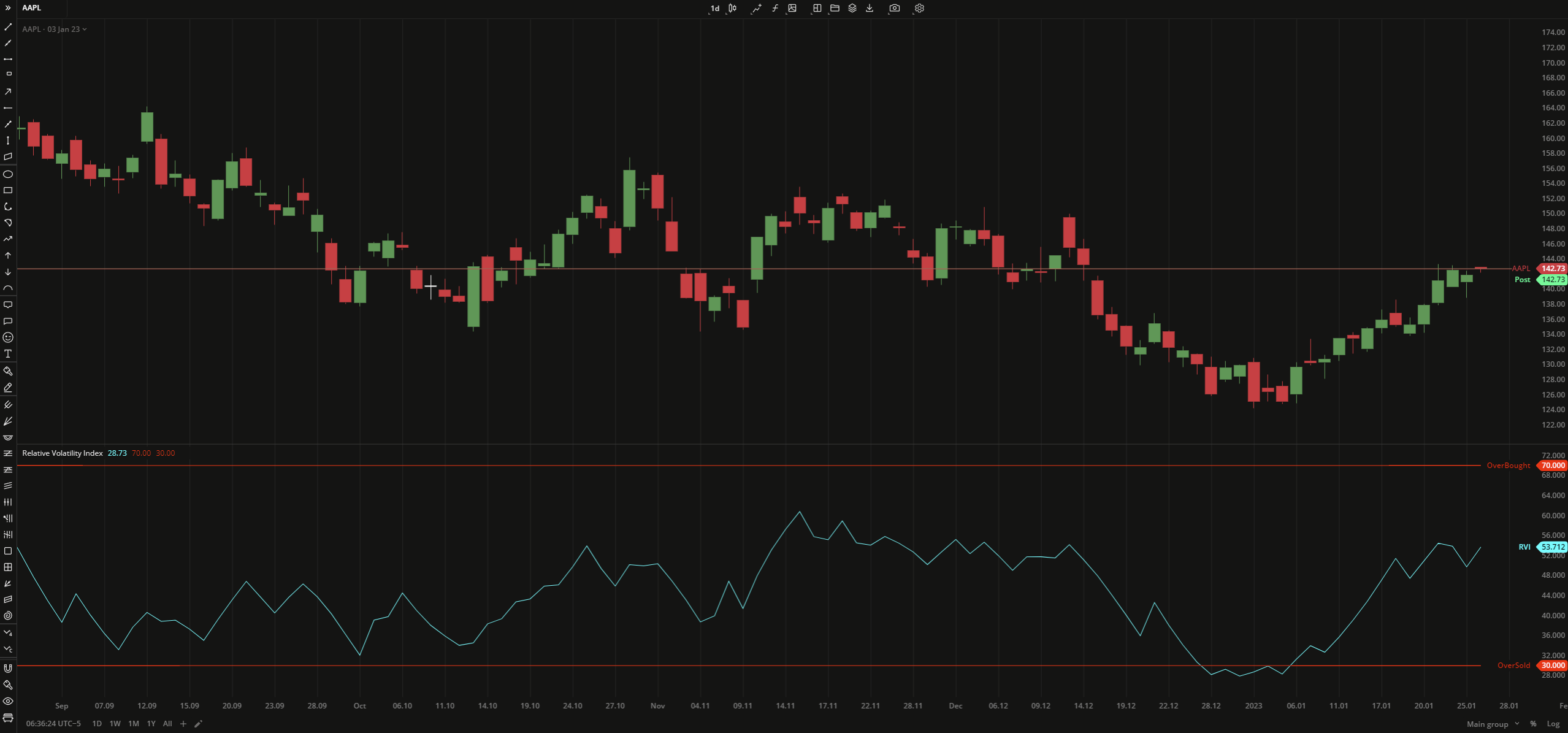 Relative Volatility Index
INPUTS
| Input | Description |
|---|---|
| Length | The number of bars used to calculate the RVI |
| Overbought | The price to fix the overbought level at |
| Oversold | The price to fix the oversold level at |
PLOTS
The plot renders the data you are working with on the chart. You can show/hide a plot by clicking the corresponding item in the settings. Every plot has a set of basic settings that you can change: color, weight, and type.
| Plot | Description |
|---|---|
| RVI | The Relative Volatility Index plot |
| OverBought | The overbought level |
| OverSold | The ovelsold level |
| Color |
|---|
Click the color rectangle under the plot's name to open the palette. Use the slider at the bottom to set the opacity of the color.  Palette PaletteTo create a custom color:
The custom-created colors are added to your palette. To remove a custom color, drag it out of the palette. |
| Weight |
| Change the value (in px) to adjust the thickness of the plot. |
| Type |
The following plot types are available:
|
OVERLAYING
Check Overlaying to display the indicator on the chart. Otherwise, the indicator is shown in a study pane down below.
Note: To reset the settings, click Restore to Default next to the SETTINGS: INDICATOR'S TITLE
Was this article helpful?