Scatter
- DarkLight
Scatter
- DarkLight
Article summary
Did you find this summary helpful?
Thank you for your feedback!
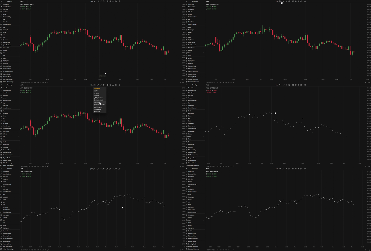
The Scatter or Scatterplot chart displays Close price values as individual dots scattered on the chart. It is similar to the Line chart but without connecting lines. You can zoom in on the chart to view individual Close prices.
The Scatter chart allows to identify correlation between two or more individual prices.
You can also use them for identifying outliers or data gaps.
 Scatter You can select alternative colors for the dots in Settings
Was this article helpful?


(20).webp)