Settings
- DarkLight
Settings
- DarkLight
Article summary
Did you find this summary helpful?
Thank you for your feedback!

Overview
Through the Settings menu, you can change the chart type, choose whether to show or hide additional elements of the chart, set and customize colors, switch between themes, change a price type, timezone, enable trading and events, and other.
Note: After changing any setting, swipe left or right or tap Back button on your phone to apply the settings
General
| № | Name | Description |
|---|---|---|
| 1 | Chart type | Select a chart type to determine how the data is displayed on the chart. The charts include basic and more specialized charts types:
|
| 2 | High and low | Displays the highest and the lowest prices for the chosen instrument on the chart. To show the crosshair with OHLC prices, tap and hold the chart area. |
| 3 | Vertical grid | Adds a vertical grid on the chart. |
| 4 | Horizontal grid | Adds a horizontal grid on the chart. |
| 5 | Candle wicks | Displays candle wicks (for the candle chart types only). |
| 6 | Watermark | Displays a watermark with the name of the instrument in the middle of the chart. |
| 7 | Timezone | The current timezone in UTC format. Exchange – the default timezone of the exchange where the financial instrument is originaly placed. |
Colors
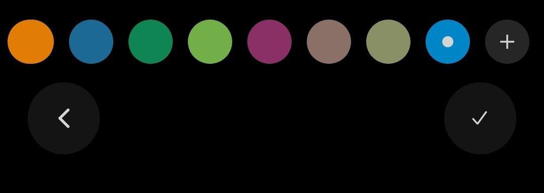
Here, you can change the color of the chart elements depending on the chart type you have set. You can change the color of the body and borders of candles, as well as the color of watermark, grid, values on scales, and chart background.
In the Settings > Colors, tap the color next to an item to open the color picker. Scroll through the list of available colors, select a color and then tap.png) to apply the color or
to apply the color or to return to Settings.
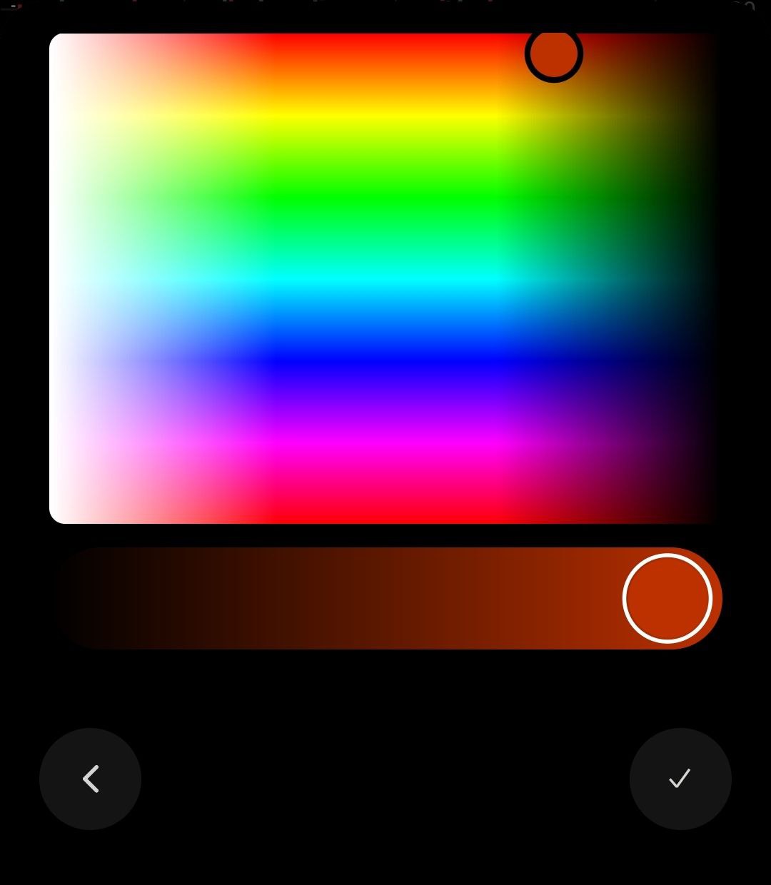
 Color pickerTo create a custom color:
- Scroll through the list of colors to the end, tap
 to open the palette.
 - Adjust the main color at the upper part of the palette.
- Then, use the slider at the bottom to set the opacity of the color if needed.
- Tapto apply the color orto return to Settings.
- The custom-created colors are added to the end of the list.
 Palette
Note: To remove a color, tap and hold the color circle in the Color picker, then select Delete. The currently selected color can't be deleted.
Trading
Activating the Trading from chart setting allows you to place market orders on the chart.
| № | Name | Description |
|---|---|---|
| 1 | Trading from chart | Activates placing orders right from the chart. |
| 2 | Show active orders | Shows all the created orders on the chart. |
| 3 | Show open positions | Shows all the active positons on the chart after the order price is reached. |
.png) The Buy and Sell buttons to place market orders
The Buy and Sell buttons to place market ordersScales
The price scale (Y-axis) and time scale (X-axis) are the vertical and horizontal scales that map prices to coordinates on the chart. Drag a scale up and down to manually adjust the values on it.
Auto-scale price axis. Turns on auto-scale for the price axis. You can choose what objects on the chart the price axis should be fit to while auto-scaling:
- Fit Studies. The price axis is scaled automatically to fit indicators.
- Fit Orders. The price axis is scaled automatically to fit orders.
- Fit Positions. The price axis is scaled automatically to fit positions.
Note: The auto-scale works for Regular and Logarithmic scale types only
Invert scale. Inverts the direction of the price axis.
Lock scale. Locks the price axis so that it adjusts to the bars as you zoom in and out of the chart.
Scale type:
- Regular – a linear price scale where the prices are positioned equidistantly (equally far away) from one another.
- Percent – the scale shows percentage value instead of price points. The scale shows the percentage change between the current price value and the starting price value of a candle. The value of 0% corresponds to the starting price of the first candle visible on the chart.FormulaPercentage value = (current price - starting price) / starting price * 100, where:
Current price – the current price of a choosen instrument. The price type is set in the Chart settings > Data > Price type.
Starting price – the price at which a candle begins. - Logarithmic - a logarithmic price scale represents proportional changes between values. That means that the prices are positioned not equidistantly but accordingly to a percent change between them.
Logarithmic price axis
Example: The distance between 1.2 and 2.4 prices is equal to the distance between 0.5 and 1.0. In both cases the second value is twice as bigger than the first one, so the growth is equal to 100%. It means that both of the prices will be shown equidistantly on the scale.
Data
| № | Name | Description |
|---|---|---|
| 1 | Session breaks | Highlights the time breaks on the chart if the aggregation period is less than 1 day. |
| 2 | Extended hours | Displays extended hours volume on the chart if the chosen instrument supports extended hours trading and aggregation period is less than 1 day. |
| 3 | Align data with session start | Synchronizes chart data with the market session start. The chart data will be synchronized with the time the market opens, not with the start of the day. |
| 4 | Price type | Price type for the chart to be based on:
|
| 5 | Volume | Displays additional volume bars on the chart. |
Events
Events on chart. Displays info markers about upcoming events on the time axis or directly on the chart (like news). The following events are available:
- Dividends
- Splits and consolidations
- Earnings and estimates
- Conference calls
- News
.png) News and Earnings events on chart
News and Earnings events on chartNote: Tap Reset to return chart to the default settings
Was this article helpful?