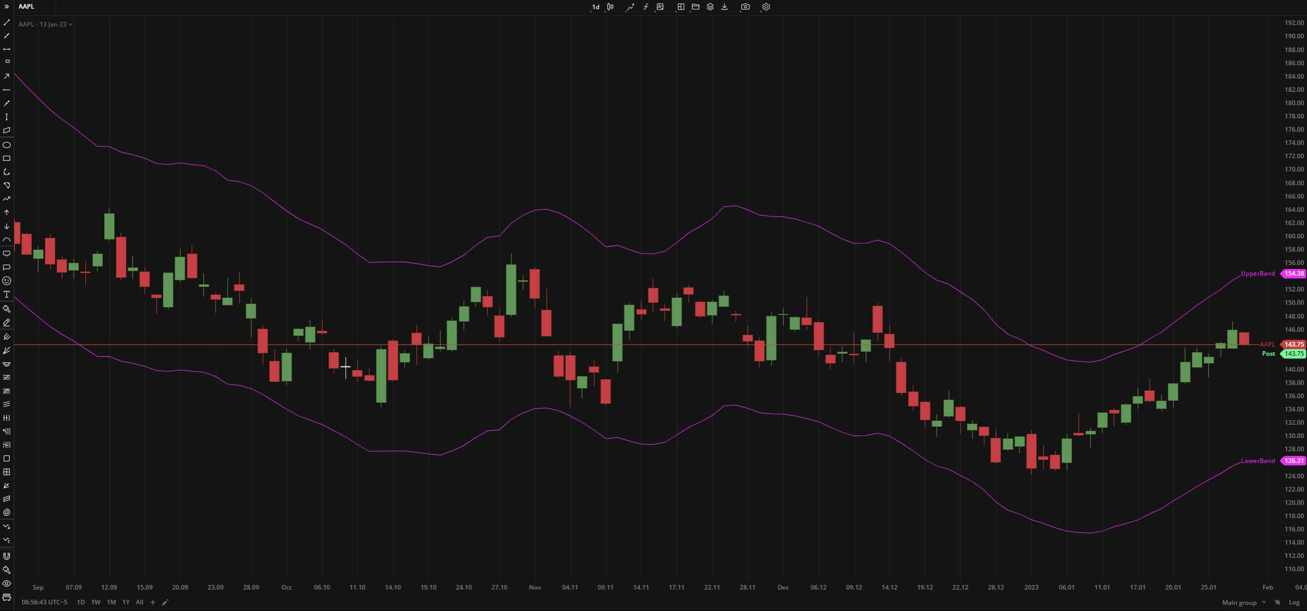
The Simple Moving Average Envelope (SMAE) indicator plots two Simple Moving Averages (SMAs) as upper and lower lines (envelopes) over a price chart. The envelopes indicate overbought and oversold conditions and can be shifted up and down by fixed percentage value.
SMA1 = (A1 + A2 ... + An) / n SMA2 = (A1 + A2 ... + An) / n
where: An – the price of an asset at period n n – the number of total periods
Simple Moving Average Envelope
INPUTS
Input
Description
Length
The number of bars used to calculate SMAs
Displace
The number of bars the indicator to be shifted to
PercentAbove
The vertical offset of the upper SMA plot in percent
PercentBelow
The vertical offset of the lower SMA plot in percent
PriceAbove
The following data sources are available for the price:
Open. The Open Price of every bar for the specified period.
High. The High Price of every bar for the specified period.
Low. The Low Price of every bar for the specified period.
Close. The Close Price of every bar for the specified period.
Median. The Median Price of every bar for the specified period - (High + Low) / 2.
Typical. The sum of High, Low, and Close prices divided by 3 for the specified period- (High + Low + Close) / 3.
OHLC average. The arithmetical mean of High, Low, Open, and Close prices for the specified period - (Open + High + Low + Close) / 4.
Volume. The Close Price of every bar + average volume of an asset for the specified period.
PriceBelow
The following data sources are available for the price:
Open. The Open Price of every bar for the specified period.
High. The High Price of every bar for the specified period.
Low. The Low Price of every bar for the specified period.
Close. The Close Price of every bar for the specified period.
Median. The Median Price of every bar for the specified period - (High + Low) / 2.
Typical. The sum of High, Low, and Close prices divided by 3 for the specified period- (High + Low + Close) / 3.
OHLC average. The arithmetical mean of High, Low, Open, and Close prices for the specified period - (Open + High + Low + Close) / 4.
Volume. The Close Price of every bar + average volume of an asset for the specified period.
PLOTS
The plot renders the data you are working with on the chart. You can show/hide a plot by clicking the corresponding item in the settings. Every plot has a set of basic settings that you can change: color, weight, and type.
Plot
Description
UpperBand
The upper SMA plot
LowerBand
The lower SMA plot
Color
Click the color rectangle under the plot's name to open the palette. Use the slider at the bottom to set the opacity of the color.
Palette
To create a custom color:
Clickto open the color picker
By using the slider at the bottom, adjust the main color
Then, set a shade for the main color on the palette
The custom-created colors are added to your palette. To remove a custom color, drag it out of the palette.
Weight
Change the value (in px) to adjust the thickness of the plot.
Type
The following plot types are available:
Linear. The plot is displayed as a line.
Column.The plot is displayed as a histogram.
Difference. The plot is displayed as a line which represents the difference between High and Low prices of the bar.
Points. The plot is displayed as points.
Text above candle. The plot is displayed as the price labels above candles on the chart.
Text below candle. The plot is displayed as the price labels below candles on the chart.
Triangle above candle. The plot is displayed as triangles above candles on the chart.
Color candle. The candles on candle-type charts are highlighted with specified colors.
OVERLAYING
Check Overlaying to display the indicator on the chart. Otherwise, the indicator is shown in a study pane down below.
Note: To reset the settings, click Restore to Default next to the SETTINGS: INDICATOR'S TITLE
Was this article helpful?
Thank you for your feedback! Our team will get back to you

 Simple Moving Average Envelope
  Palette