Smoothed Rate of Change (SROC)
- DarkLight
Smoothed Rate of Change (SROC)
- DarkLight
Article summary
Did you find this summary helpful?
Thank you for your feedback!

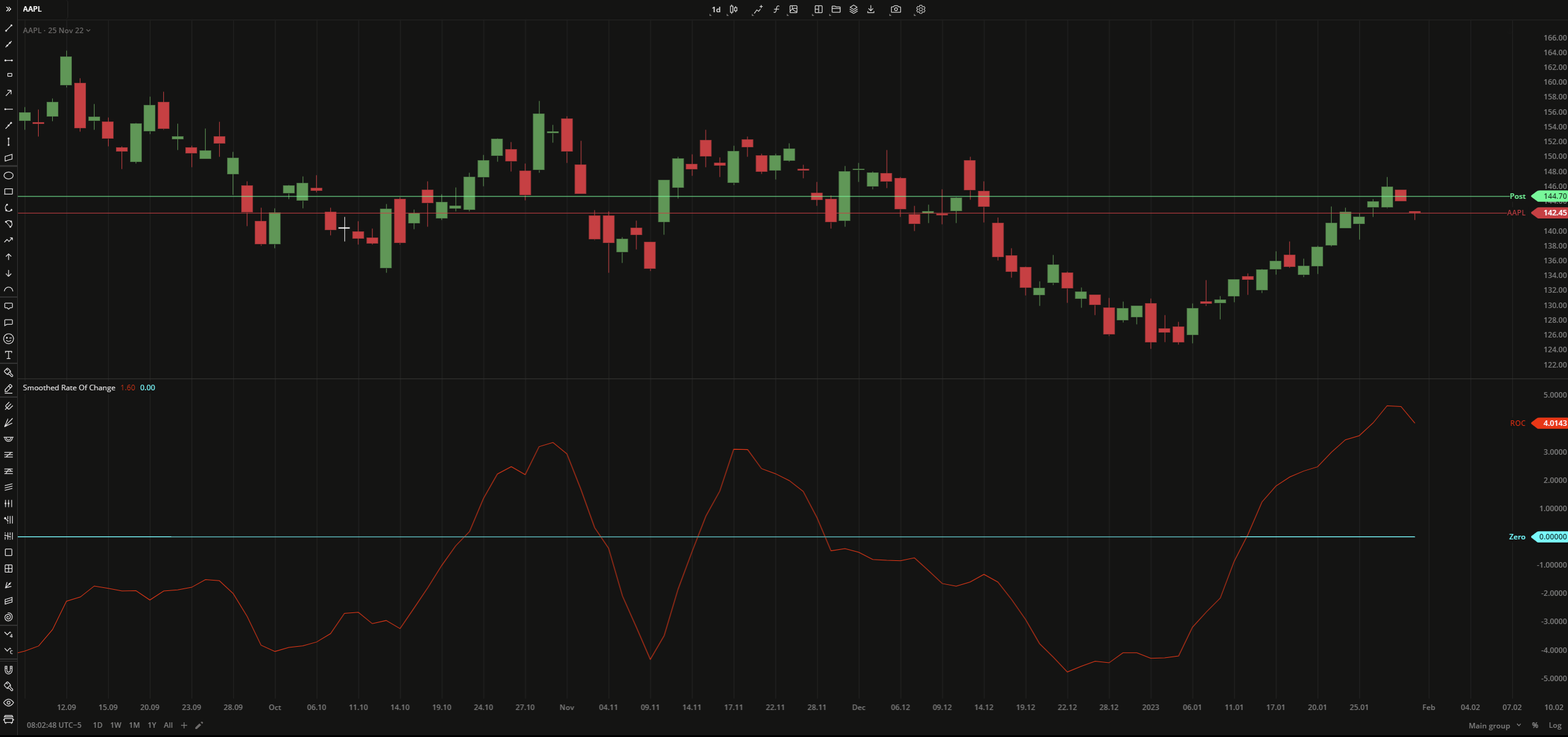
Smoothed Rate of Change (SROC) is a smoothed version of Rate of Change (ROC) indicator with the only difference that it uses Exponential Moving Average (EMA) for calculation. SROC determines the strength of a trend by comparing the current EMA and an EMA a specified period ago. The SROC line oscillates above or below the zero level and can help confirm an uptrend or downtrend respectively.
SROC = [EMA(B) - EMA(A)] / EMA(A) x 100
where:
EMA – Exponential Moving Average
B – price at current time
A – price at previous time
 Smoothed Rate of Change
 INPUTS
| Input | Description |
|---|---|
| Length | The number of bars used to calculate EMA |
| ShiftLength | The number of bars the indicator to be shifted to |
| Price |
|---|
The following data sources are available for the price:
|
PLOTS
The plot renders the data you are working with on the chart. You can show/hide a plot by clicking the corresponding item in the settings. Every plot has a set of basic settings that you can change: color, weight, and type.
| Plot | Description |
|---|---|
| ROC | The Smoothed Rate of Change plot |
| Zero | The zero level |
| Color |
|---|
Click the color rectangle under the plot's name to open the palette. Use the slider at the bottom to set the opacity of the color.  Palette PaletteTo create a custom color:
The custom-created colors are added to your palette. To remove a custom color, drag it out of the palette. |
| Weight |
| Change the value (in px) to adjust the thickness of the plot. |
| Type |
The following plot types are available:
|
OVERLAYING
Check Overlaying to display the indicator on the chart. Otherwise, the indicator is shown in a study pane down below.
Note: To reset the settings, click Restore to Default next to the SETTINGS: INDICATOR'S TITLE
Was this article helpful?