Stoller Average Range Channel Bands (STARC)
- DarkLight
Stoller Average Range Channel Bands (STARC)
- DarkLight
Article summary
Did you find this summary helpful?
Thank you for your feedback!

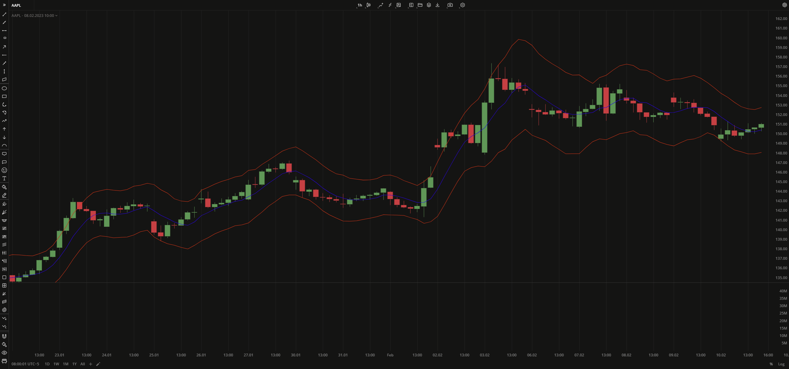
Stoller Average Range Channel Bands (STARC) is an indicator that plots two bands (support and resistance levels) above and below a security price's Simple Moving Average (SMA). Likewise Bollinger Bands (BB), STARC creates bands around a simple moving average, the only difference that BB uses standard deviations for calculation while STARC uses the Average True Range (ATR) values. The upper band (STARC+) is calculated by adding the ATR value to SMA. The lower band (STARC-) is calculated by subtracting the value of ATR from the SMA.
STARC Band+ = SMA + (Multiplier x ATR)
STARC Band- = SMA - (Multiplier x ATR)
where:
SMA – Simple Moving Average
ATR – Average True Range
Multiplier – a multiplier factor to apply to ATR
 Stoller Average Range Channel Bands
INPUTS
| Price |
|---|
The following data sources are available for the price:
|
| Input | Description |
|---|---|
| AtrLength | The number of bars used to calculate ATR |
| SmaLength | The number of bars used to calculate SMA |
| Displace | The displacement of the indicator in bars |
| MultiplierFartor | The number that is applied to ATR |
PLOTS
The plot renders the data you are working with on the chart. You can show/hide a plot by clicking the corresponding item in the settings. Every plot has a set of basic settings that you can change: color, weight, and type.
| Plot | Description |
|---|---|
| LowerBand | The lower band |
| MidLine | The Simple Moving Average plot |
| UpperBand | The upper band |
| Color |
|---|
Click the color rectangle under the plot's name to open the palette. Use the slider at the bottom to set the opacity of the color.  Palette PaletteTo create a custom color:
The custom-created colors are added to your palette. To remove a custom color, drag it out of the palette. |
| Weight |
| Change the value (in px) to adjust the thickness of the plot. |
| Type |
The following plot types are available:
|
OVERLAYING
Check Overlaying to display the indicator on the chart. Otherwise, the indicator is shown in a study pane down below.
Note: To reset the settings, click Restore to Default next to the SETTINGS: INDICATOR'S TITLE
Was this article helpful?