Vertical Horizontal Filter (VHF)
- DarkLight
Vertical Horizontal Filter (VHF)
- DarkLight
Article summary
Did you find this summary helpful?
Thank you for your feedback!

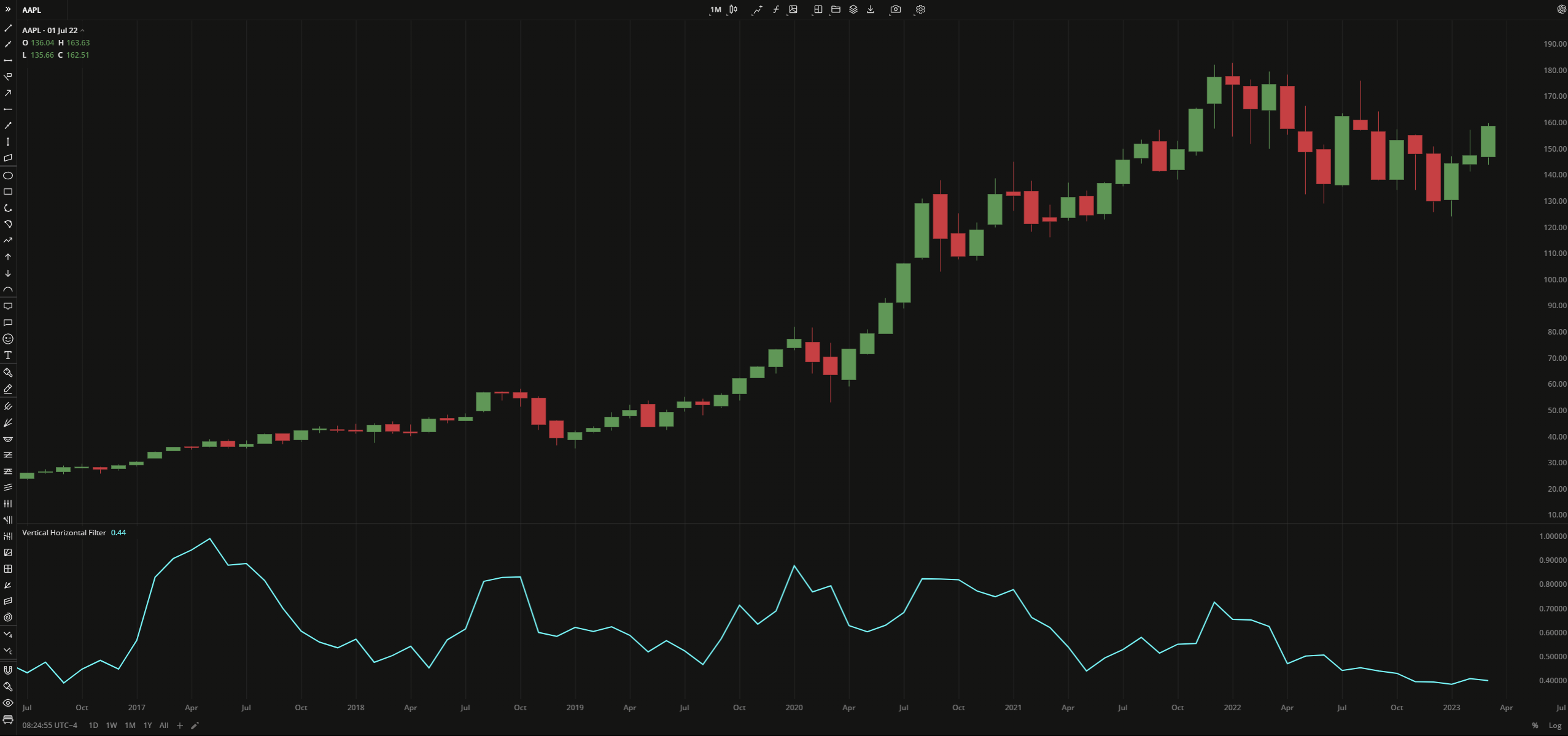
The Vertical Horizontal Filter (VHF) indicator determines whether prices are trending (VHF rises) or are stabilizing around a specific range (VHF falls). VHF values are calculated as the difference between the highest close and the lowest close for a specified period. The difference is then divided by the sum of an absolute value of daily close changes over the same period.
VHF = (HCPn - LCPn) / (Sum of absolute values for n periods)
where:
HCP – highest closing price
LCP – lowest closing price
n – number of periods
 Vertical Horizontal Filter
INPUTS
| Input | Description |
|---|---|
| Length | The number of bars used to calculate VHF |
PLOTS
The plot renders the data you are working with on the chart. You can show/hide a plot by clicking the corresponding item in the settings. Every plot has a set of basic settings that you can change: color, weight, and type.
| Plot | Description |
|---|---|
| VHF | The Vertical Horizontal Filter plot |
| Color |
|---|
Click the color rectangle under the plot's name to open the palette. Use the slider at the bottom to set the opacity of the color.  Palette PaletteTo create a custom color:
The custom-created colors are added to your palette. To remove a custom color, drag it out of the palette. |
| Weight |
| Change the value (in px) to adjust the thickness of the plot. |
| Type |
The following plot types are available:
|
OVERLAYING
Check Overlaying to display the indicator on the chart. Otherwise, the indicator is shown in a study pane down below.
Note: To reset the settings, click Restore to Default next to the SETTINGS: INDICATOR'S TITLE
Was this article helpful?