Volume Weighted Average Price (VWAP)
- DarkLight
Volume Weighted Average Price (VWAP)
- DarkLight
Article summary
Did you find this summary helpful?
Thank you for your feedback!

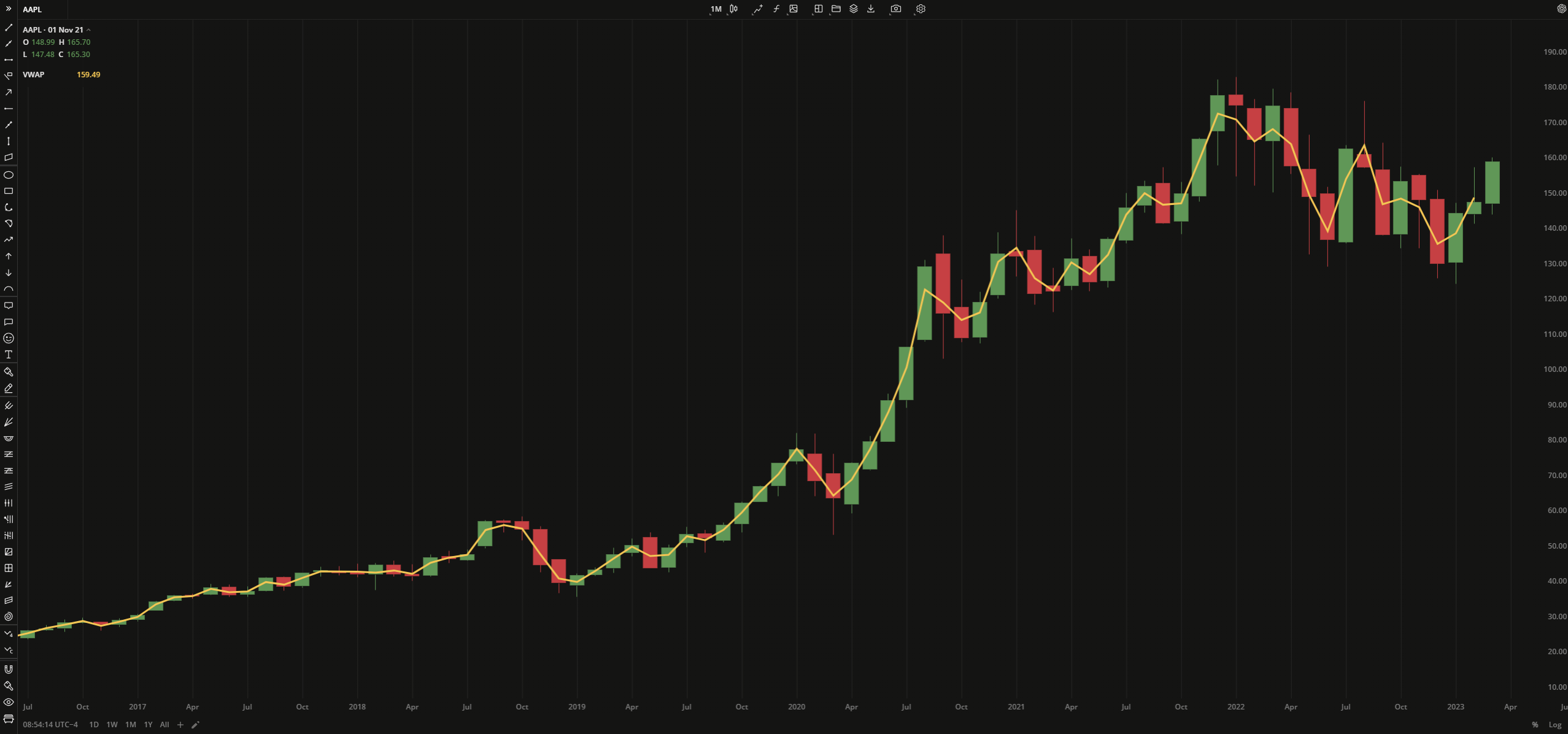
Volume Weighted Average Price (VWAP) is an indicator that shows a daily average weighted price the security has been traded at. Likewise a usual SMA, the indicator provides a less volatile view of the recent price trend, however, it considers both price and volume during calculation. VWAP is calculated as Typical Price (TP) multiplied by volume and then divided by cumulative volume aggregated through the day.
VWAP = Cumulative Typical Price x Volume/Cumulative Volume
where:
Typical Price (TP) = (High price + Low price + Closing Price) / 3
Cumulative – total since the trading session opened
 Volume Weighted Average Price
PLOTS
The plot renders the data you are working with on the chart. You can show/hide a plot by clicking the corresponding item in the settings. Every plot has a set of basic settings that you can change: color, weight, and type.
| Plot | Description |
|---|---|
| VHF | The Volume Weighted Average Price plot |
| Color |
|---|
Click the color rectangle under the plot's name to open the palette. Use the slider at the bottom to set the opacity of the color.  Palette PaletteTo create a custom color:
The custom-created colors are added to your palette. To remove a custom color, drag it out of the palette. |
| Weight |
| Change the value (in px) to adjust the thickness of the plot. |
| Type |
The following plot types are available:
|
OVERLAYING
Check Overlaying to display the indicator on the chart. Otherwise, the indicator is shown in a study pane down below.
Note: To reset the settings, click Restore to Default next to the SETTINGS: INDICATOR'S TITLE
Was this article helpful?