WaveTrend (WT)
- DarkLight
WaveTrend (WT)
- DarkLight
Article summary
Did you find this summary helpful?
Thank you for your feedback!

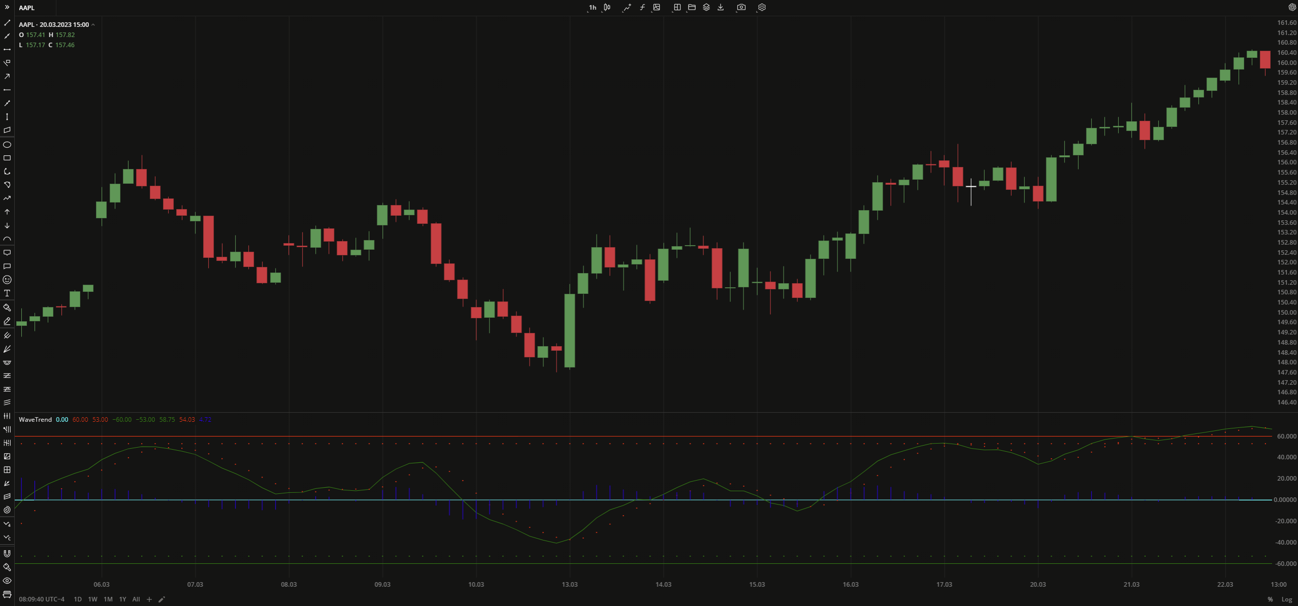
WaveTrend (WT) is an oscillator that follows the price swings and indicates when the market conditions are overbought/oversold. The WT plots two waves with highs (appear as a line) and lows (appear as dots) oscillating below/above the zero level. The oscillator also provides overbought/oversold levels (-60 and +60) and additional signal levels (-50 and +50) that appear as dots. When one of the oscillator's wave is above the overbought level and crosses down the signal level, it is considered a sell signal. Similarly, when one of the oscillator's wave is below the oversold level and crosses above the signal level, it is considered a buy signal. Additionally, WT plots the Wave Difference plot that shows the relationship between the high and low prices over specified period.
WT = (10 * EMA((High + Low + 2Close)/4) - 21 * EMA((High + Low + 2Close)/4)) / sqrt(2 * 30 * Var((High + Low + 2*Close)/4))
where:
EMA – Exponential Moving Average
 WaveTrend
INPUTS
| Input | Description |
|---|---|
| ChannelLength | The number of bars used to calculate both WaveTrend1 and WaveTrend2 plots |
| AverageLength | The number of bars used to calculate EMA that is applied to the WaveTrend1 and WaveTrend2 plots |
| OverBoughtLevel1 | The price to fix the overbought level at |
| OverBoughtLevel2 | The price to fix the signal line for the overbought level |
| OverSoldLevel1 | The price to fix the oversold level at |
| OverSoldLevel2 | The price to fix the signal line for the oversold level |
PLOTS
The plot renders the data you are working with on the chart. You can show/hide a plot by clicking the corresponding item in the settings. Every plot has a set of basic settings that you can change: color, weight, and type.
| Plot | Description |
|---|---|
| Zero | The zero level |
| OverBought Level1 | The overbought level |
| OverBoughtLevel2 | The signal level for the overbought level |
| OverSoldLevel1 | The oversold level |
| OverSoldLevel2 | The signal level for the oversold level |
| WaveTrend1 | The plot going through the high prices |
| WaveTrend2 | The plot indicating the low prices |
| WaveDifference | The plot that visualizes the difference between WaveTrend1 and WaveTrend2 |
| Color |
|---|
Click the color rectangle under the plot's name to open the palette. Use the slider at the bottom to set the opacity of the color.  Palette PaletteTo create a custom color:
The custom-created colors are added to your palette. To remove a custom color, drag it out of the palette. |
| Weight |
| Change the value (in px) to adjust the thickness of the plot. |
| Type |
The following plot types are available:
|
OVERLAYING
Check Overlaying to display the indicator on the chart. Otherwise, the indicator is shown in a study pane down below.
Note: To reset the settings, click Restore to Default next to the SETTINGS: INDICATOR'S TITLE
Was this article helpful?