Williams Fractal
- DarkLight
Williams Fractal
- DarkLight
Article summary
Did you find this summary helpful?
Thank you for your feedback!

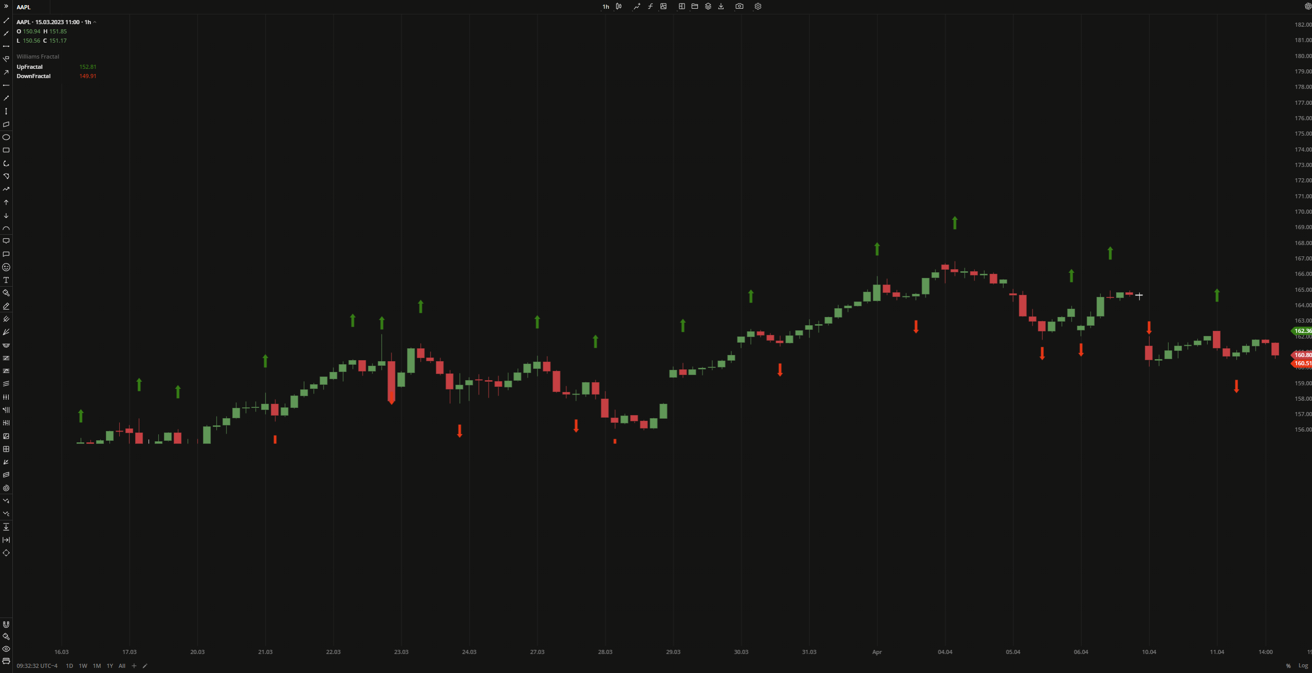
Williams Fractal is a pattern that helps detect reversal points (highs and lows) marking them with up and down arrows. The upward fractal is a series of at least five successive bars where the highest price is reached in the middle, surrounded by lower highs. Conversely, the downward fractal is a sequence of five bars with the lowest value in the middle, preceded and followed by lower highs.
.png) The UpFractal/DownFractal values in the legend box show the last high/low price found relative to the currently selected candle on the chart.
The UpFractal/DownFractal values in the legend box show the last high/low price found relative to the currently selected candle on the chart.
| Bearish Fractal | Bullish Fractal |
| High(N) > High(N - 3) and High(N) > High(N - 2) and High(N) > High(N - 1) and High(N) > High(N + 1) and High(N) > High(N + 2) | Low(N) > Low(N - 3) and Low(N) > Low(N - 2) and Low(N) > Low(N - 1) and Low(N) > Low(N + 1) and Low(N) > Low(N + 2) |
where:
N – High/Low of the current price bar
 Williams Fractal
INPUTS
| Input | Description |
|---|---|
| Offset | The number of higher lows or lower highs which should be followed and preceded to detect an upward or downward fractal |
PLOTS
The plot renders the data you are working with on the chart. You can show/hide a plot by clicking the corresponding item in the settings. Every plot has a set of basic settings that you can change: color, weight, and type.
| Plot | Description |
|---|---|
| UpFractal | The bearish pattern |
| DownFractal | The last found low price of the bullish pattern |
| Color |
|---|
Click the color rectangle under the plot's name to open the palette. Use the slider at the bottom to set the opacity of the color.  Palette PaletteTo create a custom color:
The custom-created colors are added to your palette. To remove a custom color, drag it out of the palette. |
| Weight |
| Change the value (in px) to adjust the thickness of the plot. |
| Type |
The following plot types are available:
|
OVERLAYING
Check Overlaying to display the indicator on the chart. Otherwise, the indicator is shown in a study pane down below.
Note: To reset the settings, click Restore to Default next to the SETTINGS: INDICATOR'S TITLE
Was this article helpful?