
Forecast Oscillator (FOSC) attempts to forecast price movements using the Time Series Forecast (TSF) for calculation. FOSC is calculated as the difference (in percent) of the actual closing price with the TSF's value of that close. FOCS provides a zero line along with the signal line which is an Exponential Moving Average (EMA) of Forecast Oscillator. Crossover of the FOSC line and its signal line indicates that the prices are expected to rise (FOCS above the signal line) or the prices are expected to fall (FOCS below the signal line).
FOSC = [ CCP - TSF(CCP) ] * 100
where:
CCP – current Close price
TSF – Time Series Forecast
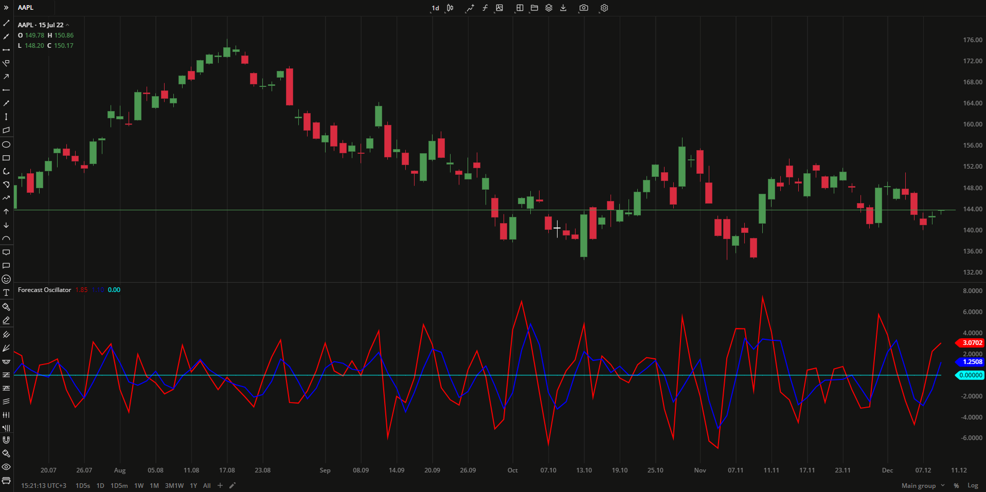 Forecast Oscillator
INPUTS
| Input | Description |
|---|---|
| Length | The number of periods the indicator uses for calculation |
| SmLength | The number of periods the indicator uses to calculate the EMA |
PLOTS
The plot renders the data you are working with on the chart. You can show/hide a plot by clicking the corresponding item in the settings. Every plot has a set of basic settings that you can change: color, weight, and type.
| Plot | Description |
|---|---|
| FOsc | The Forecast Oscillator plot |
| Signal | The signal line (EMA) |
| Zero | The zero level |
| Color |
|---|
Click the color rectangle under the plot's name to open the palette. Use the slider at the bottom to set the opacity of the color. 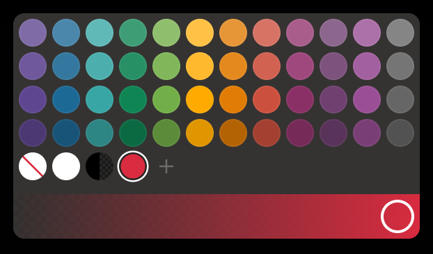 Palette
The custom-created colors are added to your palette. To remove a custom color, drag it out of the palette. |
| Weight |
| Change the value (in px) to adjust the thickness of the plot. |
| Type |
The following plot types are available:
|
 to open the color picker
OVERLAYING
Check Overlaying to display the indicator on the chart. Otherwise, the indicator is shown in a study pane down below.