2018 UI Trends in Financial Software Development
Specialists in every field like to share their opinions on the current and upcoming trends and we’re no exception. In this
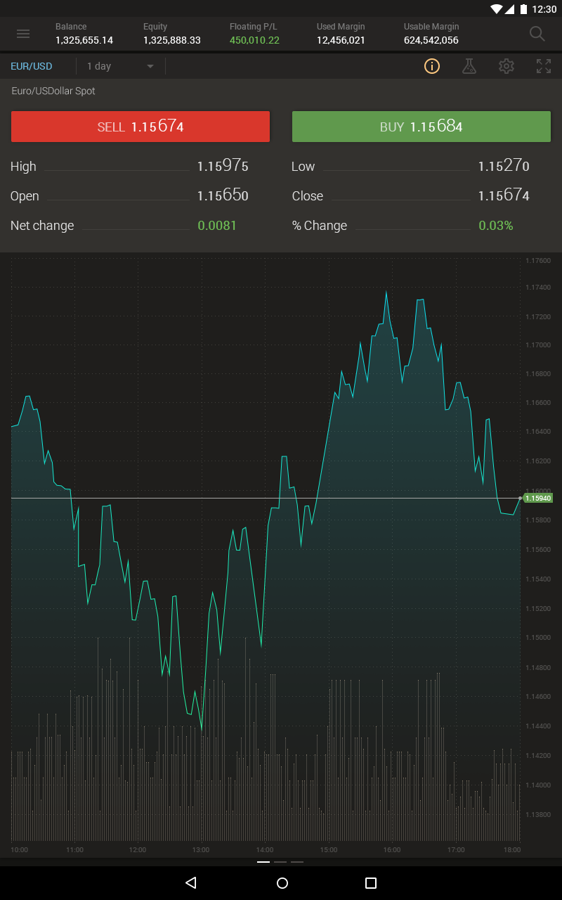
1. Semi Flat Design
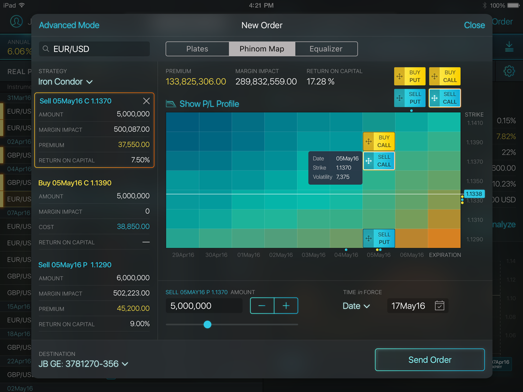
Starting from semi flat we hit the mark because it’s our main focus. Some new trends are a “blast from the past” and we’re sure they won’t live long. Some of them we’ve been using since the dawn of time. And some new trends have no use in our work so we’ve retained only those which are effective for us. But semi flat is a good starting point in UI of financial trading platforms, where we can provide good illustrations.
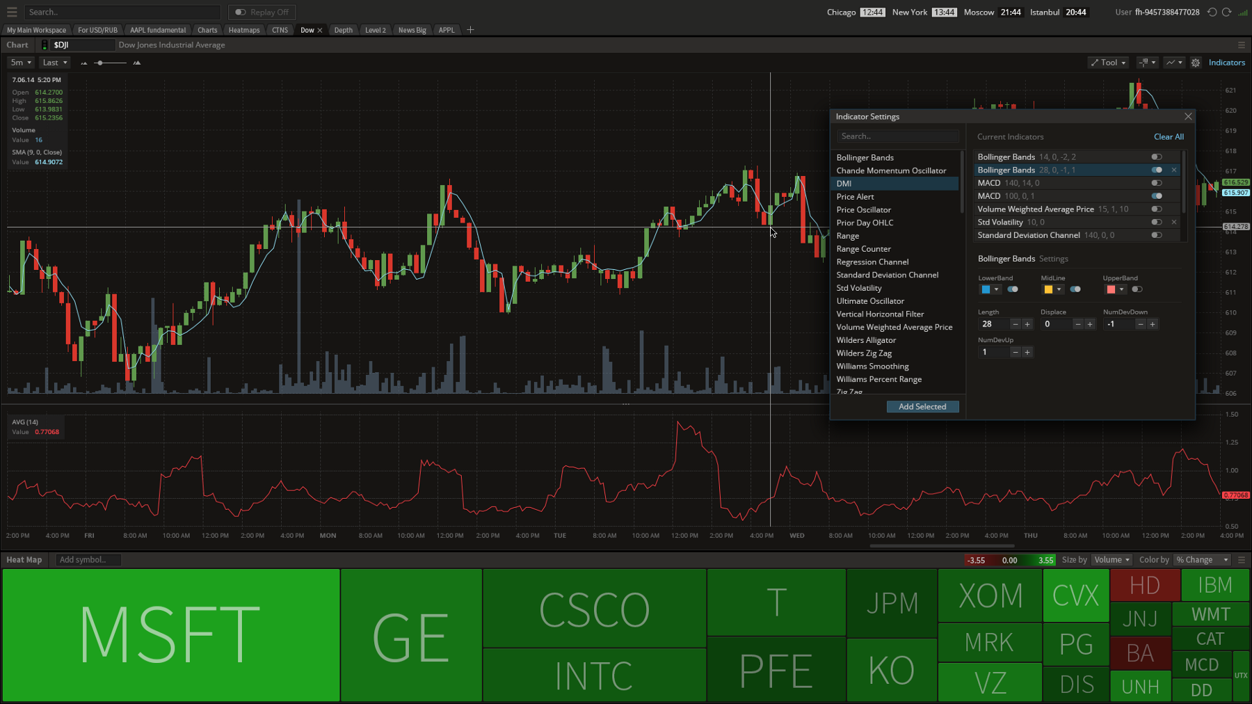
Graphics hardware and CPU are more powerful today. We’ve moved away from flat colors because of information overload during trading activities. Now shadows are big enough to help distinguish several information layers, to show an object’s dominance over others by emphasizing it with another color or shadow. This is how the user sees the screen now: a new layer is visually above and doesn’t fade into other layers or a background, so they can understand what to look at first.
Semi-flat is definitely not new to us as we’ve always been using it. Flat design never entirely prevailed, as some volume was always needed. But I would advise you not to use it everywhere. In several current projects (examples are ahead) we’ve moved forward into more graphic diversity. Among these elements are gradients, feathering, and blur. For control elements, we‘ve used thin shadows or highlighting to indicate they’re clickable.
There is a special term — affordance. Affordance is a visual clue to further use and functions of an item. For example, a button looks like an element to press or a call to action, hyperlinks are in the blue familiar color and underlined, there are easily recognizable metaphors behind icons — “+”, “?”, “i”, etc., cursor types, and so on. So the user is not forced to think about what he is expected to do next. This is where semi-flat serves well.
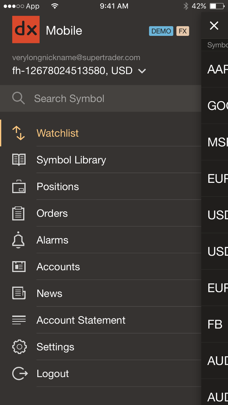
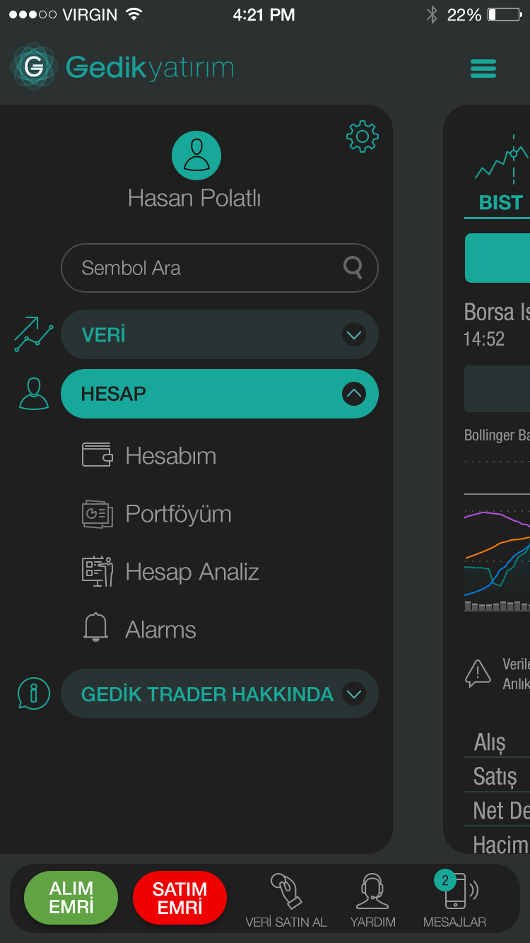
For Android, semi-flat works perfectly because we do our projects according to their producers’ guides — we use their Native Development Kit to program the app.
2. 3D
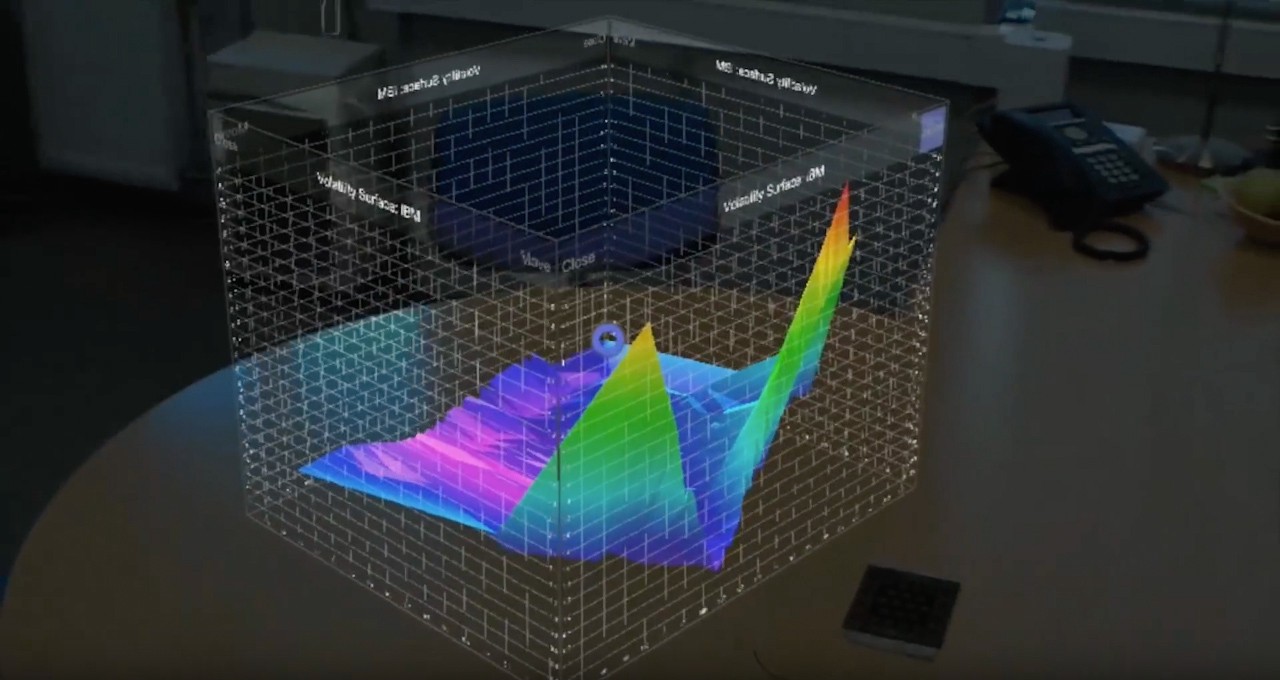
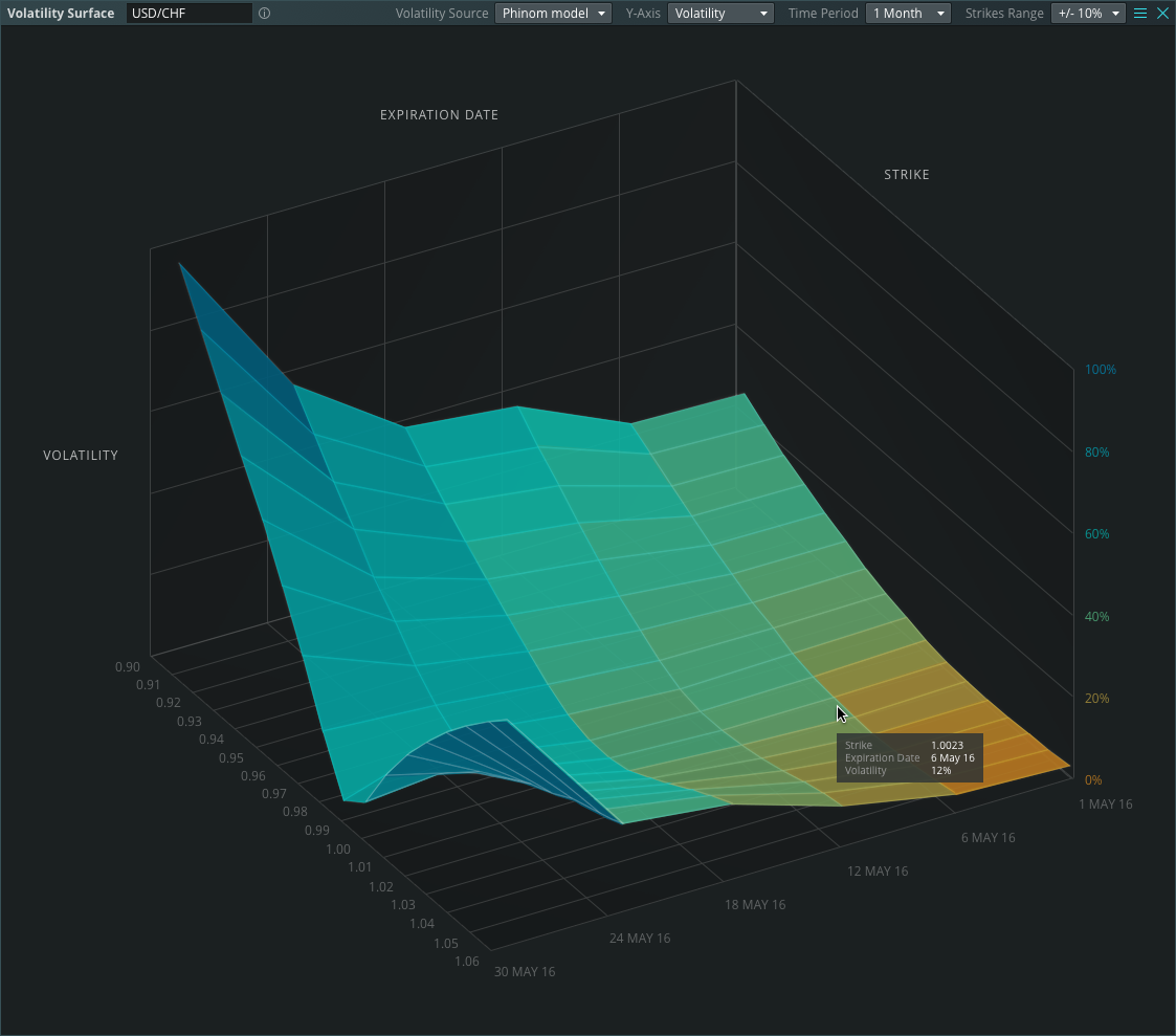
3D is ideal for advertising, merchandising, and making posters and promo materials stand out. But 3D has only recently come into use in trading systems.
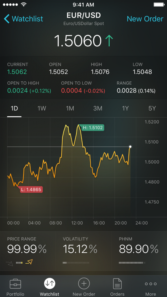
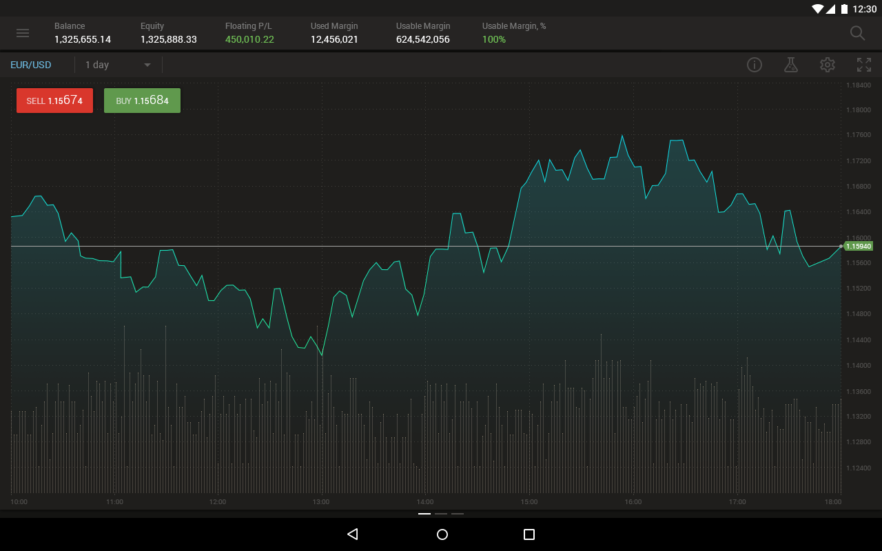
We know clients have questions about three-dimensional graphs. We emphasize caution, because we care about information accuracy. In trading platforms people deal with big money; if they misread information they can make a wrong decision. This is why 90% of graphs are 2D, which they’re familiar with.
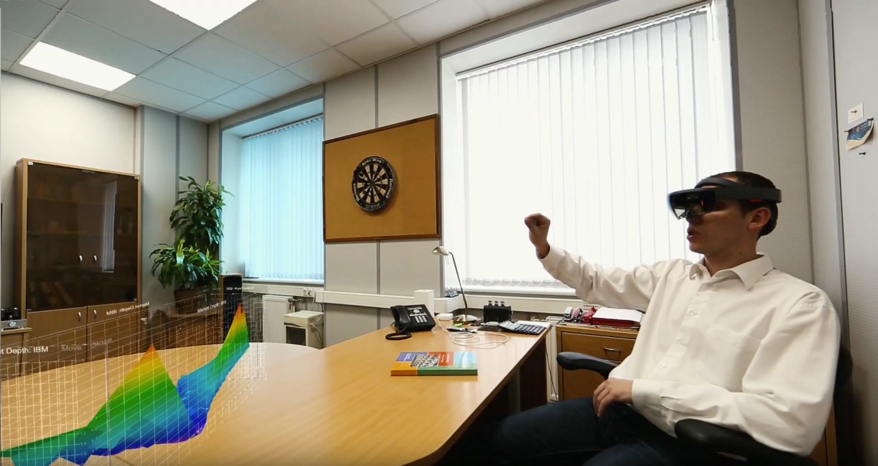
There is one good example of 3D though — a volatility surface in 3D. Traders know how it looks and how to analyze it, and they are used to it.
2. Animation
Watch the animated .gif below. This example is great for start pages to entertain you while waiting.
This example of animation is an irrespective unreal object. It’s not connected to the main idea of an app and isn’t tied in with a trading platform.
So let’s go further and see examples of respective relative animation use — how components appear, disappear, and interact.
When users have a positive UX experience they feel a connection to the system. They see how pages turn, how objects and lines fade in or out, how lists drop down, and how a button is pressed. If it happens abruptly it creates discomfort because users aren’t prepared for sudden changes. It’s better when it goes smoothly, but also not slowly. Animation should be close to human expectations. Too much animation can be frustrating.
Here’s a quick example: button color change under a cursor should be 0,3 seconds. And even 0,3 seconds seems too long when you interact with a system for several hours. You want the system response to be faster.
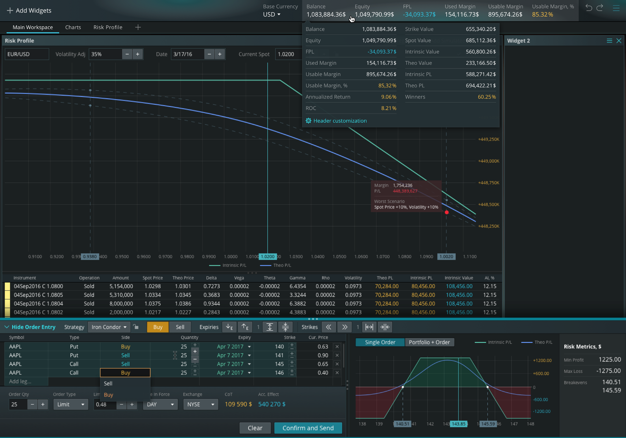
4. Courageous colors
We use brave colors in one of our current projects. It’s a mixture of cyan with light blue (azure) and intense yellow (golden) — two complementary colors bolstered by a complex gradient background.
In the past, colors were dull and flat. Now the trend lies in using vibrant hues. And we see no reason against this: it’s done to stand out, to attract attention, to look tasty, to advertise itself. But still our first priority as a UX/UI design team is to solve a task. If a client works at night and they don’t need bright colors on a black screen, we’ll adopt a less vibrant/more calm color design to meet their request.
The advantage of this trend is that several unavoidable colors keep everything in one style. The disadvantage is we can’t step aside If we think that we used these colors too much, so we are restricted in color choice.
Although the usage of gradients is possible, it can be even complex gradients consisting of 3 or 4 hues nearby in the color spectrum.
Interface color choice should be based on human preferences. People like colors which can be found in nature — from a rainbow to shadows and reflections — because we’re used to them. This knowledge isn’t new and has been around for ages.
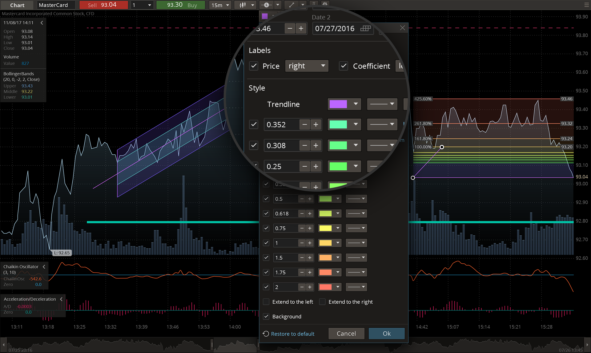
5. Color Transition
Although color transition stands for a simple gradient, we’ve moved further into this and added more hues. It’s not just the basic transition between two colors, but a mixture of several colors and angled or radial overlaid gradients.
In Android we use semi-flat (because of producer’s guides as was mentioned above), and in iOS it’s used nearly always.
6. Responsive Design
Responsive design is one design, created and adjusted for a web screen or a tablet. The design will spread on the screen according to the rules the designers set depending on what device is in use.
The horizontal/vertical orientations of tablets and smartphones are responsive design examples. Users rotate a device and the layout changes position to fit the new screen size; something extends and something collapses.
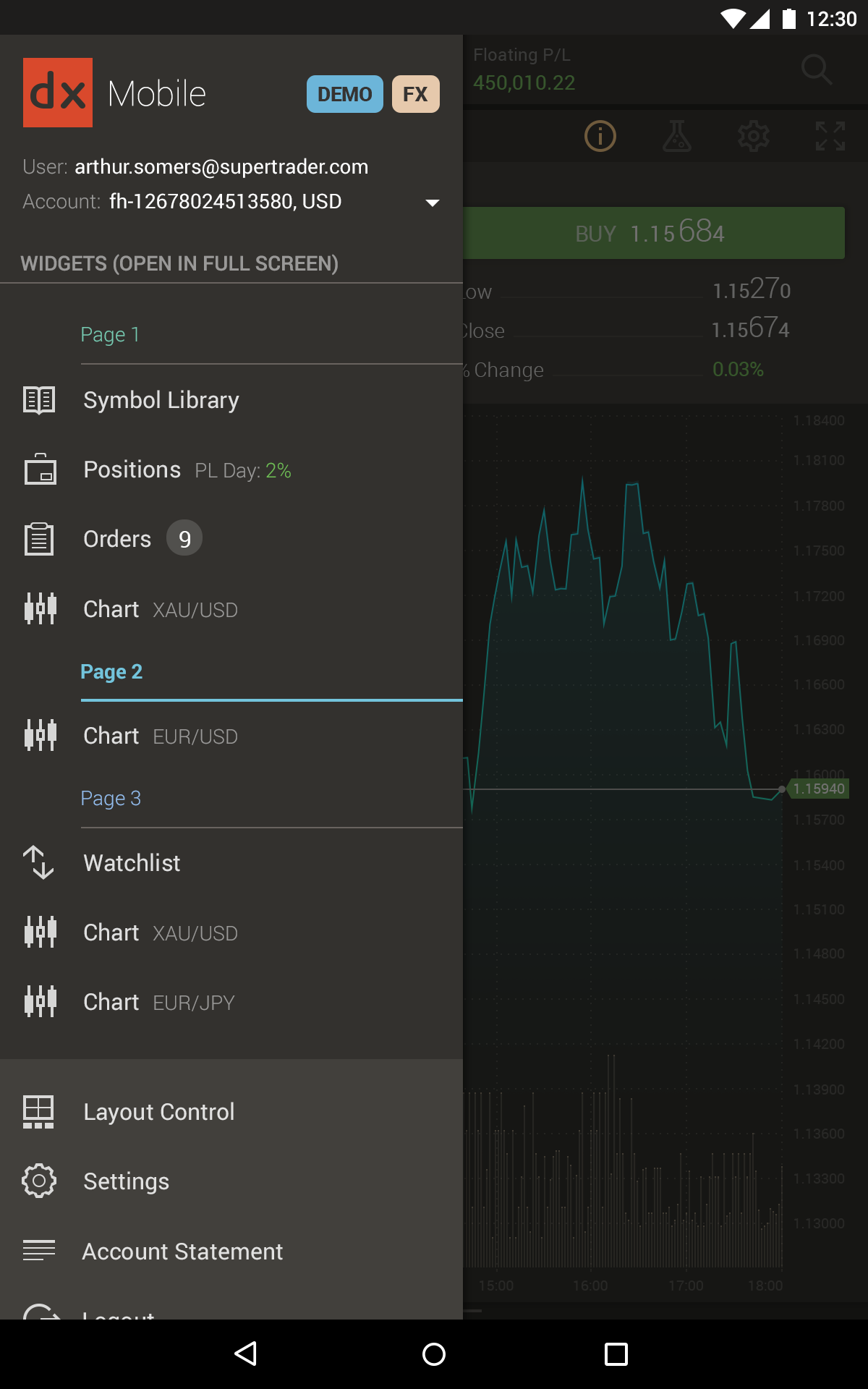
7. Custom Graphics and Illustrations
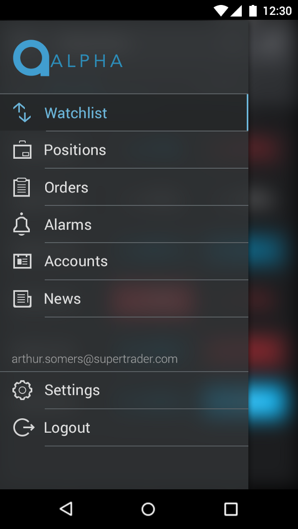
Graphics and Illustrations work well on pages with additional functionality. They’re unique, created upon request, and coordinate with the main style. We have a specific example: a custom illustration for an Android tablet sidebar.
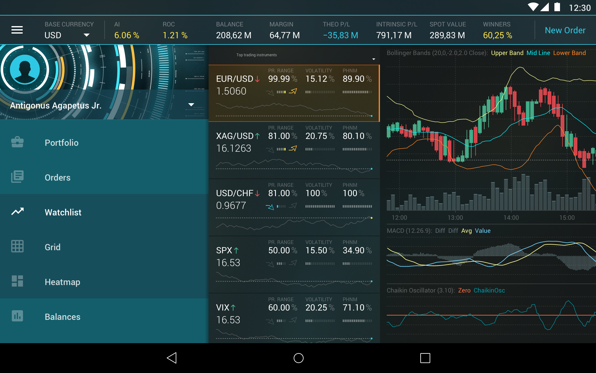

The illustration makes the menu look more interesting and attractive. Its creation was the result of design team’s brainstorm: when they reviewed the mock-up, they realized that an empty space can be filled in with an interesting drawing.
8. Creative Use of Neutral Space and Grid
This works great on web sites or applications with enough free space. We can’t afford it because we don’t have a single free pixel. But this trend goes well for landing or log-in pages, presentations and maybe learning centers.
We use Native Grids in any operating system. Developers of these systems state, for example, that according to their guides the space between content areas in mobile should be 8dp, text in the app bar should be Medium 20 Spreadings, button style is Medium 14sp, all caps, etc.; specific metrics are also applied for tablet.
Though it’s more standard and monotonous, we adhere to these guides because it helps our end-user. They’re familiar with baseline grids and they know where to find a wanted object.
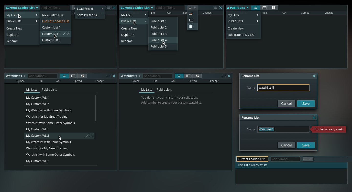
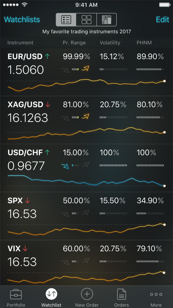
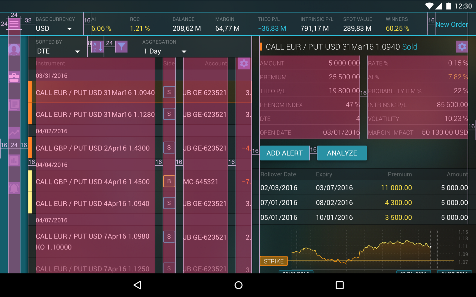
9. Split Content
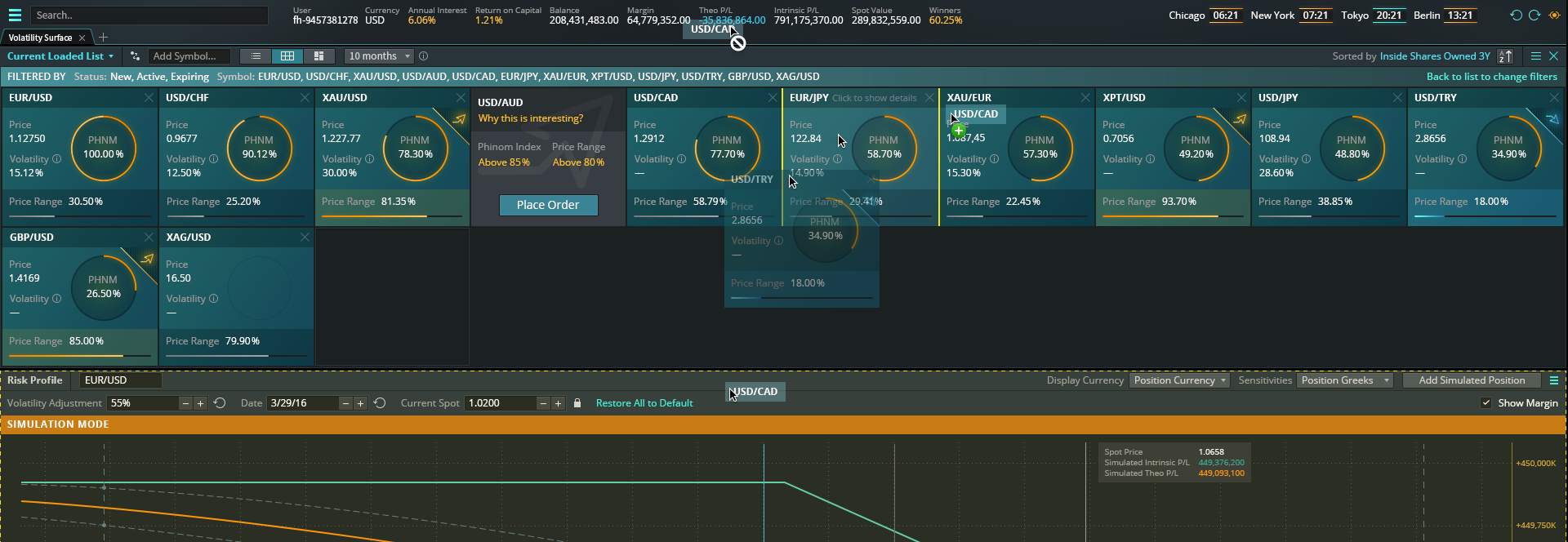
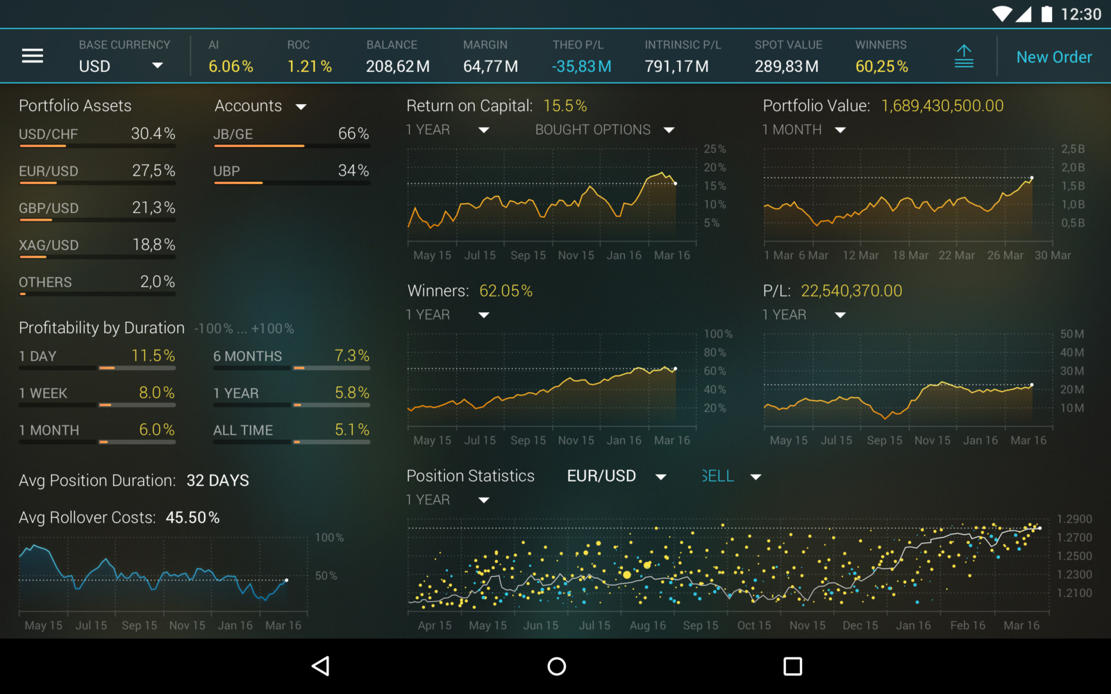
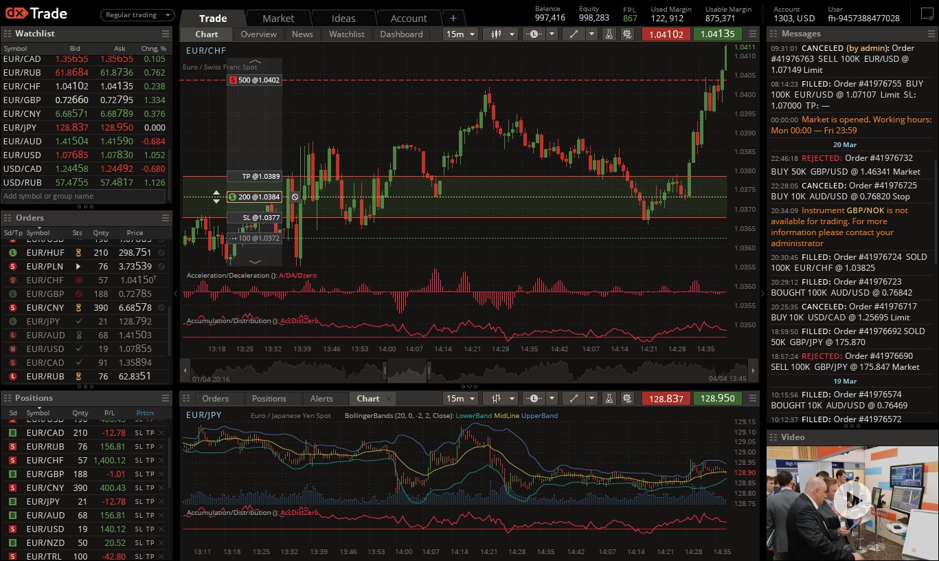
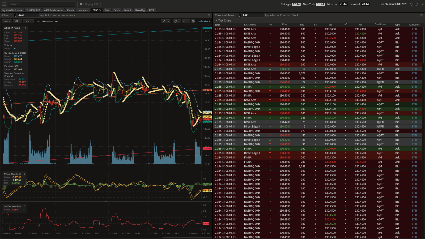
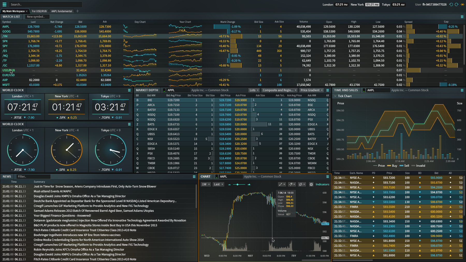
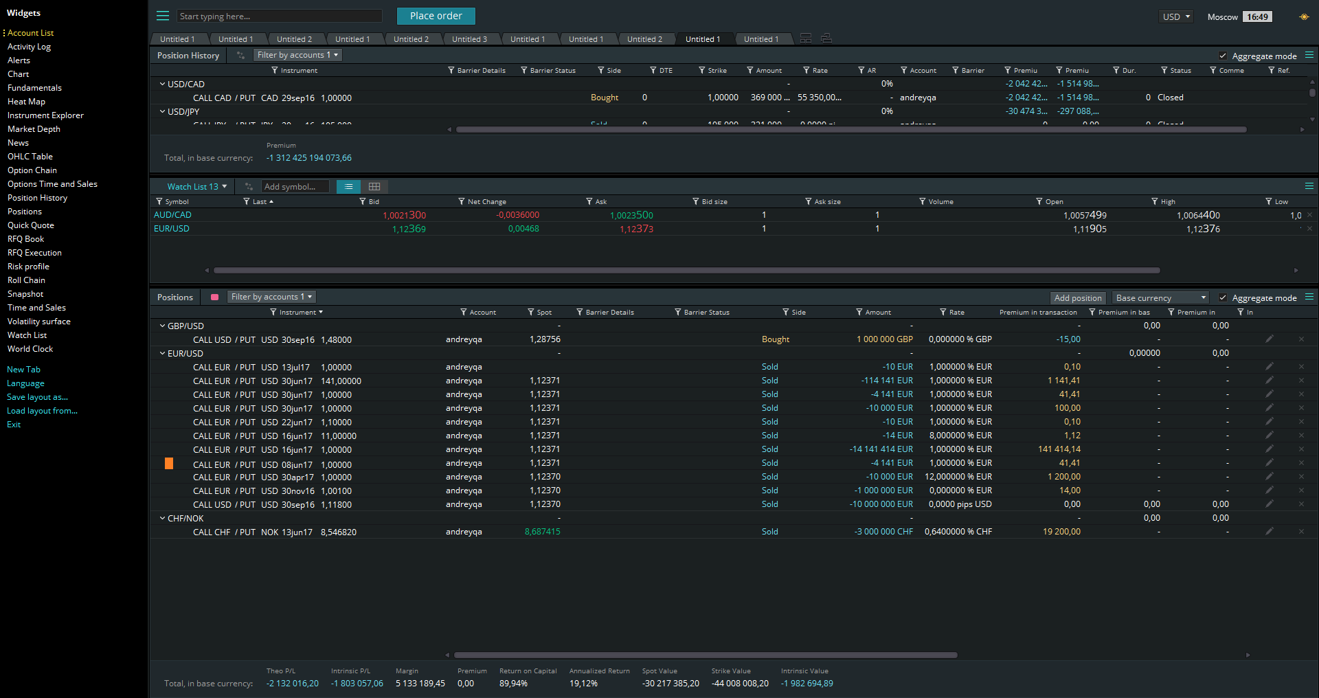
We definitely use this — and again, it’s not new, it’s been in use since the first trading platform. There are several widgets and they split the screen in five, six, seven, or even more sections. But it’s essential for trading as it helps keep a lot of data accessible.
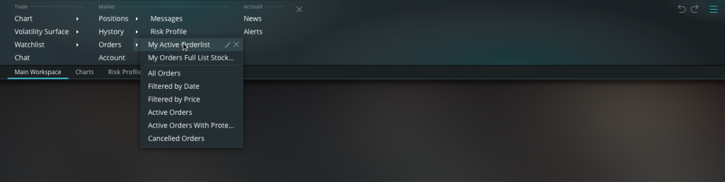
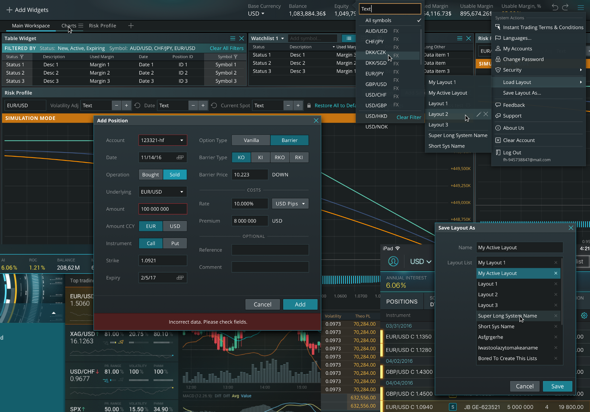
10. Hidden Navigation
And here we took over modern trends in 2018. The technology originally came into use for big data front-end terminals in 2010. Before we started implementing this we had a few menu items and it was easy to allocate all of them in a row at the top or at the bottom of the screen. But after the number of items rose beyond 10 we knew we needed to hide them but be able to show them upon request.
11. Tiny Design Details
These are everywhere in trading software. It’s not only tiny elements or notification icons, but also in accuracy and pixel perfection
12. Animated Logo and Typography

When we do white labeling, we get a logo and color set from our client and work with it. Color set is a starting point, because the logo position is already established. In both white labeling and custom solutions, an animated logo can only show up during page loading to make the wait shorter, so this is a single-time animation. If the logo stays animated for the whole time the user is working in the application, it can disturb their eyes and pull attention.
13. Color Transitions in Typography
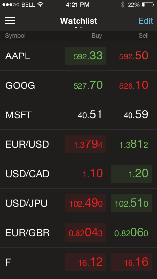
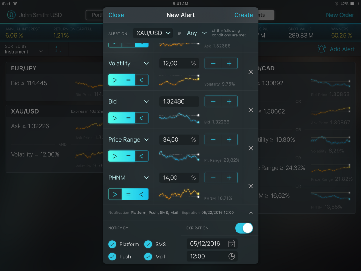
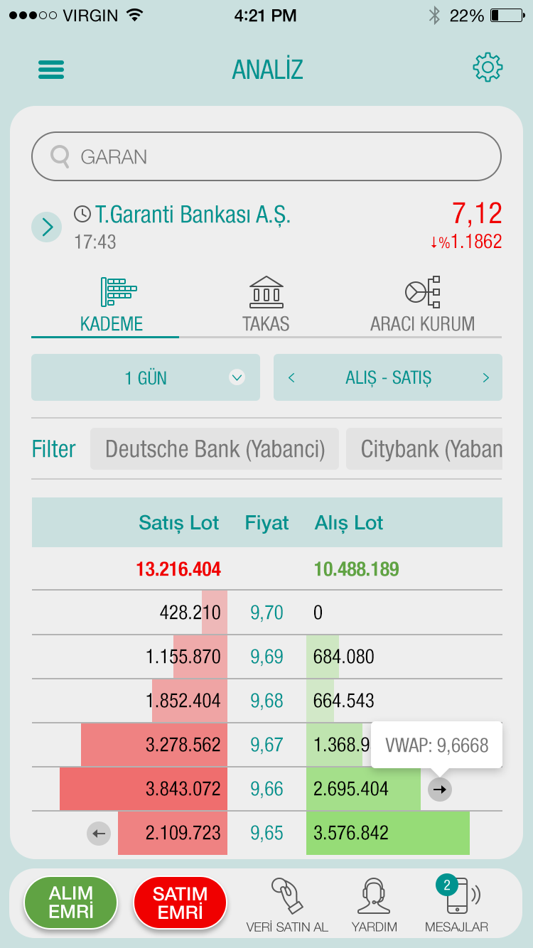
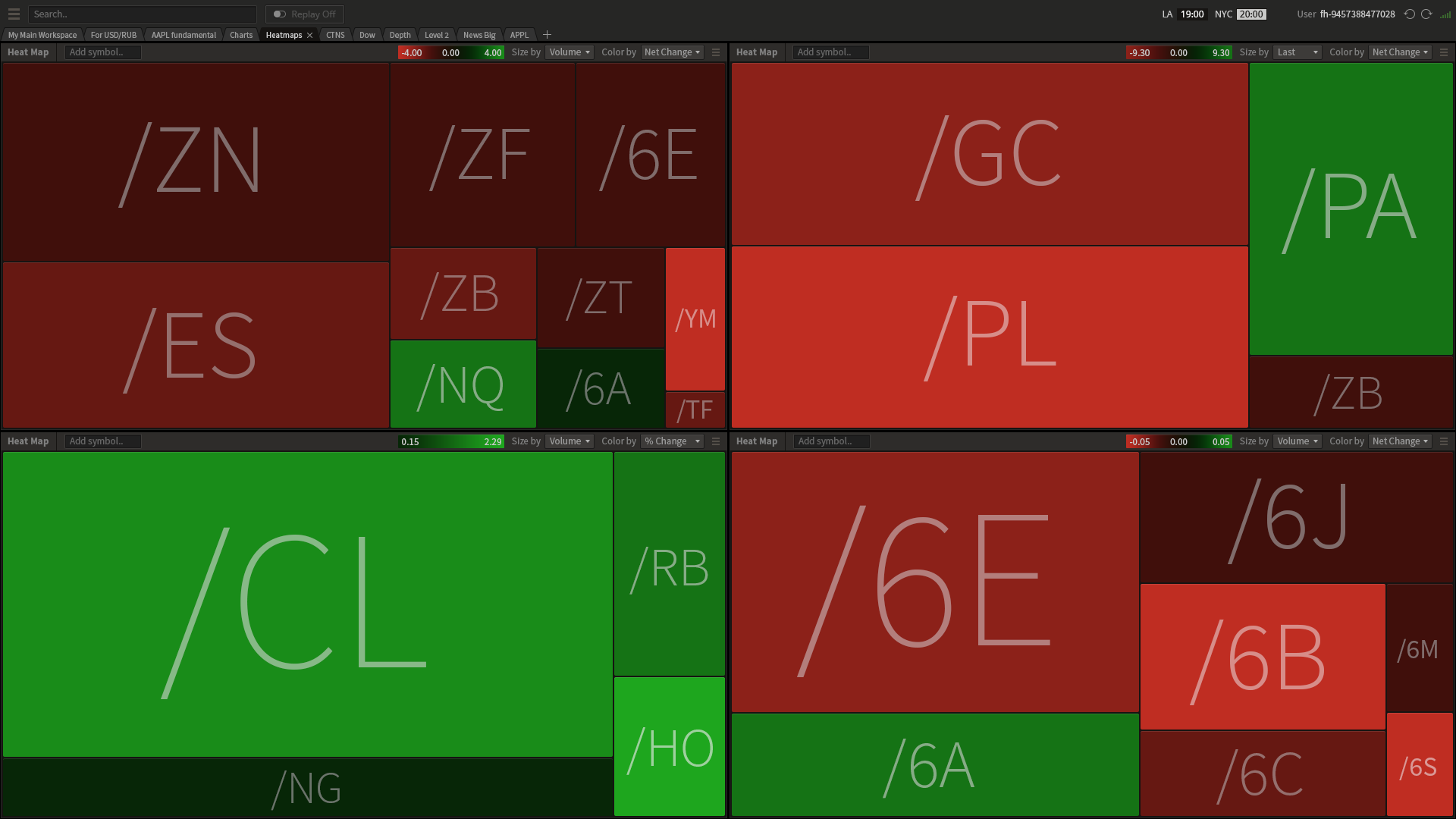
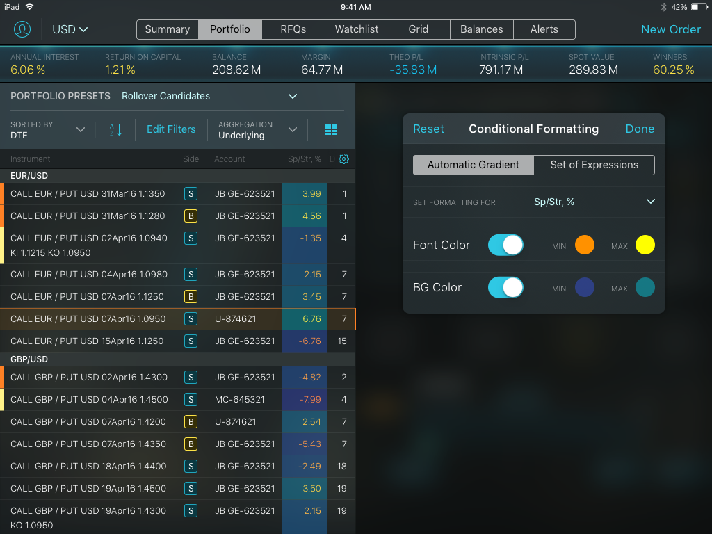
We use these for additional eye appeal and better information representation. The color transition in our apps goes vertically; it’s called condition formatting. Condition formatting colors cells according to the rules set by a user — for example cells, with negative numbers are in bright colors. Other examples include: market depth widget, where the cells are colored depending on their value, order book in gradient, and heat map.
14. Visual Hierarchy
This is always in use, according to the producers’ individual guidelines.
15. Tiny Typography
In highly loaded information systems such as our trading platform, everything is small but not tiny. We reduce letters and numbers until a certain degree in order to fit in as much information as possible, but keep it readable, fundamental and appropriate.
We’re interested in making our systems accessible for the visually-impaired. We want to appeal to all segments because they represent a wider audience for our products.
We would like to mention some UI trends which are inefficient for heavy loaded information systems:
- Cinemagraphs — demand too much space
- Landing pages — can only be used for financial learning centers
- Full screen forms — are used to fill in some extra space, and we don’t have any extra space
- Videos everywhere — the devil’s delight, as they load space and memory
Every pixel is a valuable space for tables, charts, numbers, and anything else that’s essential. Another waste of pixel space is visual noise. Our goal is to make every effort to streamline and improve user interaction — color composition, animation and hidden navigation, lights and shadows.
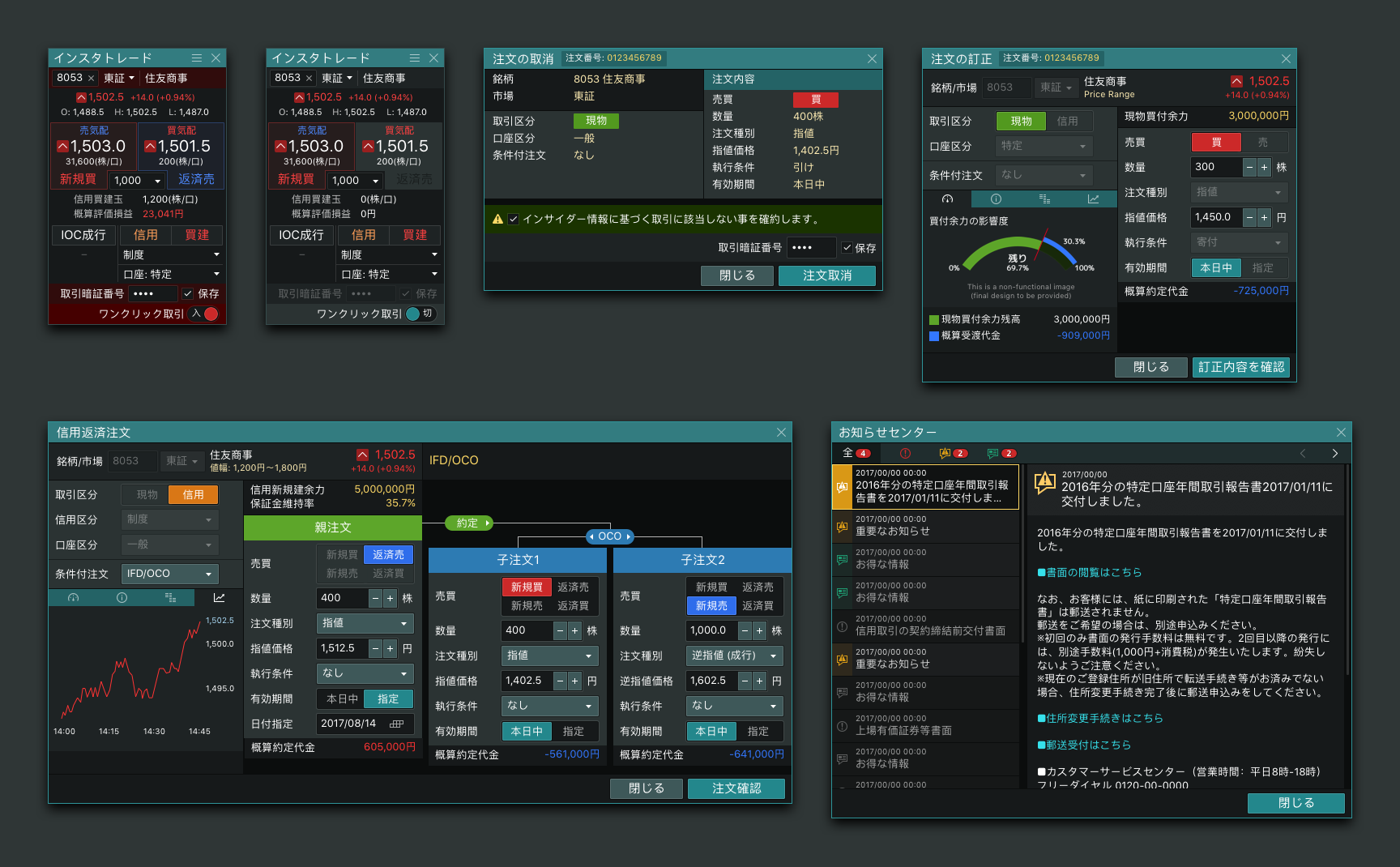
All illustrations in this article belong to Devexperts.