DXcharts Tools: Exploring Different Chart Types

Welcome to the first article in our series on DXcharts where we will explore the features and tools offered by our comprehensive charting solution for technical analysis. Today, we will dive into the wide range of chart types available in DXcharts and examine the valuable insights they provide.
DXcharts currently offers 11 chart types ranging from essential basic chart types to specialized ones that can help satisfy any analytical need. You can see and test them all on the DXcharts demo page.
Let’s take a closer look at each of these chart types and understand how they work.
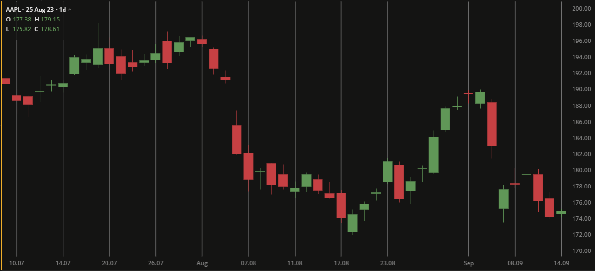
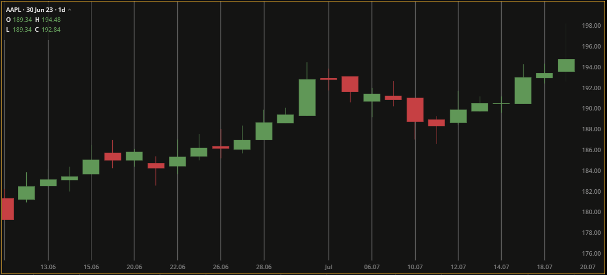
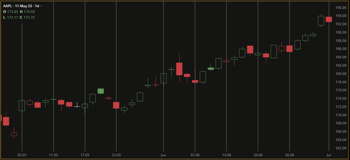
Candle chart
The Candle chart displays colored rectangles, or candles, that represent a specific period of time. Each candle has a body and wicks. The body represents the difference between the open and close prices while the wicks indicate the high and low prices during the period. The borders and bodies of the candles are colored based on the relationship between the closed and open prices.
Candle charts provide a visual and intuitive way to interpret and analyze price data. They are widely used by traders and analysts to study market trends.
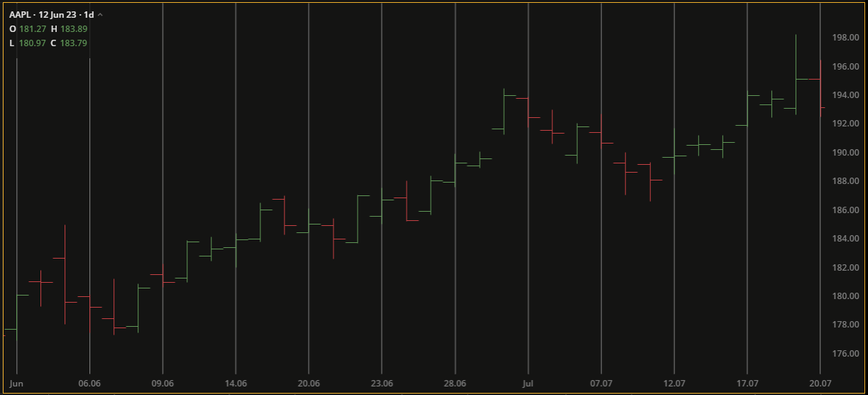
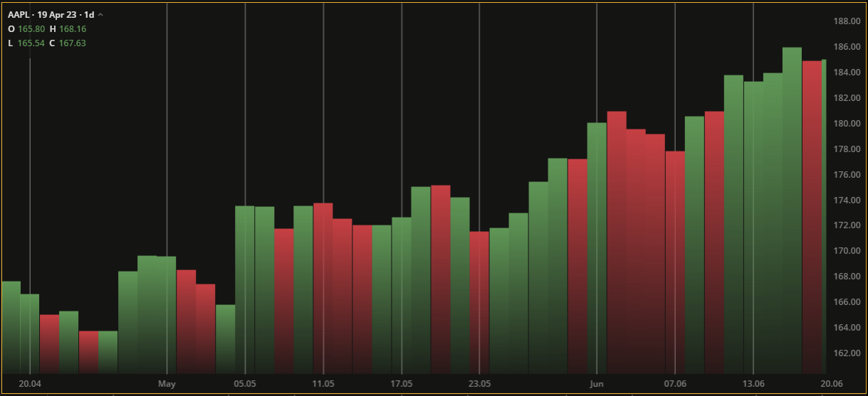
Bar chart
The Bar chart displays the aggregated open, high, low, and close price values for a given time period. Each bar consists of a vertical line with a stroke on the left indicating the open price and a stroke on the right indicating the close price. The line’s top and bottom tips represent the high and low prices, respectively.
Bar charts are particularly useful for comparing data values across categories. They make it easy to identify and understand patterns, trends, and relative differences in the data.
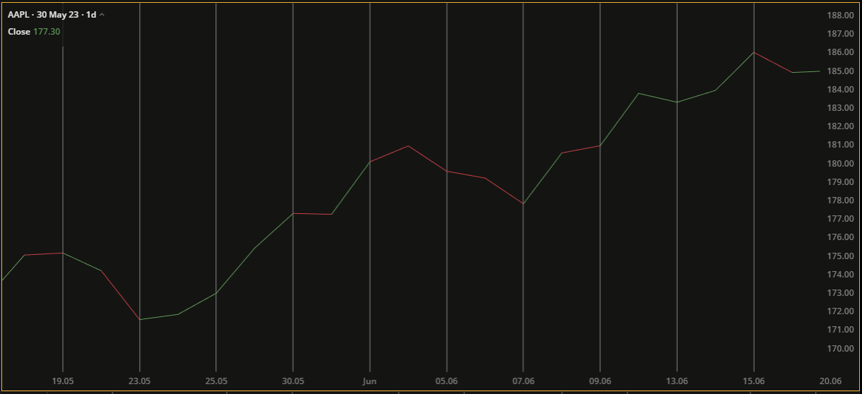
Line chart
The Line chart connects the closing prices of successive periods with lines. It does not show open, high, or low values. The lines on the chart are colored based on the relationship between the current closing price and the previous closing price.
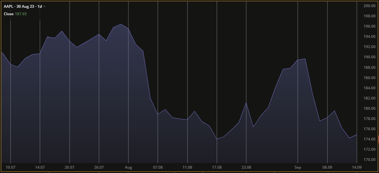
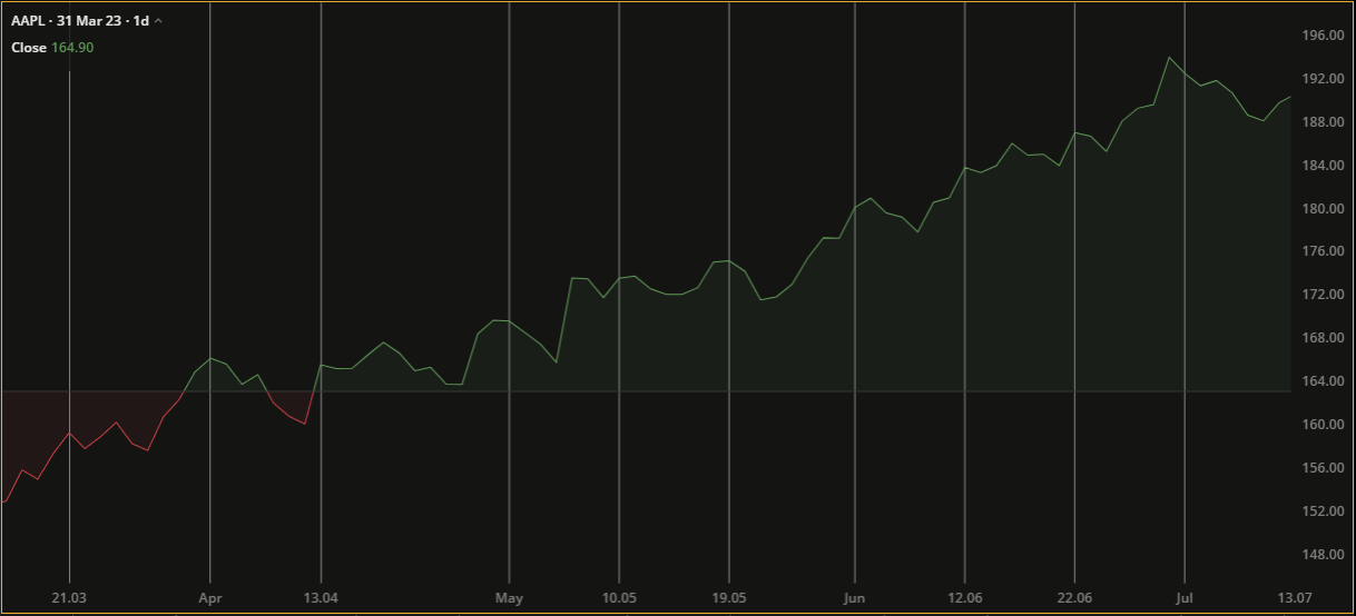
Area chart
The Area chart is plotted using close price values. It shows the area between the current close price and the zero price level providing a clear visual representation of the price trend.
A visual representation of cumulative data often used in finance, business, sales, and other fields where tracking changes over time is critical. Area charts help you quickly understand trends, patterns, and relative values.
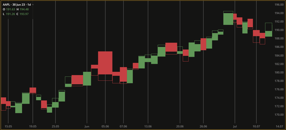
Similar to the Candle chart, the Equivolume chart displays boxes of varying width and height instead of candlesticks. The width of the box represents the volume traded, while the upper and lower boundaries represent the high and low prices. It does not show the open price, but it can show the close price.
Equivolume chart
It’s important to note that equivolume charts are not as widely used as candle charts, but they can provide valuable insights to traders and analysts who incorporate volume analysis into their technical analysis.
Heikin-Ashi chart
Heikin-Ashi is a type of charting technique used in technical analysis to display the price movements of an asset. The Heikin-Ashi chart uses candles, calculated based on specific formulas. The open, close, high, and low prices are converted into Heikin Ashi values, which are then used to plot the candles on the chart. As a result, Heikin-Ashi candlesticks may appear smoother than traditional candlesticks, making it easier to identify the trend direction.
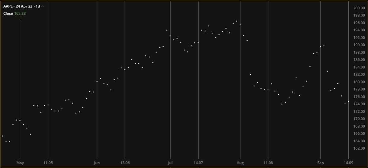
Scatter chart
The Scatter chart displays individual closing prices as scattered dots on the chart. Since there are no connecting lines, users are able to zoom in and view individual prices. It is particularly useful for identifying correlations, outliers, and data gaps.
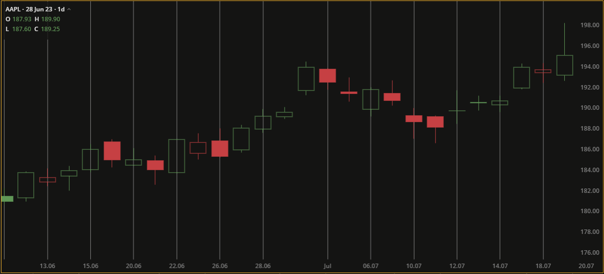
Hollow candles chart
The Hollow Candles chart takes into account not only the difference between the close and open prices of the current candle but also the high and low prices of nearby candles. The coloring and filling of the candles depend on whether the closing price is higher or lower than the opening price of the current or previous periods.
Histogram chart
The Histogram chart shows the volume of trades that occur at different price levels. The chart consists of vertical bars where each bar represents a price range or interval. The height of each bar represents the corresponding volume or frequency of trades within that range. By studying the histogram chart, traders can gain insight into areas of high trading activity.
Baseline chart
The Baseline chart shows price movements relative to a baseline selected by the trader. The baseline is drawn horizontally on the chart and can be moved up or down. It provides insight into price fluctuations.
Trend chart
The Trend chart, similar to the Candle chart, displays candles that are colored based on the open and close prices of the current period, and the two adjacent periods. The candle bodies are filled based on the relationship between the open and close prices, while the borders are colored based on the close price of the current period compared to the previous period.
Trend charts are particularly useful for identifying patterns and trends in data over time, such as upward or downward trends, fluctuations, or seasonality.
That’s it! We hope this article has given you an insight into different chart types. Get ready to delve deeper into the tools and capabilities of DXcharts next time.
Stay tuned for the next article!