Unveiling the Power of Drawings in DXcharts

See all our DXcharts guides here.
Welcome to the second article of this series. Today, we will take an in-depth look at the wide range of drawings available in DXcharts, the essential tools for predicting price direction and identifying trends.
DXcharts boasts an impressive assortment of drawings designed to sharpen your insights and empower your trading decisions. From fundamental linear drawings such as Trend Line and Price Line to intricate geometrical shapes such as Oval and Rectangle, we’ve got you covered.
There are also sticker-type drawings and specialized advanced drawings such as Fibonacci Retracements or Gann Box. So this time, let’s take a closer look at each of these drawing tools.
Basic drawings
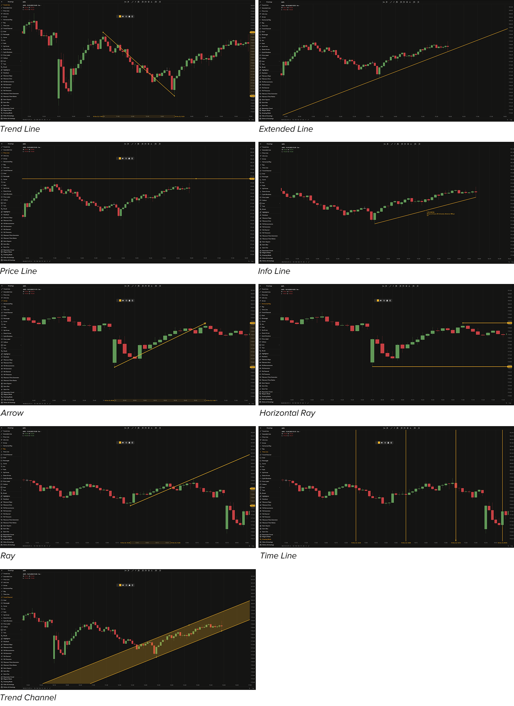
The basic drawings are fundamental tools for technical analysis. They include the Trend Line, Extended Line, Price Line, Info Line, Arrow, Horizontal Ray, Ray, Time Line, and Channel. These drawings provide valuable insights to identify trends, support and resistance levels, and potential areas of price movement.
- Trend Line. A fundamental tool that connects two points on the chart to identify areas of support and resistance. A positively sloped trend line indicates a bullish trend, while a negatively sloped trend line indicates a bearish trend.
- Extended Line. An infinitely extended line that can be used to create custom trend lines or trend channels. It remains visible and maintains the same angle even when navigating far into the past or future on the chart.
- Price Line. A horizontal line that marks a specific value on the price scale. Traders often use it to indicate price targets and identify support and resistance levels.
- Info Line. Connects two points on the chart and displays additional information such as the number of bars, time covered, and distance in pixels.
- Arrow. Connects two points with an arrow at its end indicating the direction of the trend.
- Horizontal Ray. Draws a horizontal line that extends indefinitely towards the right from its starting point.
- Ray. Allows you to draw an extended line in any direction, not limited to the horizontal line.
- Time Line. A vertical line that marks a specific point on the time scale.
- Trend Channel. Enables you to draw an ascending or descending area (channel) on the chart using two lines. The upper line represents resistance, and the lower line represents support. Both the tops and bottoms of channels identify potential areas of support or resistance. A negatively sloped channel is bearish, while a positively sloped channel is bullish.
Geometrical figures
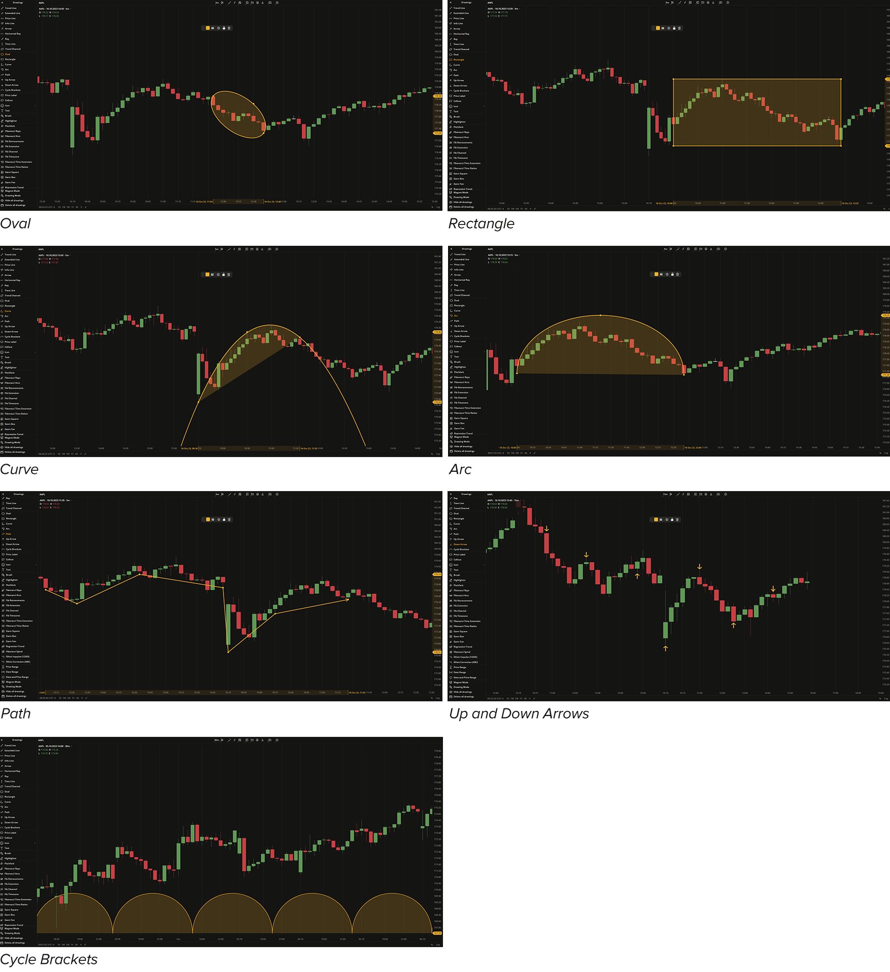
The figures such as Oval, Rectangle, Curve, Arc, and Path, are used to highlight specific areas or patterns on the chart allowing for better visualization and analysis.
- Oval. Frames and highlights an oval area on the chart.
- Rectangle. Frames and highlights a rectangular area on the chart.
- Curve. A parabolic-line graph is used to frame specific areas or patterns on the chart.
- Arc. Highlights certain areas or patterns on the chart.
- Path. A line with an arrow at the end illustrates the direction of the trend. It can go through multiple points on the chart.
- Up arrow and down arrow. These arrows are a simple tool to use when you need to point out specific elements of the chart.
- Cycle Brackets. This tool is useful when you need to separate a chart into periods (cycles) so that you can predict an uptrend/downtrend tendency at the start of the next cycle. Every cycle is measured from one point to another.
Labels
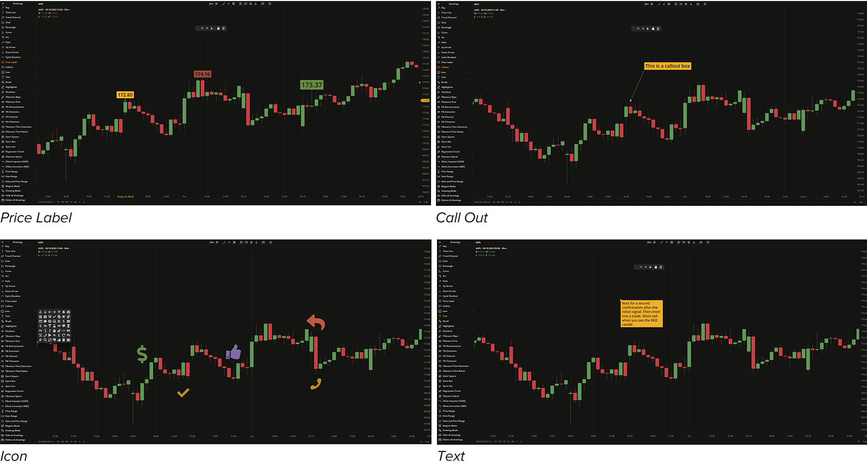
This group includes Price Label, Callout, Icon, and Text drawings. These drawing tools are used to mark specific values, provide additional information, or make annotations or titles on the chart.
- Price Label. Marks a specific price value on the chart.
- Callout. Creates a short string of text linked to a particular element on the chart.
- Icon. Allows you to place graphical symbols on the chart.
- Text. Enables you to make annotations or titles on the chart.
Brush and Highlighter
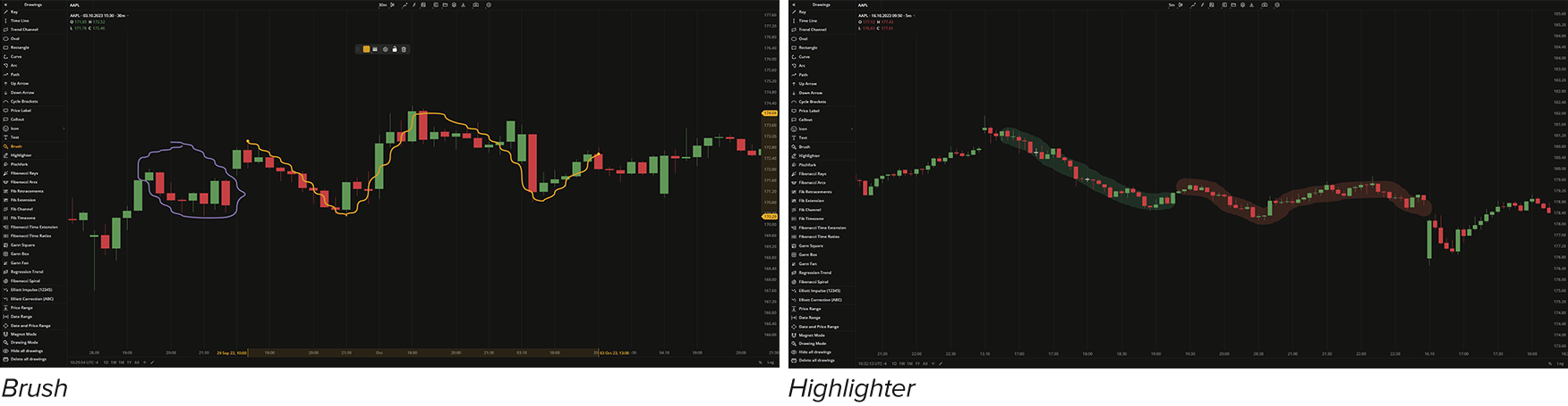
The Brush and Highlighter simply help highlight specific details on the chart.
- Brush. The tool is used to draw freely on the chart.
- Highlighter. Marks important elements on the chart, similar to a brush with a highlighting effect.
Advanced drawings
Advanced drawings are based on various technical analysis methods and patterns, such as Fibonacci ratios, Gann angles, Elliott Wave theory, and regression trends. These tools offer insights into potential support, resistance, and price movement patterns.
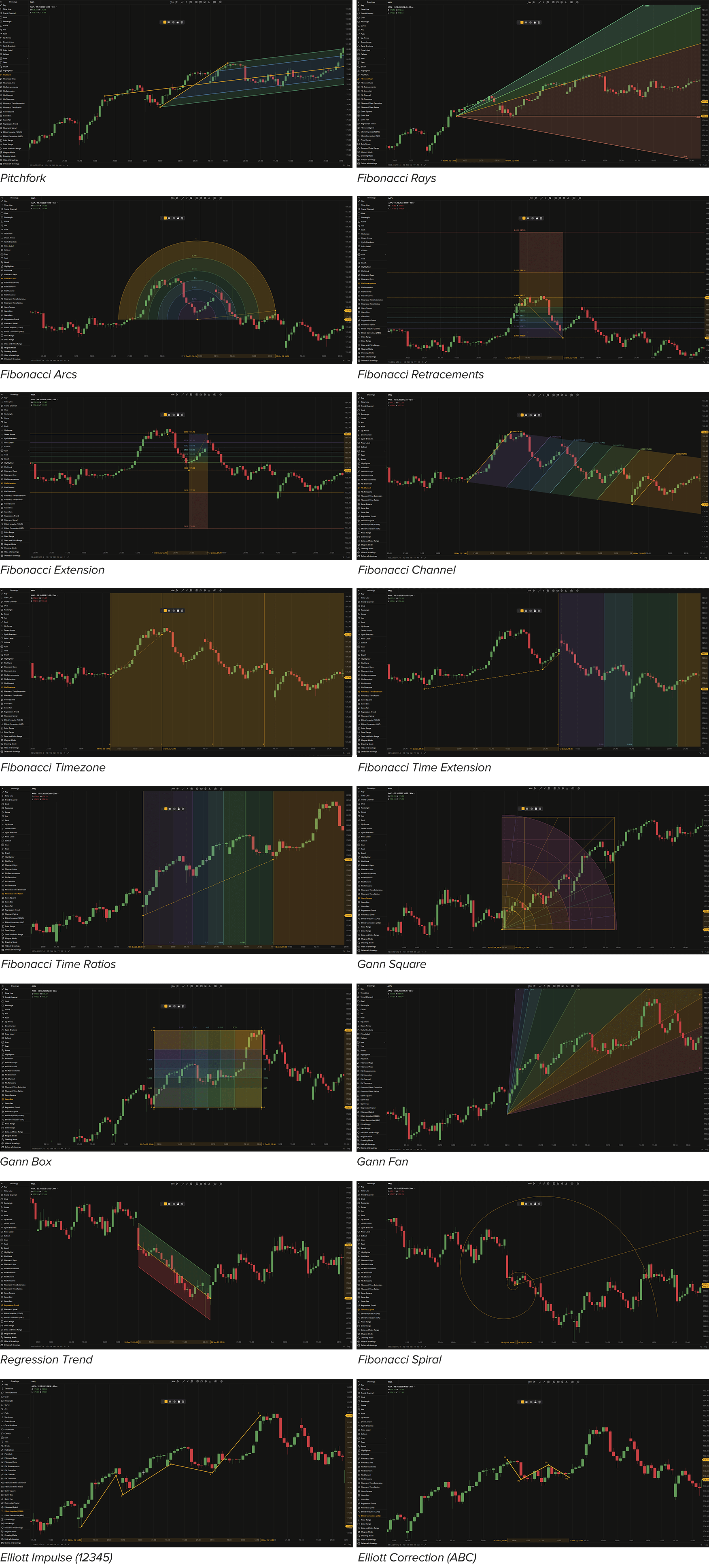
- Pitchfork. Consists of trend lines indicating where the price breaks out of a pitchfork channel. It includes a central trend line and additional lines representing levels of standard deviations away from the trendline.
- Fibonacci Rays. Based on the Fibonacci sequence, the tool helps draw rays extended from an initial point on the chart. These rays indicate trend halts or activations.
- Fibonacci Arcs. Semicircles extended outward from a center point providing support and resistance levels for price movements.
- Fibonacci Retracements. Sets price lines on the chart based on the Fibonacci sequence to identify potential support and resistance levels.
- Fibonacci Extension. Similar to Fibonacci Retracements but focused on identifying potential exit points for market movements.
- Fibonacci Channel. A price channel with diagonal levels plotted based on the Fibonacci sequence estimating support and resistance levels.
- Fibonacci Timezone. Sets time lines on the chart based on the Fibonacci sequence, used to forecast potential exit points for the market.
- Fibonacci Time Extension. Sets time lines on the chart based on the Fibonacci sequence indicating potential exit points for the market.
- Fibonacci Time Ratios. Similarly sets time lines on the chart based on the Fibonacci sequence, used to forecast potential reversals based on elapsed time.
- Gann Square. Plots a squared area on a chart, which consists of levels, fans, and arcs. The main purpose of the Gann Square is to identify and plot a proper square relationship that helps predict future price movements.
- Gann Box. Plots a grid of squares formed by price and time levels. It can be used to set the time and price range on the chart in order to measure and detect a cycle that is expected to repeat.
- Gann Fan. Plots a bunch of indefinite rays (Gann angles) coming from the initial point. The rays divide time and price on the chart into proportional parts according to the Gann method and are designed to show different support and resistance levels on the chart. Gann Fan is drawn by two extreme points that make up a trendline.
- Regression Trend. Similar to a Trend Channel, it shows deviation levels (upper and lower) from a baseline. The main idea is to determine where the price crosses these deviation levels.
- Fibonacci Spiral. Derived from the Golden Spiral concept, this tool involves inscribing a spiral into squares, with each side based on a Fibonacci number. It is believed that the spiral intersects significant price points on the chart.
- Elliott Impulse (12345). This tool is based on Elliott Wave theory and helps identify long-term price patterns related to persistent changes. It consists of five sub-waves (degrees) that make net movement in the same direction as the trend. This pattern is the most common motive wave and the easiest to spot in a market.
- Elliott Correction (ABC). Also based on Elliott Wave theory, this tool consists of three sub-waves (degrees). The Elliott Correction works in pairs with Elliott Impulse but makes net movement in the opposite direction to the trend.
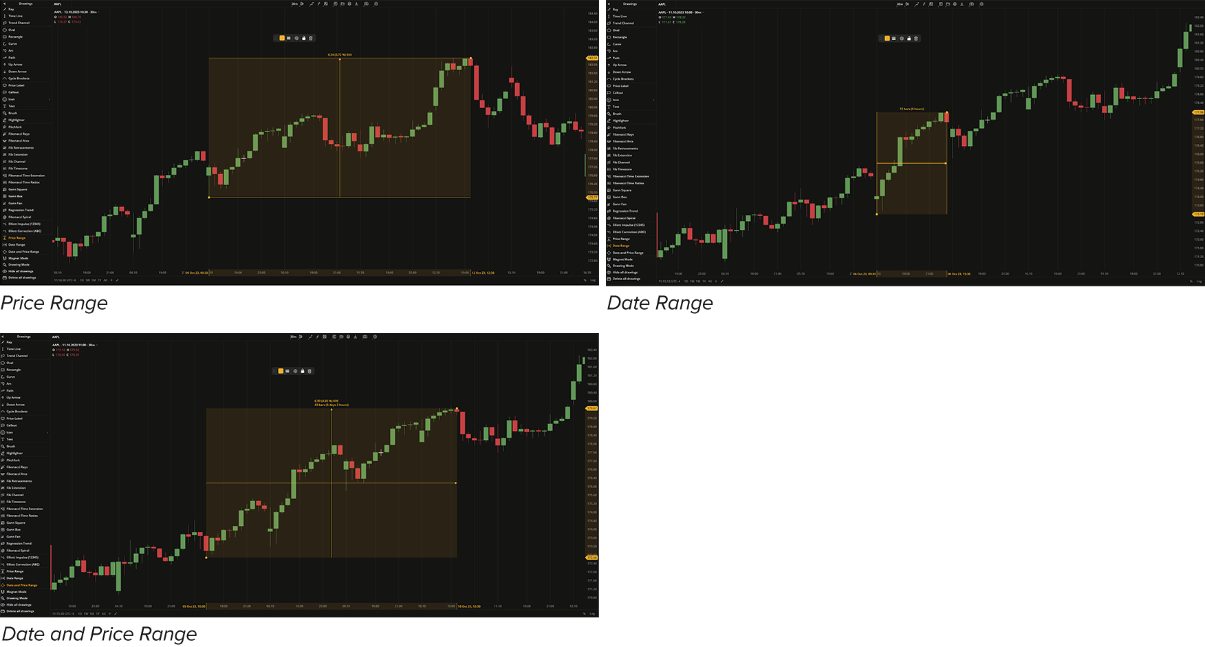
Range drawings
These tools are used to measure price and time intervals on the chart aiding in the identification and analysis of price movements and time duration within a specific range.
- Price Range. This tool simply helps measure price intervals (up and down movements) on the chart. The Price Range is drawn by two points to form a square.
- Date Range. This tool helps measure date/time intervals on the chart. The Date Range is drawn by two points in order to make up a square.
- Date and Price Range. This tool is a combination of the previous two measuring both date/time and price intervals on the chart simultaneously.
Congratulations on delving into the world of drawing tools. You can see and test them all on the DXcharts demo page.
Today, we’ve just scratched the surface of what DXcharts has prepared for you, and hope you’ll find it insightful. Get ready to explore further with us the features and potential of DXcharts in our upcoming articles.
Keep an eye out for our next article!