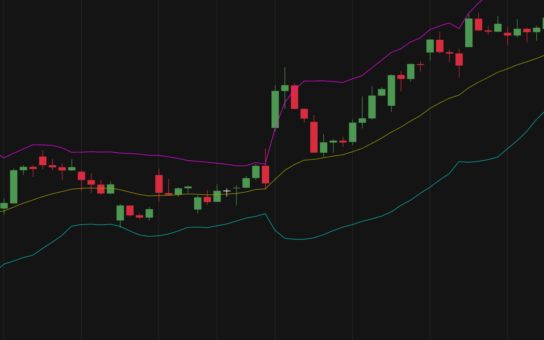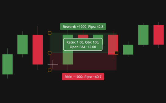
A Candle or candlestick chart is one of the most popular ways to visualize price movements because it presents several key data points in a compact and intuitive form. Each candle represents a specific time period—such as a minute, an hour, or a day—and is built from four essential values: Open, High, Low, and Close. Together, these elements form the “anatomy” of a candle, allowing traders to quickly understand how the price behaved during that interval.
At the center of every candlestick is the body, which shows the range between the opening and closing prices. If the closing price is higher than the opening price, the candle is typically shown in a lighter or green color, indicating upward (bullish) movement. If the closing price is lower than the opening price, the candle appears darker or red, signaling downward (bearish) movement. This visual contrast makes it easy to see whether buyers or sellers were in control during that period.
Extending above and below the body are thin lines known as wicks or shadows. The upper wick reaches from the top of the body to the highest price achieved during the period, while the lower wick extends from the bottom of the body to the lowest price. These wicks provide important context, showing how far the price moved beyond the open and close, even if it didn’t stay there.
The relationship between the body and the wicks can reveal valuable insights about market behavior. For example, a long upper wick may suggest that prices were pushed higher but then pulled back, indicating potential selling pressure. A long lower wick can imply that prices dropped but recovered, hinting at buying interest. Meanwhile, a candle with a large body and short wicks often reflects strong, decisive movement in one direction.
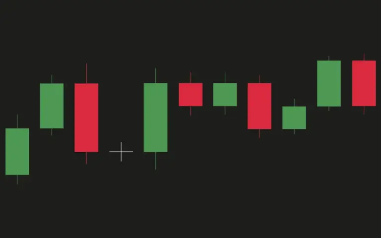
By combining all these elements, a single candle tells a detailed story about price action within a given time frame. When viewed together in a sequence, candles form patterns that traders use to identify trends, reversals, and potential trading opportunities. This balance of simplicity and depth makes candle charts a powerful and widely used tool in technical analysis.