In general, charts are visual representations of how values change over time. They can be used to analyze a wide range of data, from temperatures and population growth to financial markets.
Financial charts, specifically, are a core tool for traders and investors, helping them track how a security’s price evolves, identify trends, and make decisions when to buy or sell. Typically, the vertical axis represents price, while the horizontal axis represents time, allowing users to quickly see patterns such as upward or downward trends, periods of volatility, or consolidation. By visualizing historical price data, stock charts support both short-term trading strategies and long-term investment analysis.
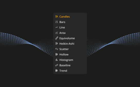
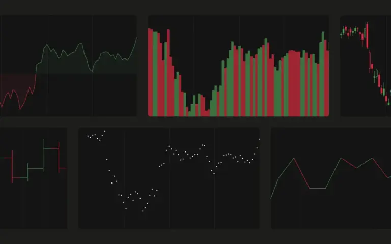
There are a variety of chart types, but the most widely used are Line, Bar, and Candle charts.
Line charts
Line charts provide a clear and simplified view of data by connecting selected points—often the final value within each time interval. This makes them especially useful for understanding overall trends and long-term direction while filtering out short-term variability or noise.
The Line graph connects consecutive Close prices on the chart. Open, High, or Low values are not shown for this chart type.
Bar charts
Bar charts provide more detailed information for each time period by showing a range of values, including minimum, maximum, and intermediate points. This allows for a better understanding of variability and distribution within each interval, making them useful when the full scope of change matters.
A Bar chart shows price movements using simple bars that include the Open, High, Low, and Close values for each period. Each bar has a vertical line, with the top marking the highest price and the bottom the lowest. Small horizontal lines on the sides indicate the Open price (on the left) and the Close price (on the right), giving a clear view of how the price moved during that time.
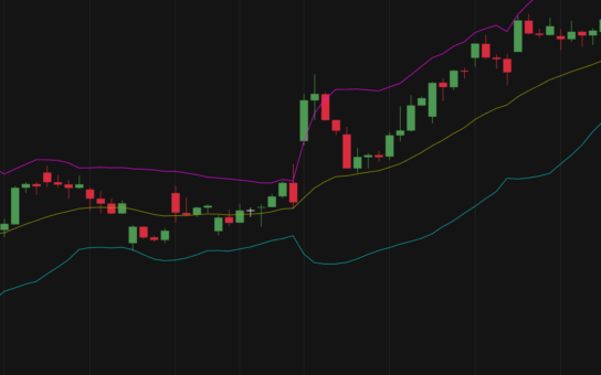
Candle charts
Candle or candlestick charts display similar information to bar charts but in a more visual and intuitive format. They make it easier to quickly identify increases, decreases, and patterns in the data at a glance.
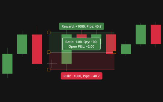
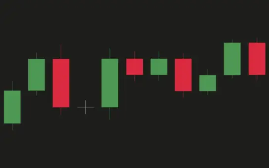
A Candle chart shows price movements using colored shapes called candles, each made up of a body and thin lines (wicks) above and below it. The top of the upper wick marks the highest price during the selected time period, while the bottom of the lower wick shows the lowest price. The candle’s body corresponds to the Open and Close prices, making it easy to see how the price moved at a glance.
There is no single “best” chart type—each has its own advantages and limitations. The choice depends on how you prefer to interpret data, and combining multiple chart types can often provide a more comprehensive view.